Kannaswiss
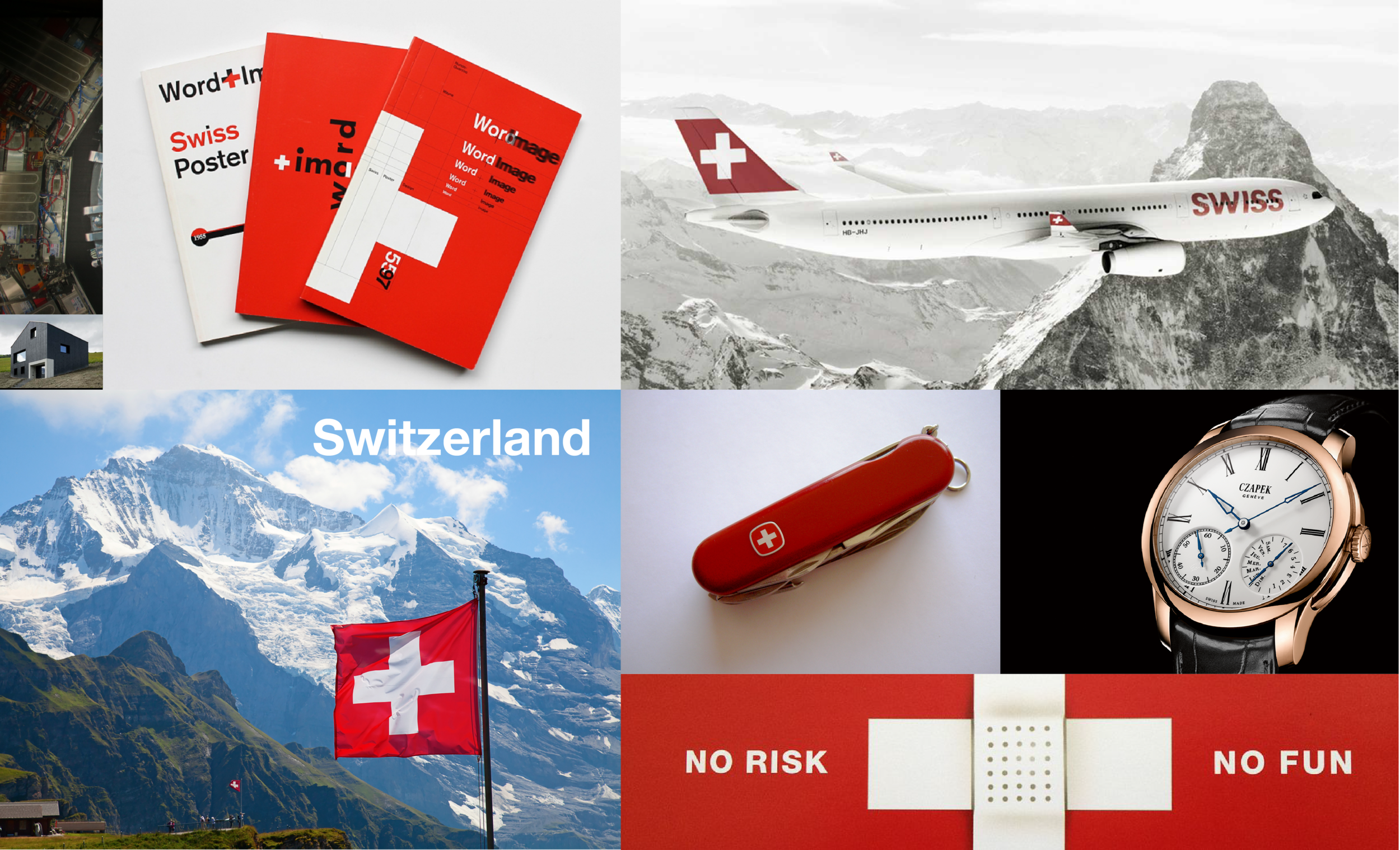
Haloing off the Swiss school of modern graphic design we forged an identity that is at once accessible and inviting while also being reliably “pharmaceutical” in order to communicate the brand’s promise and the related value system and the premium price positioning of their expanding line of CBD-enhanced products.
An excerpt from the design brief.

Wellness is central to the brand promise.


The “plus” monogram device is loaded with meaning.

Subliminal promise of comprehensive lifestyle support implied and expressed.

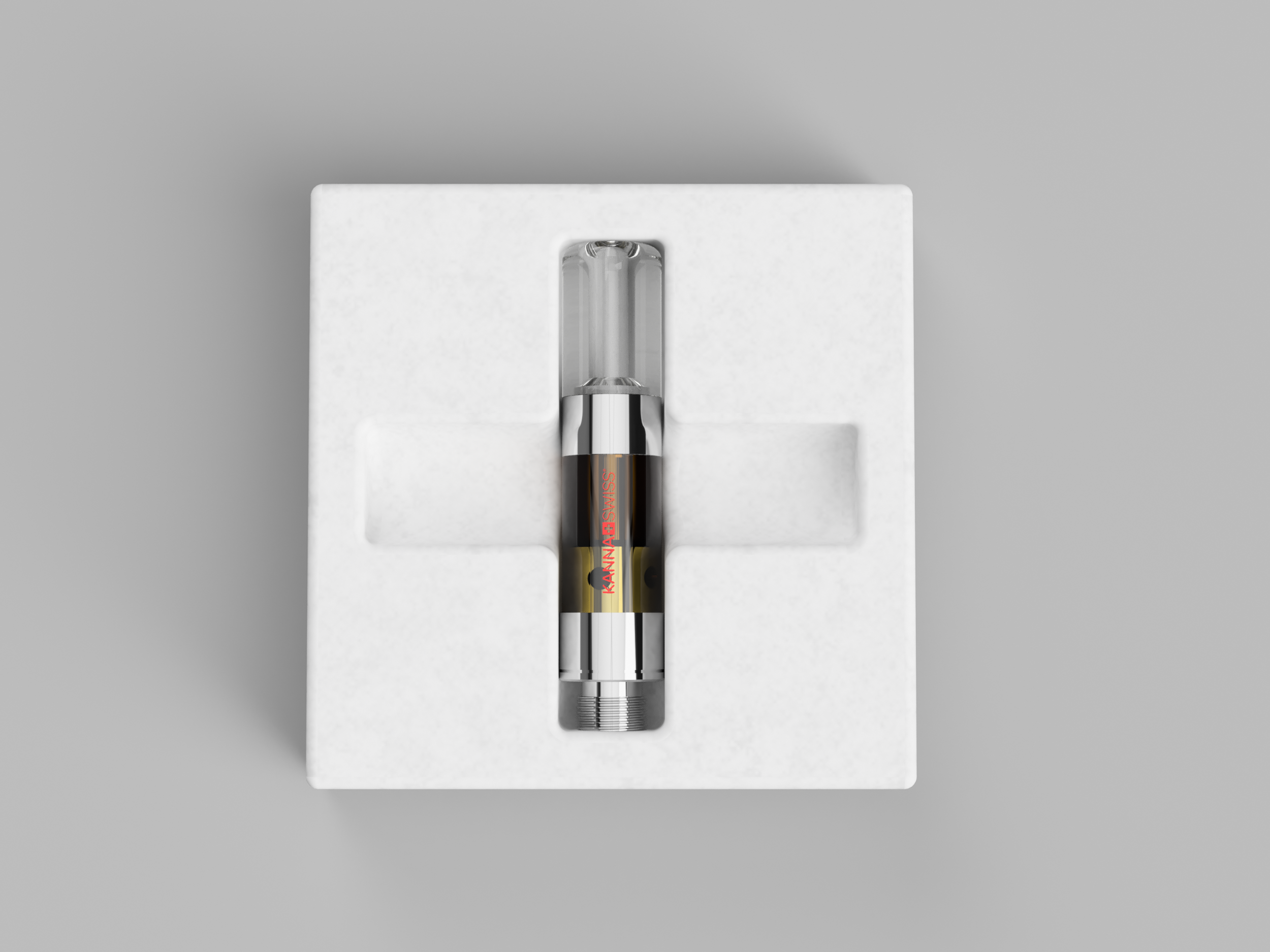
The first SKU that launched the medicinals category.

An ever-expanding number of SKUs.
Bagasse fiber mesh molds echo the values of the brand.

Attention to detail is endemic.

A custom mold for the most Swiss of all chocolates.

Retail facade elevation prototype reinforces the underlying Swissness.

Modular expo system that packs flat for a life on the road.

Comfortable, functional and modern.

Reusable totes from organic jute.
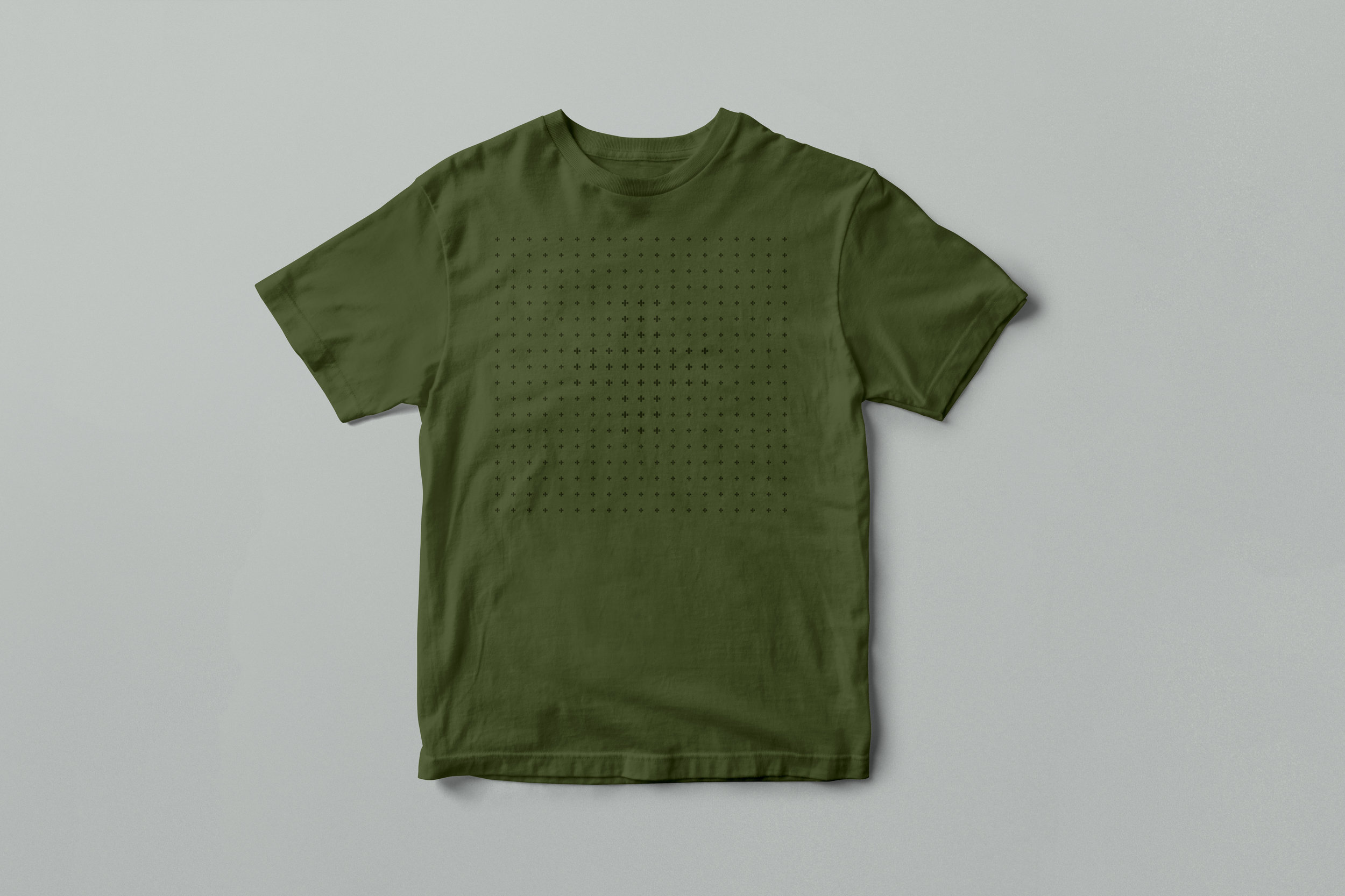
Organic cotton tees.