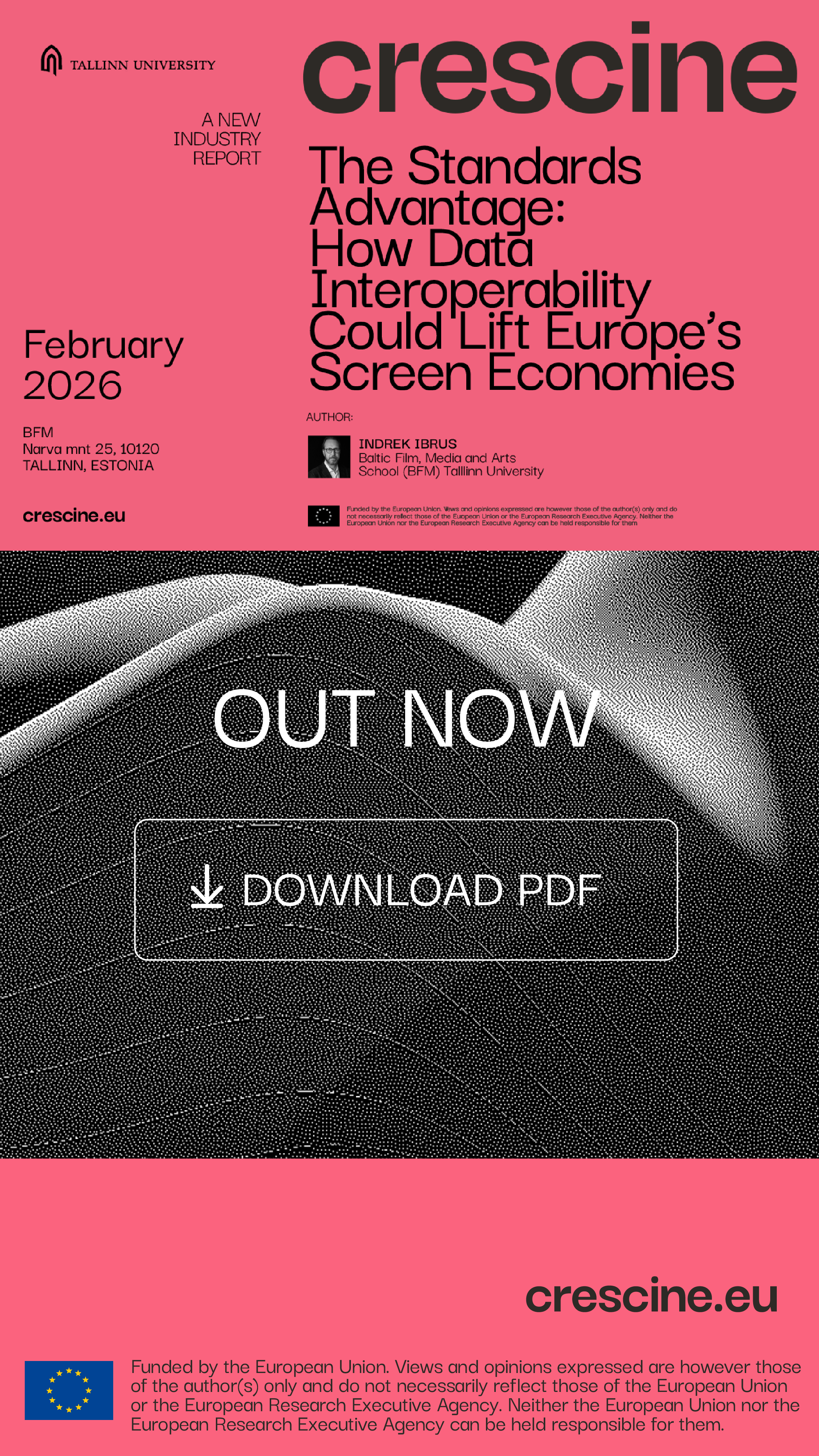
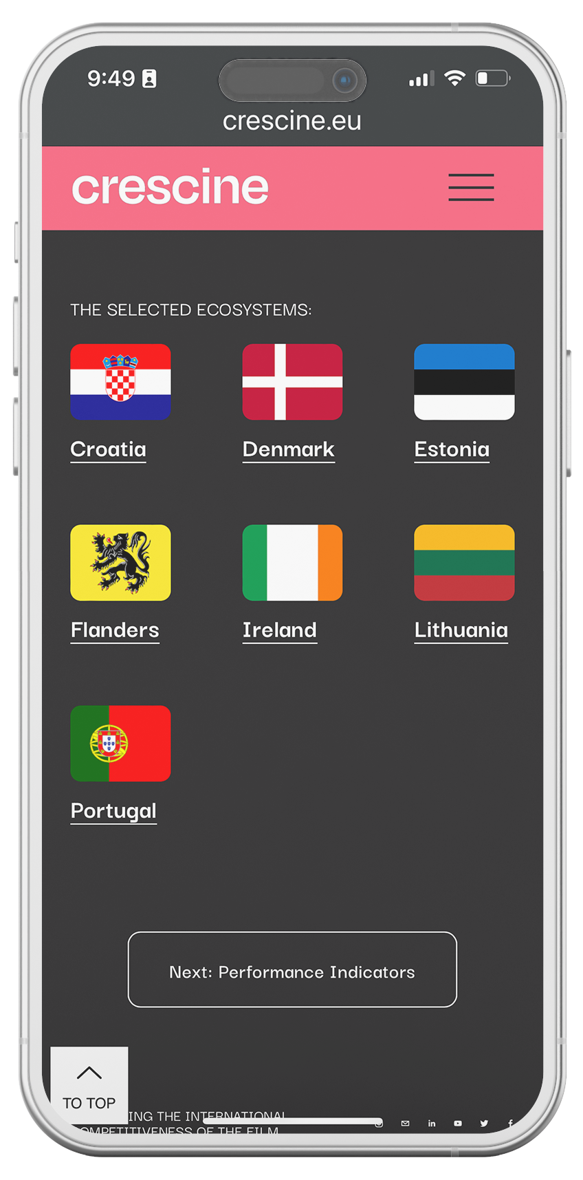
CresCine
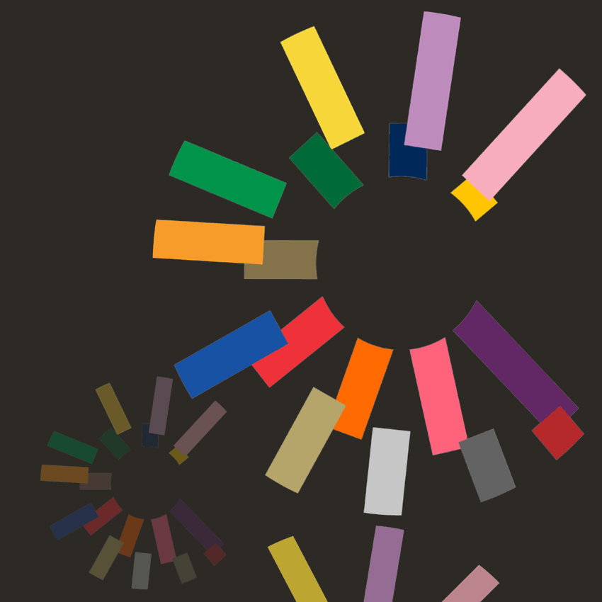
By the underlying complexity alone, academic-private-government partnership projects with stakeholders from culturally diverse and distinct origins, and local and national mandates and priorities, can present unique challenges in expressing unified ideas without political controversy, while continually building consensus and gathering and sharing knowledge. That’s why the unity of diverse components and symmetry are among the key concepts that inspired the visual rebranding of CresCine - a multi-year undertaking sponsored by the EU.
Logo


Print & Digital Publications
Event Posters & Digital Signs

Social Media


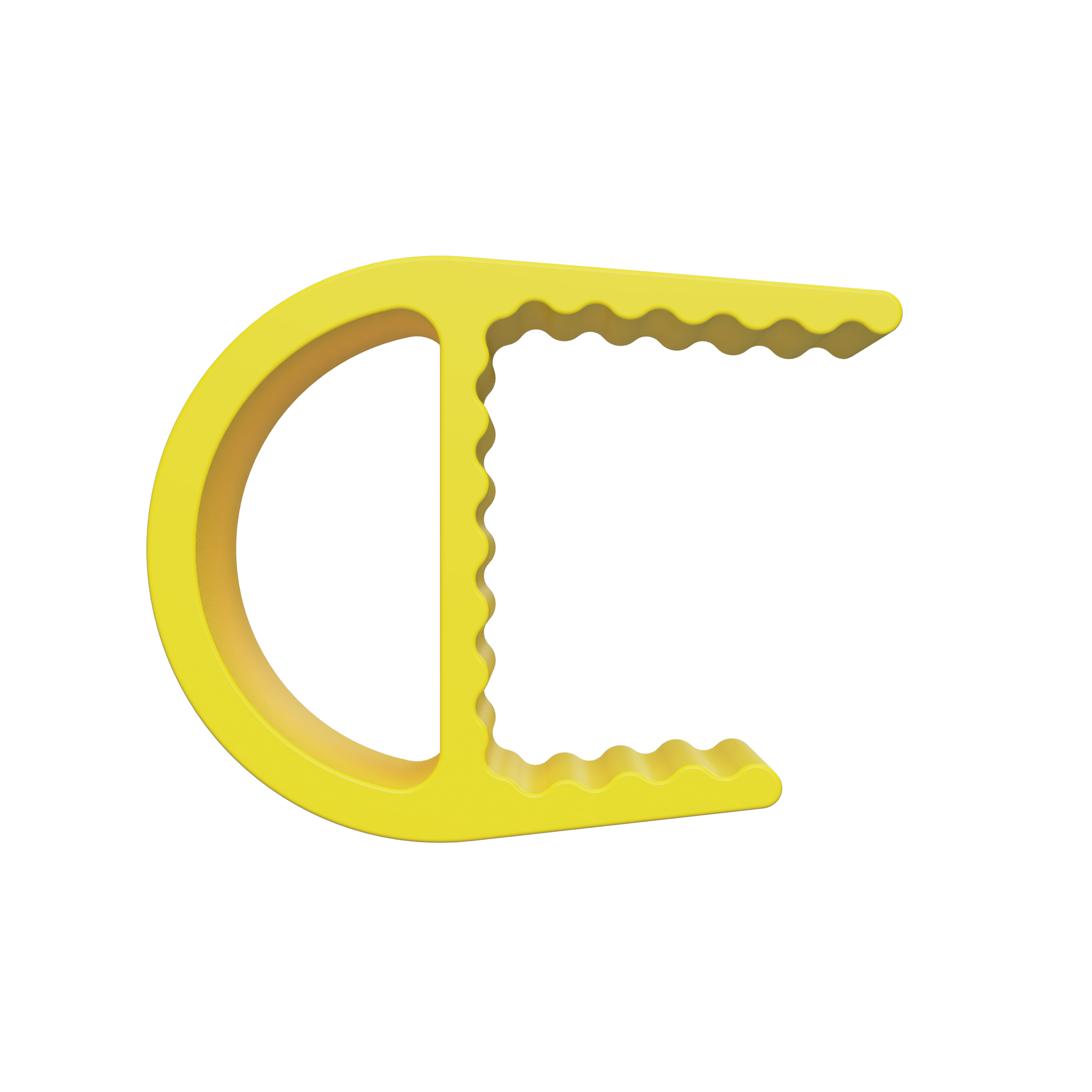
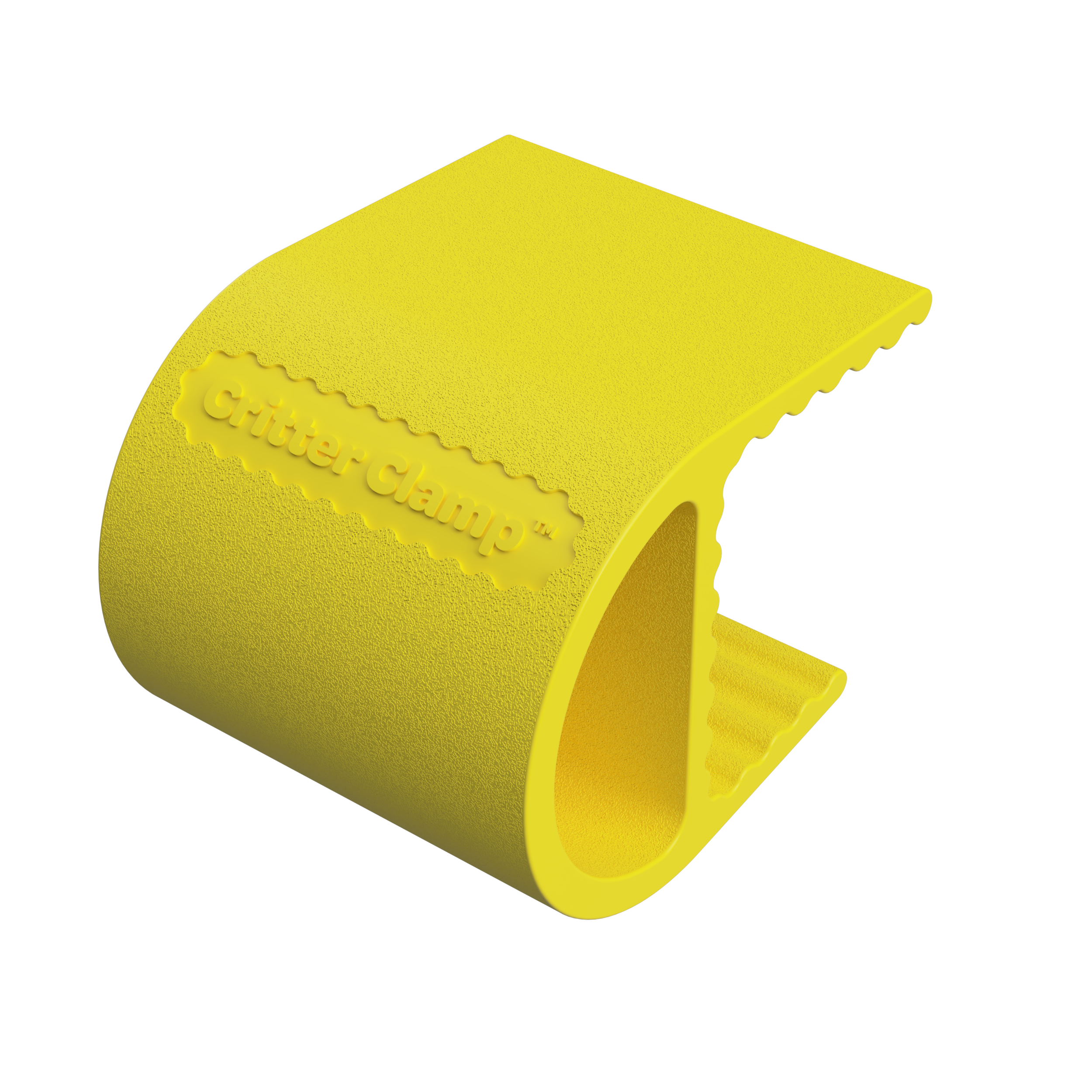
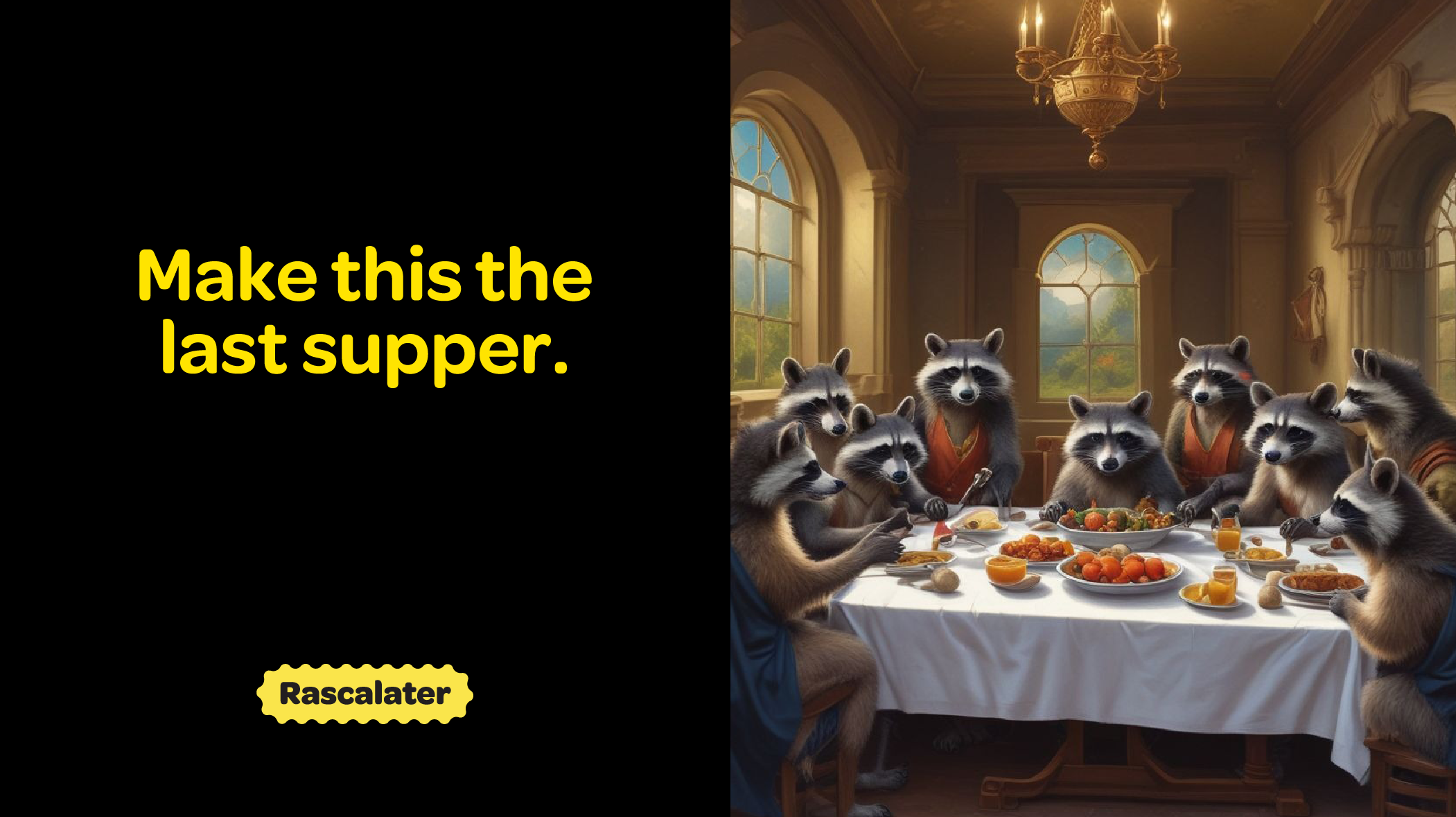
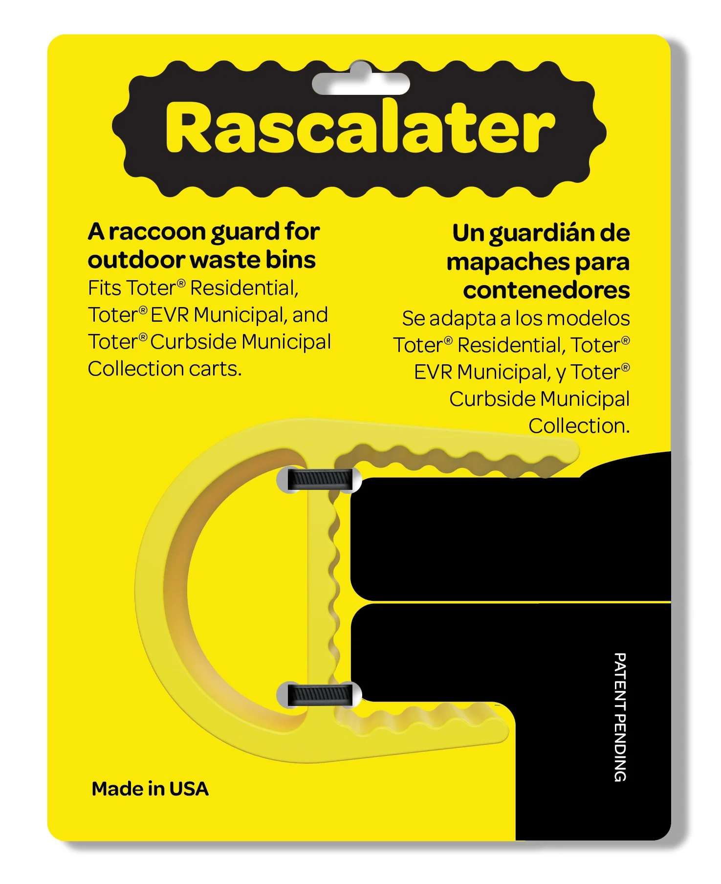
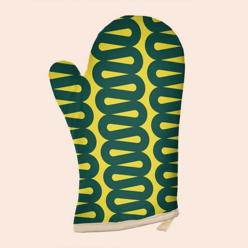
Rascalater
Keeping everybody happy can be a challenging but also fun task when that includes the homeowners, wildlife, and the community at large. Fully exploiting the expressiveness and intelligence of raccoons this balance of wildness and playfulness with utility is present in every aspect of the brand expression including the product design itself.
Brand Identity

Main logo style and alternative uses.
Product Design

Manufacturing & Supply Chain

Storytelling


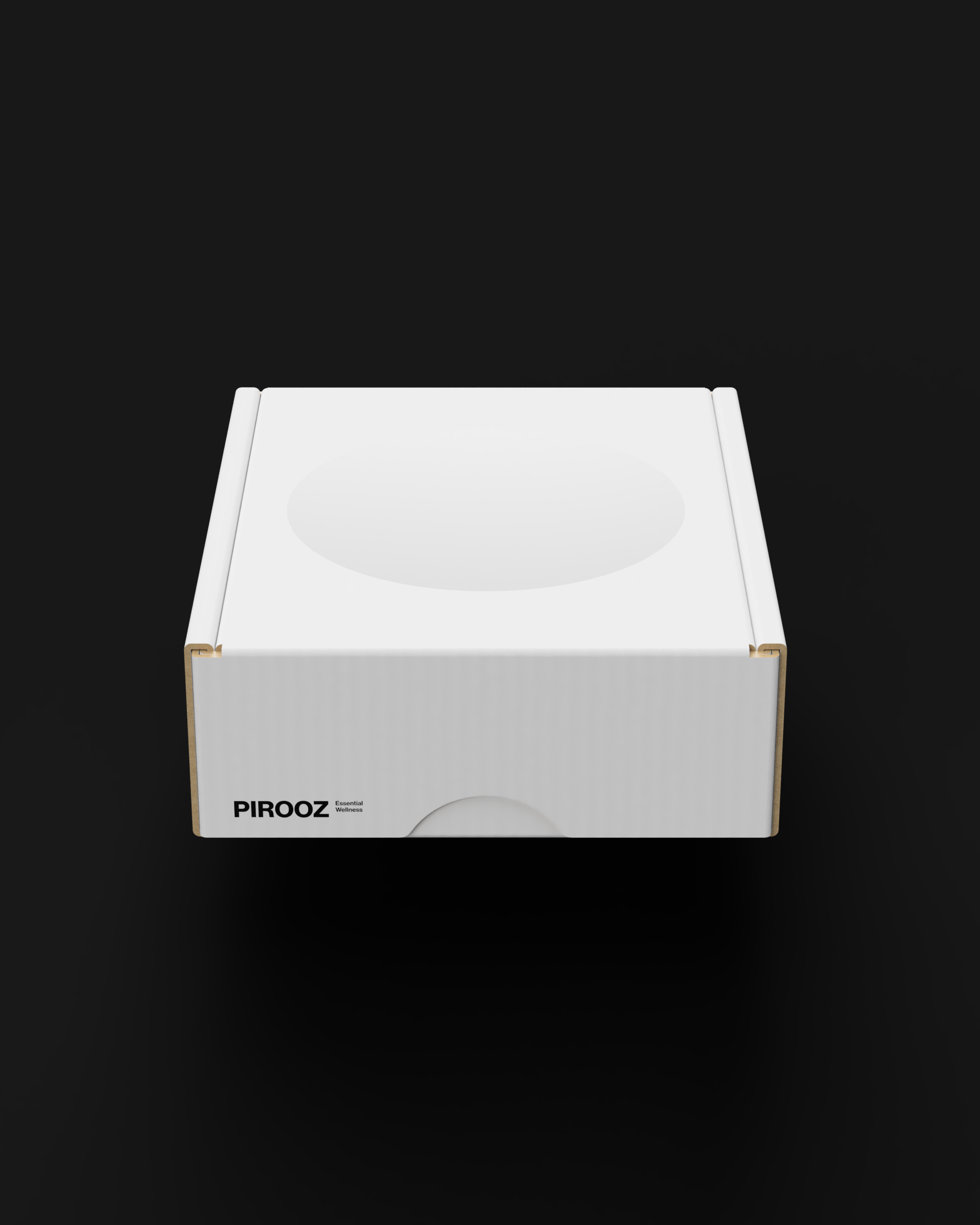
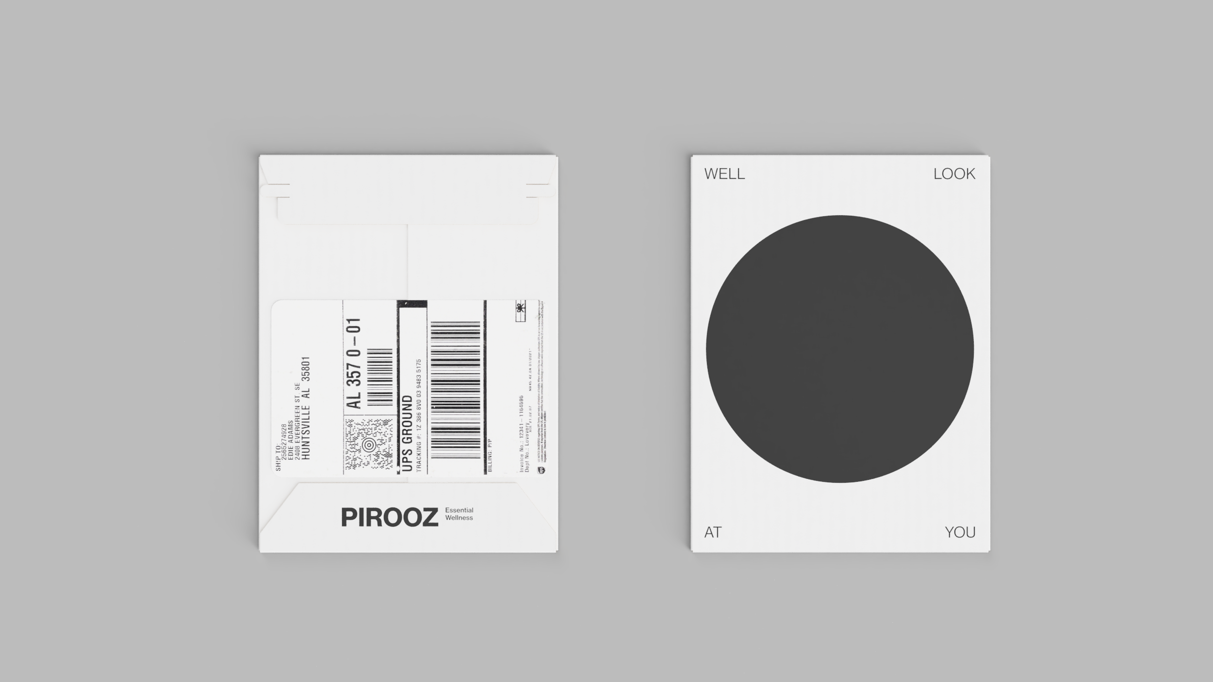
Packaging
Web & Digital


Fonbnk
“If you’ve got a phone, you’ve got a lawyer” is familiar to many Americans of a certain generation who have lived in the mid-Atlantic. Fast-forward to the present and a significant population of the world depends on their mobile phone for just about everything to make the everyday without the need for a passport, a credit card, the physical banking infrastructure or really even a bank account.
Fonbnk came to us with the challenge of creating a highly intuitive brand, easy-to-use but still distinctive user interface that works in low bandwidth or restricted data environments to allow as many folks as possible to pay for products & services locally or across the border instantly, securely and without the traditional interchange fees and red tape while converting their mobile phone data minutes into digital currency.
The Brand Identity


The brand palette. Green for money. Charcoal for good luck.

The symbol in the logo is inspired by the Bell telephone rotary dial action. For connecting the dots between legacy and the future.
The Apparel


Storytelling

Taking cues from Afrofuturism and religious iconography, the visual storytelling is aspirational and focuses on the enterprising, younger customer at the center of change.

The App

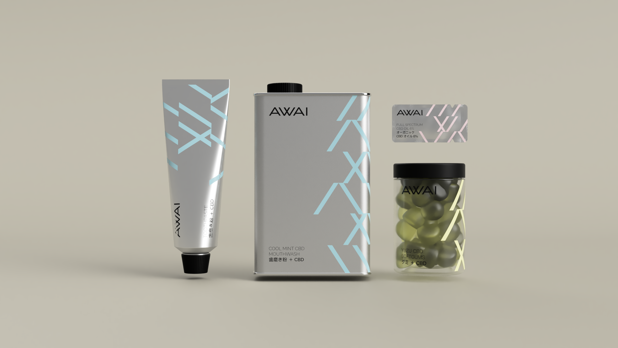
Awai

An angular, choppy stroke pattern evocative of Japanese traditional brush calligraphy is a time capsule containing the heritage of the brand.
Print Stationery

Oral Care & Supplements


Subscription Mailer.
Skincare


Trade Show Booth


Keeping the brand consistent across ALL the touch points.


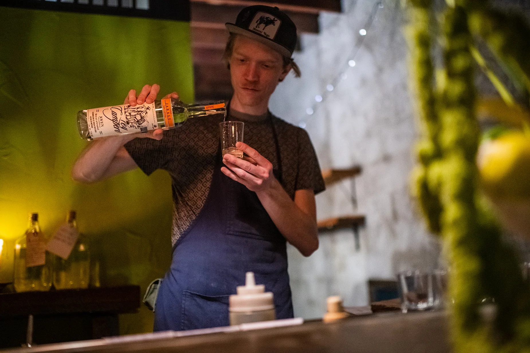
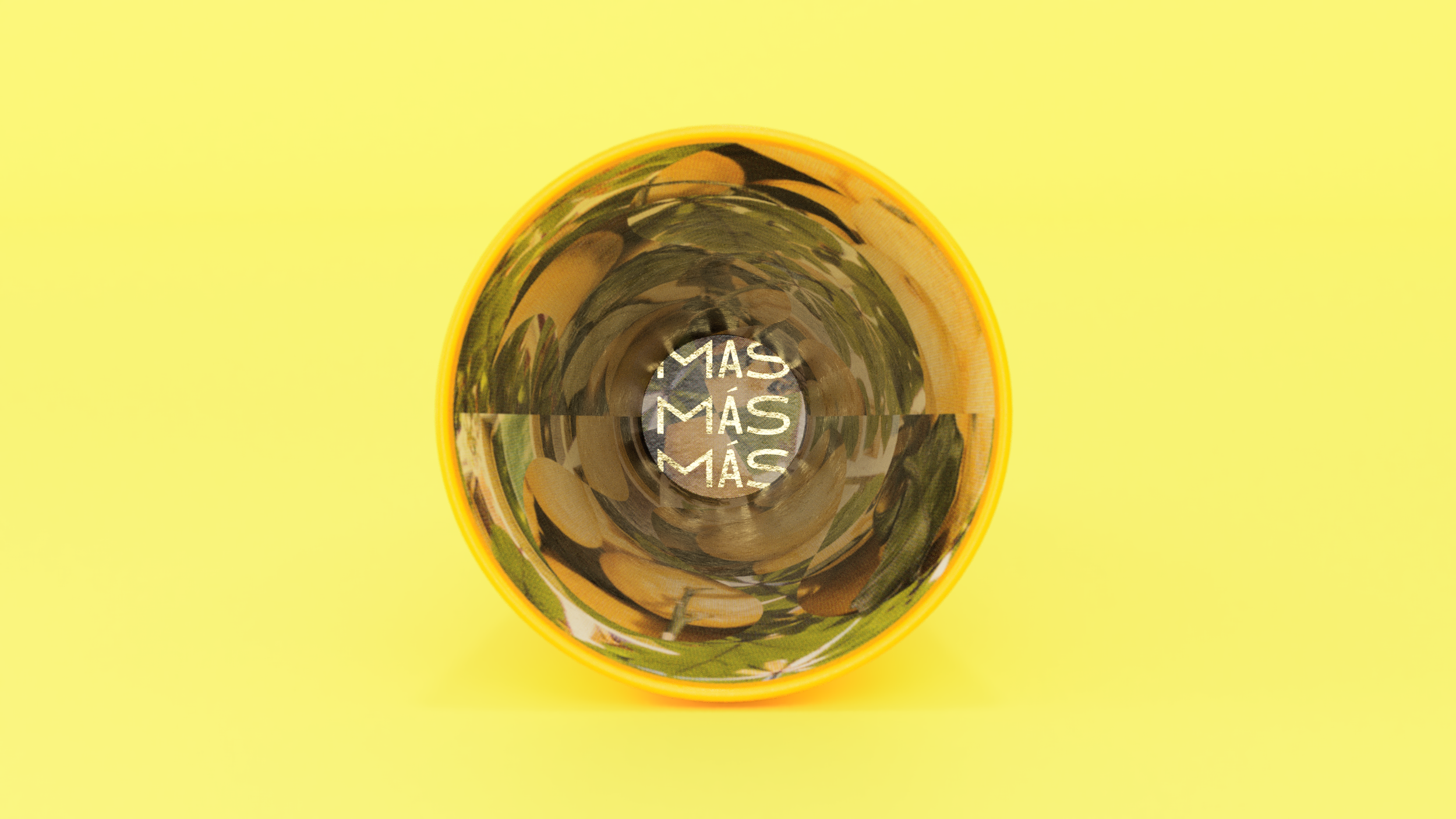
Awamoritime
Once upon a time, in a kingdom far, far away a beverage was born from exotic ingredients. Introducing Awamori to North American audiences as a versatile alternative to Sake, and Okinawa as a unique and special destination within Japan were the key requirements of the brief.
The Inspiration


Okinawa is one of the planet's so-called "blue zones" where people regularly live to a very advanced age.
Brand Identity
The brand's icon is a custom-designed Shisa dragon symbol that draws directly from the Okinawan folklore.
Storytelling


Web & Digital


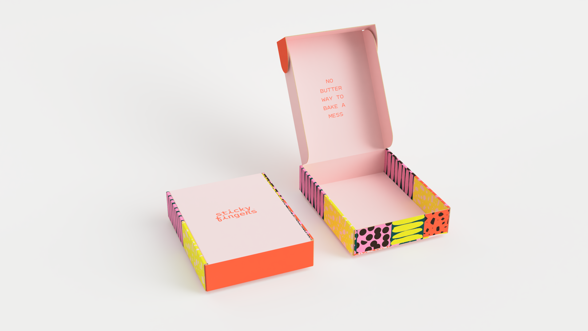
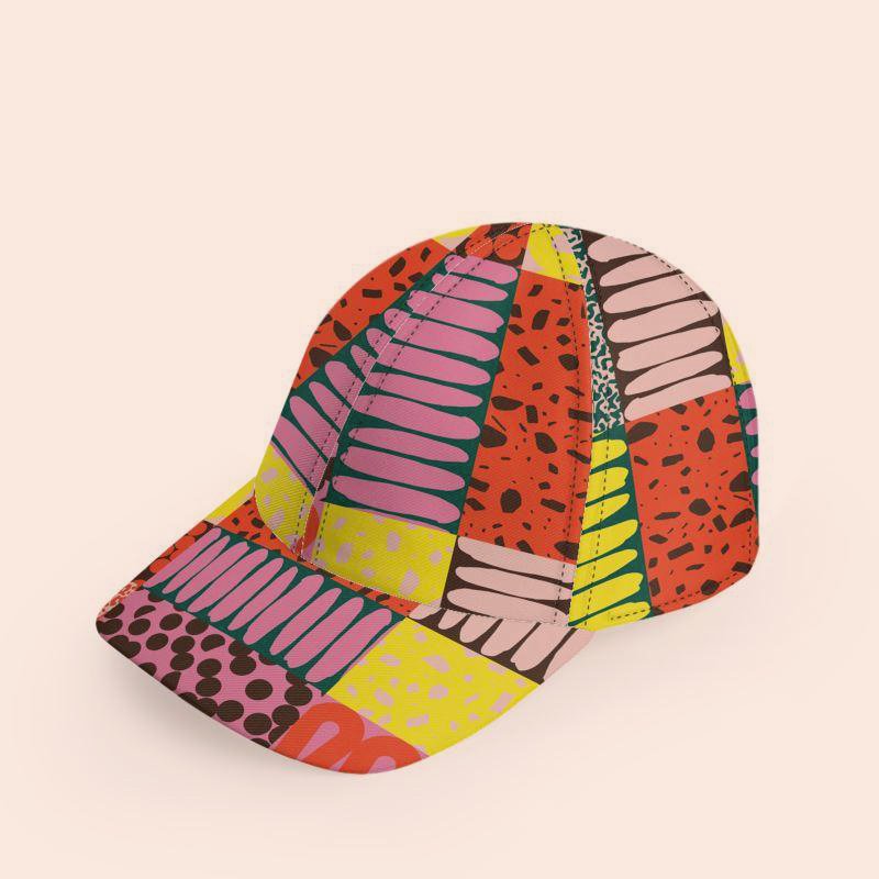
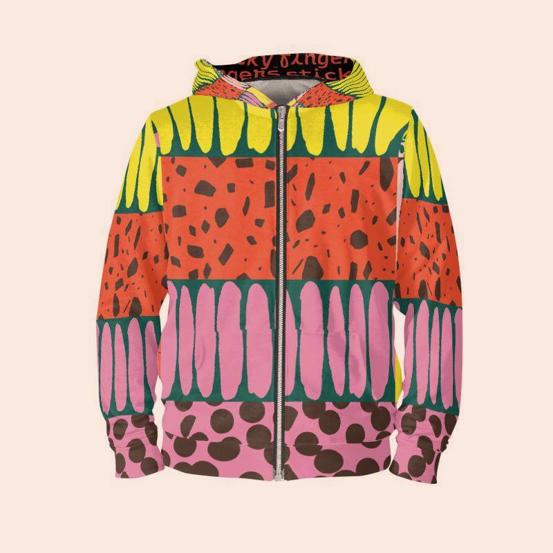
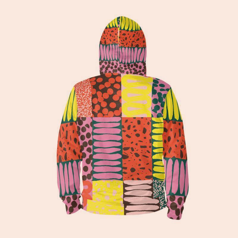
Sticky Fingers
“No butter way to bake a mess” is what we said when we first accepted the opportunity to create a foundation for the next level of growth for a legendary DC-area vegan brand founded by reality baking celebrity Doron Petersan.
Together, we re-imagined Sticky Fingers as a unified and highly visual but also coordinated offering of products and services offered some offered only locally and others nationally, some online while others in brick-and-mortar settings. This means we truly began from scratch.
Starting from the joyful color scheme and friendly typography style the resulting image is accessible, fun, playfully humorous, and inclusive in presentation and tone with an emphasis on delivering bespoke-like luxury and superior performance all while reducing waste and increasing compostability and compatibility with local recycling stream.
Visit the Bakery Website
Visit the Diner Website


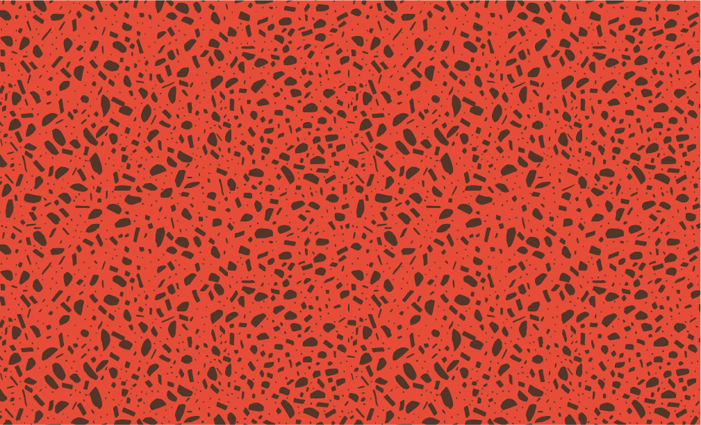
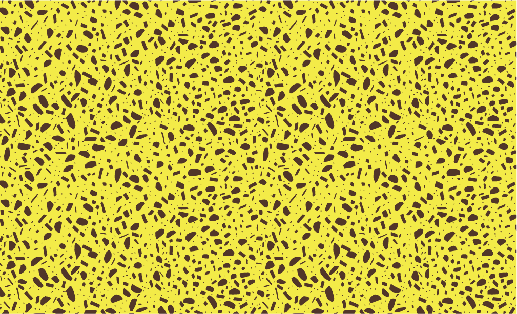
A palette that doesn’t take itself too seriously and vibrant graphic patterns that map to product categories work together to create a quirky but accessible DIY mood.


The flexible pouch is a high-resolution medium with a relatively low waste profile. 100% recyclable and modular by design.


Wholesale multi-packs.

The “hat box” for gifting and kits.
A branded mailer system.
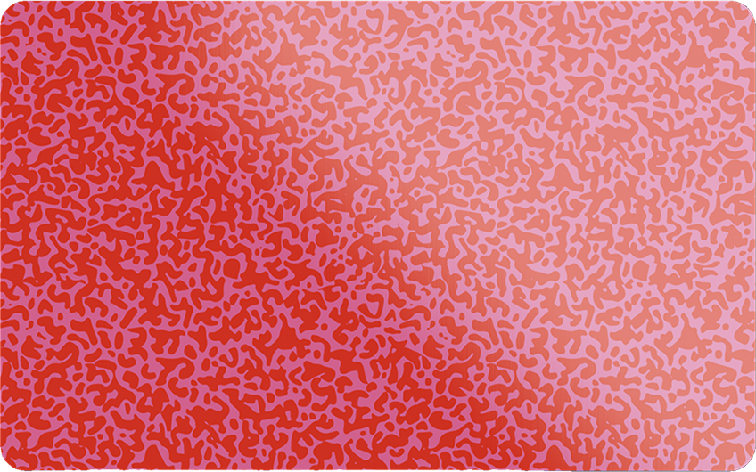
The Sticky Card gift card.


Printed collateral system evokes the nostalgia of old-timey postcards.

Holiday gifting kits. And more!


Solartag
Ever since there was light most life as we know it in our solar system has depended on it for its boundless energy. Despite advances in technology, rooftop solar continues to suffer from the stigma of cost and the perception of aesthetic limitations. That is why Solartag emphasizes its Danish design & engineering heritage while positioning themselves as a more sensibly priced alternative to Tesla.
Brand Identity

Product labels for the panels.
Storytelling


Web & Digital

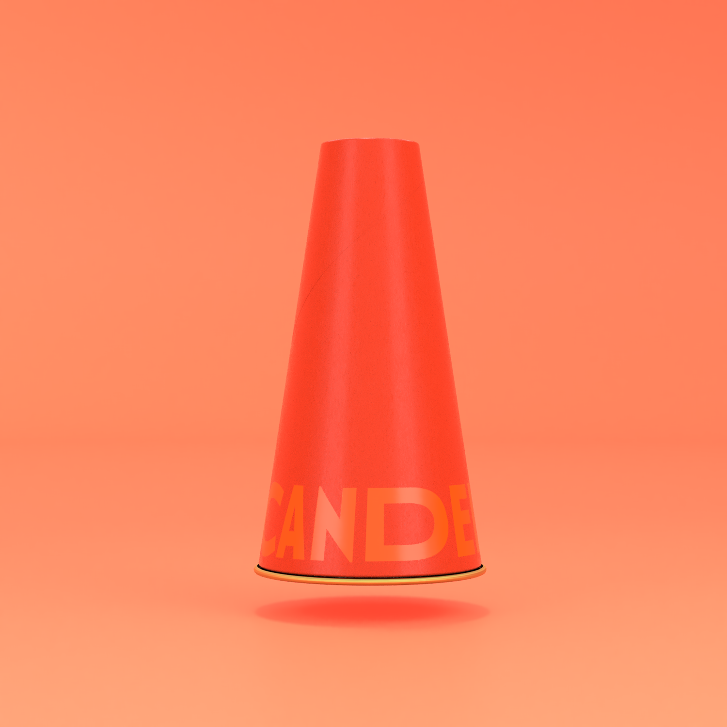


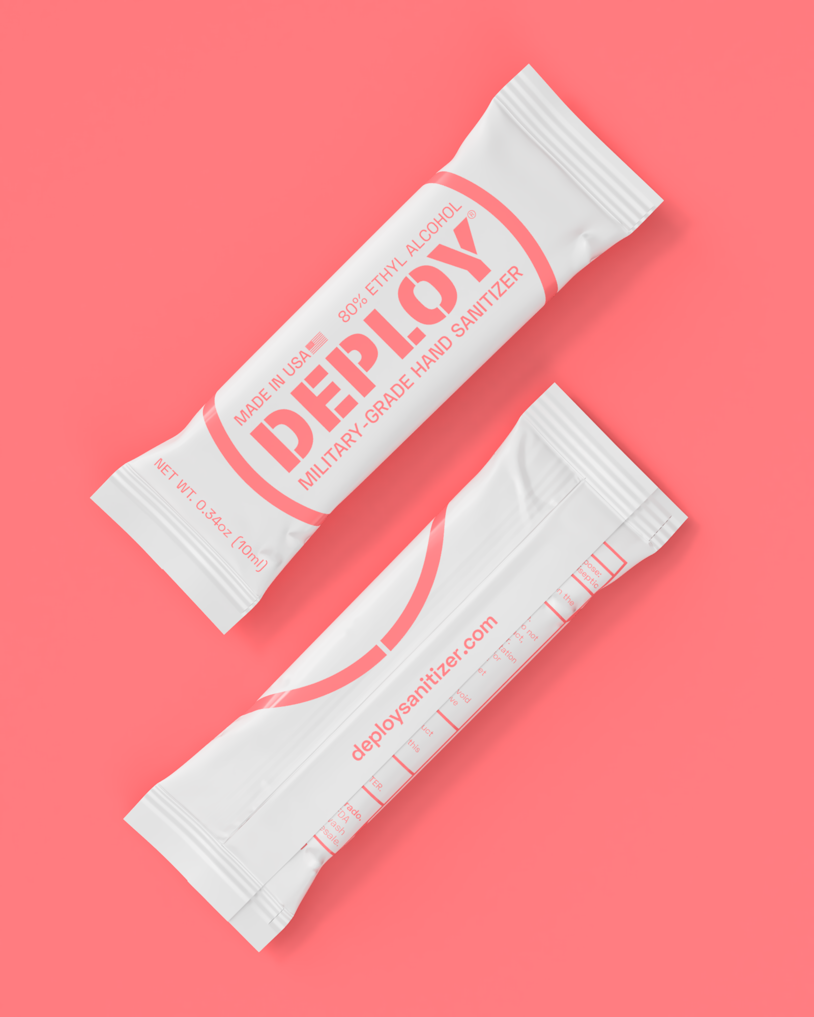
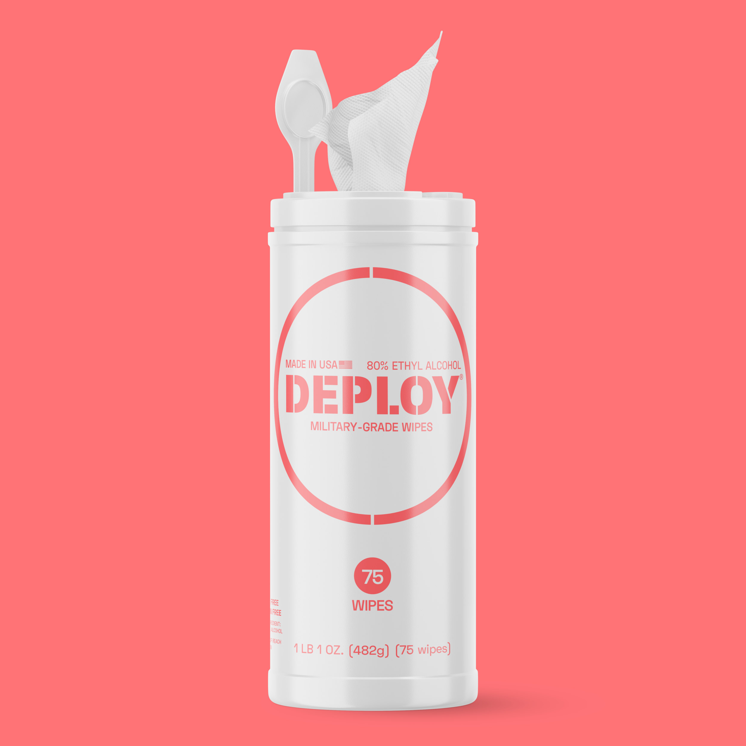
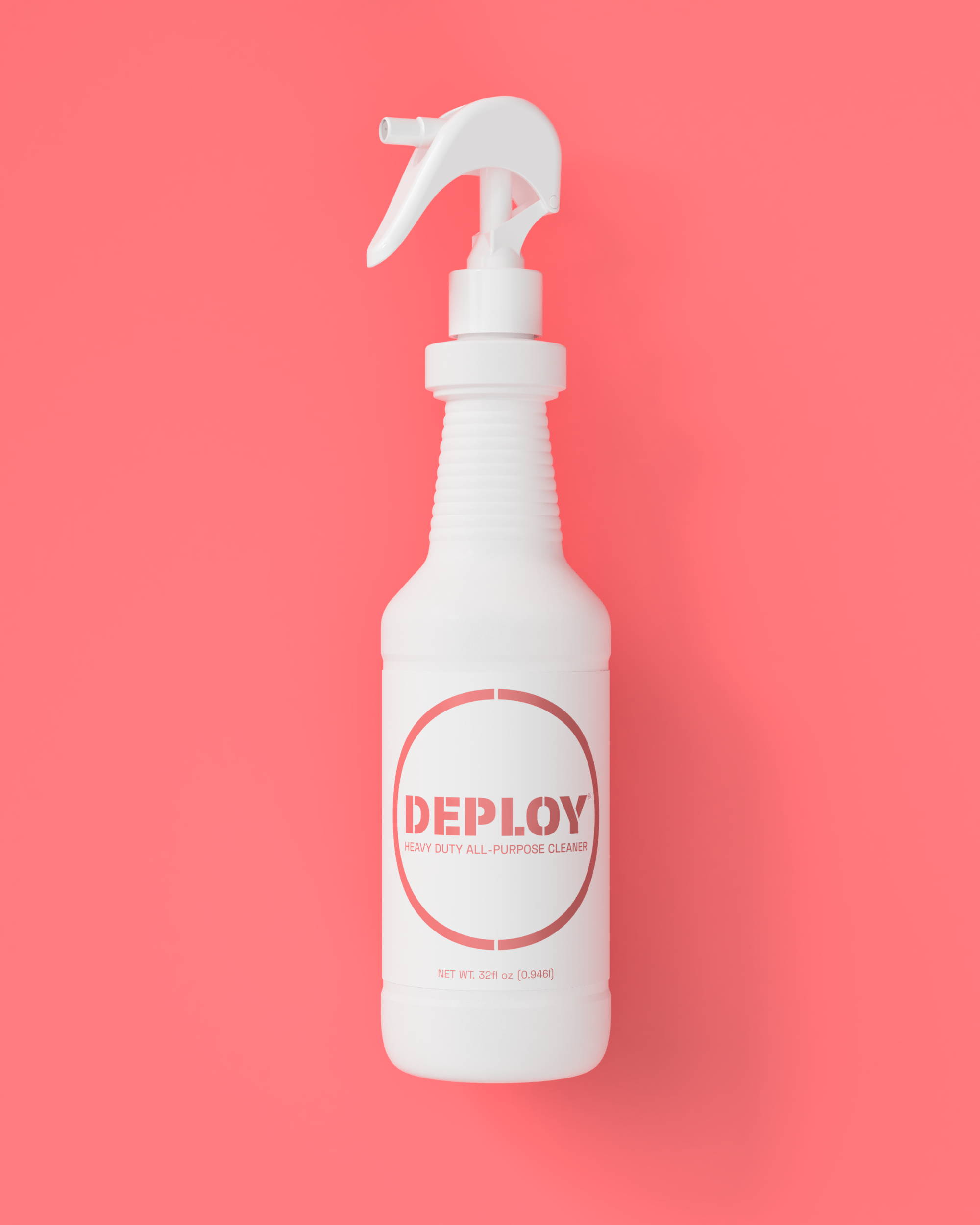
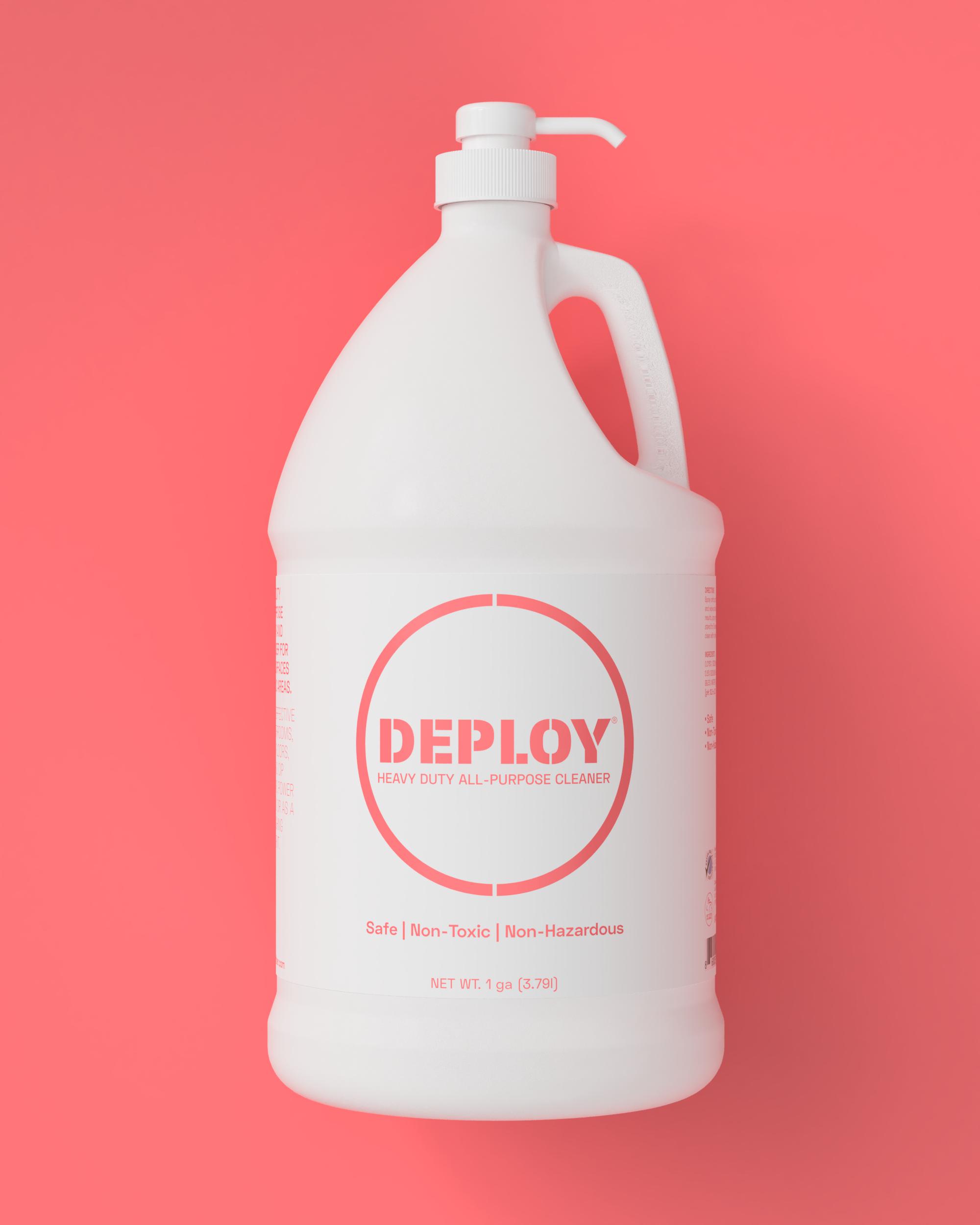
Deploy
Inspired by effectiveness - a trait they credit their hero General Patton with, Deploy was born as a best-of-class product in any category. American-owned and made, it is meant to be bold and stand tall and represent a military-grade germ defense perimeter - like an invisible but very real force field of sorts. The idea of urgency combined with the notions of efficacy and blunt force power added to the very real need to differentiate in the retail isle necessitated the eventual choice for the coral neon as the vibrating and singular signature brand color.


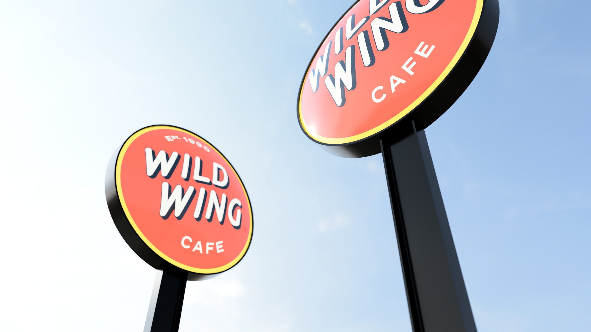
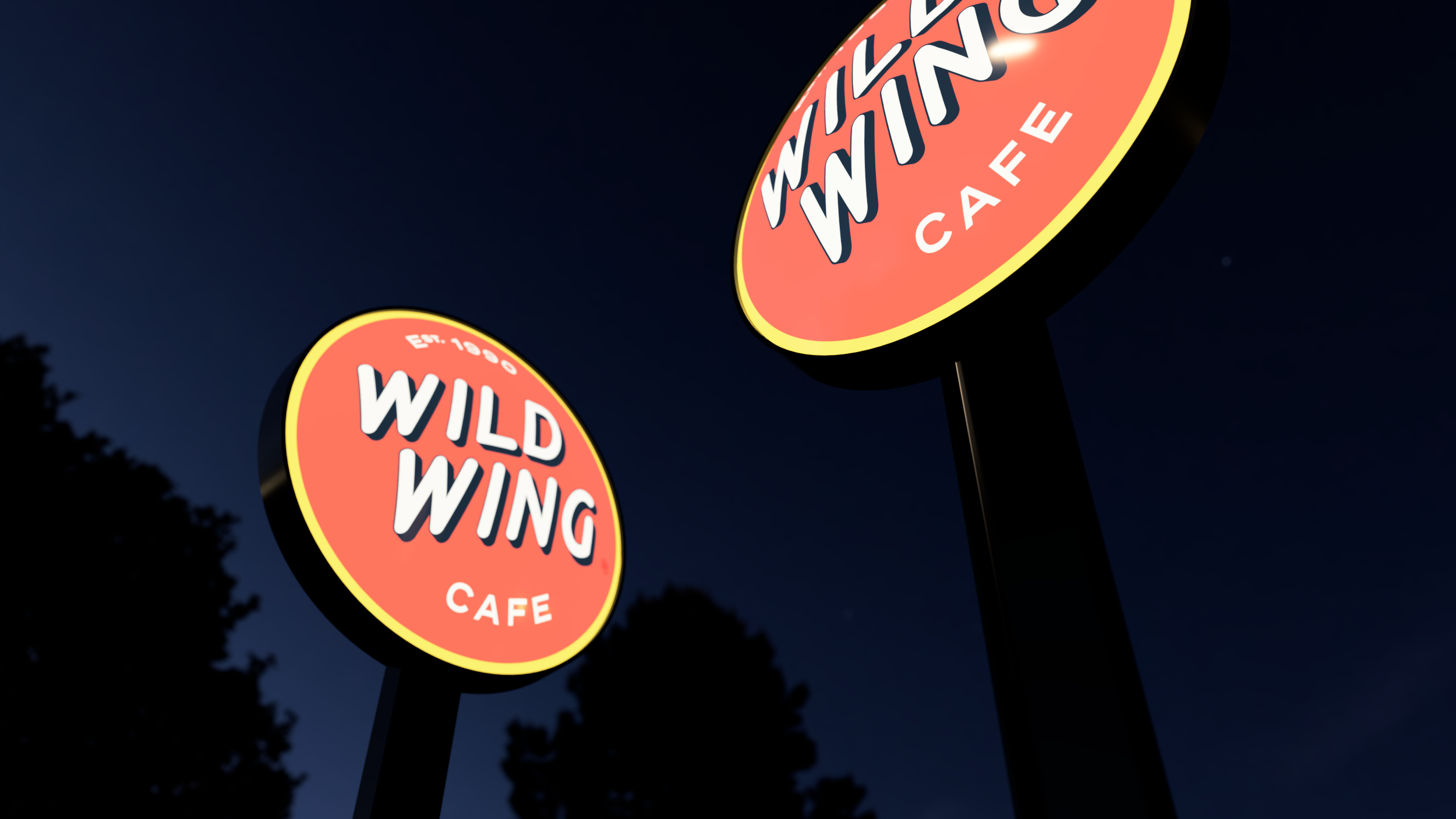
Wild Wing Cafe
Where the wild wings are.
New everything. Rebranded, redesigned, rethought, and a return to course for a NC-headquartered Southern casual bar & restaurant franchise built around freshly baked chicken wings and local live entertainment. We started with devising an updated brand strategy which includes redefined values and brand positioning tagline, as well as, a restated mission and vision statements. Then followed by an aesthetic recalibration and re-imagination of the visual expression from logo to color scheme, the re-establishment of the brand’s purposeful and coordinated voice and tone. ultimately finishing with the environmental store prototype redesign.

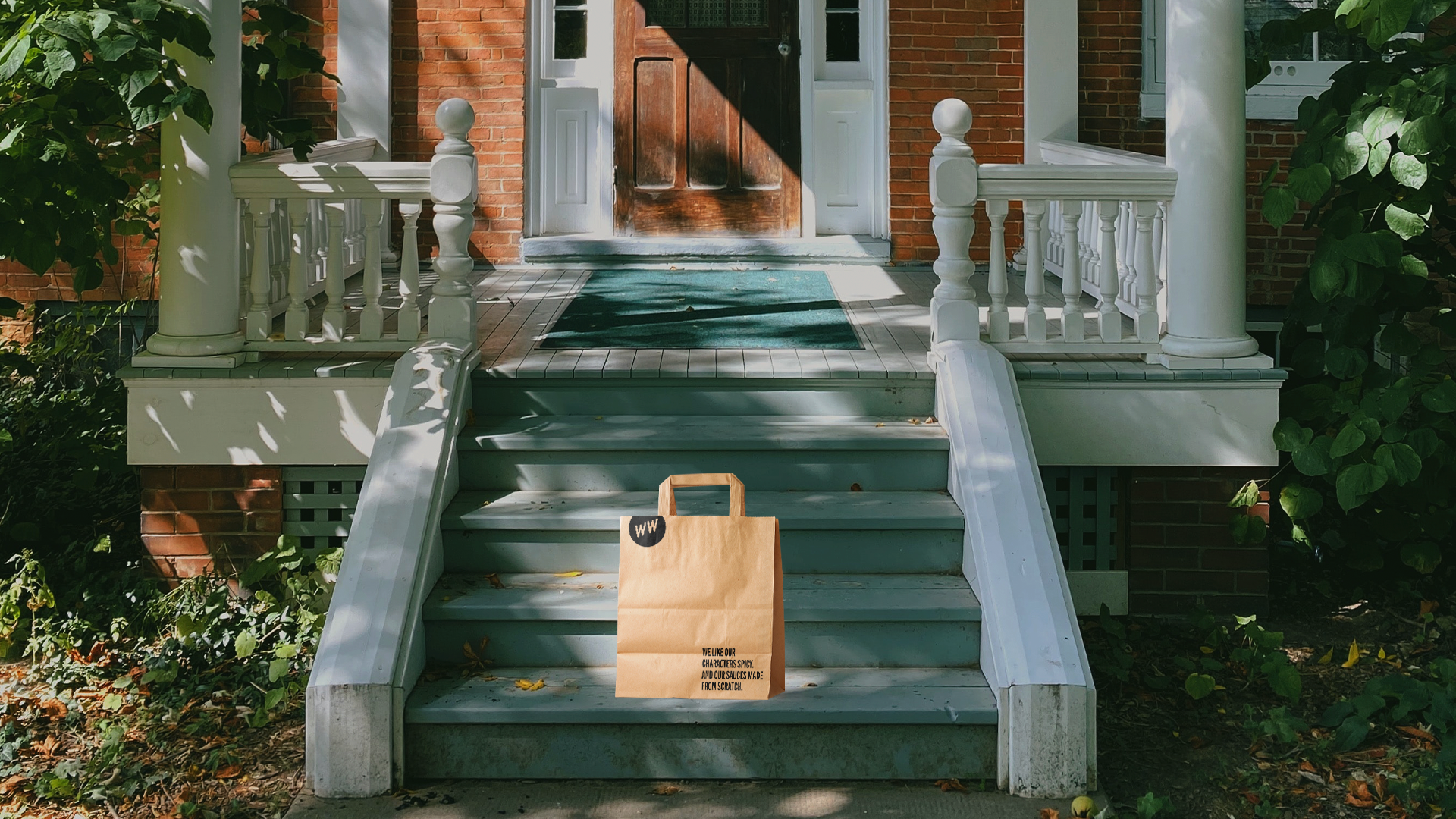
As part of activating the new brand strategy, WWC has begun a wholesale conversion to mostly compostable or highly recyclable single-use packaging system.


The reimagined retail exterior prototype includes signature elements such as covered porches and generous outdoor areas as additional subtle expressions of the endemic Southern hospitality.
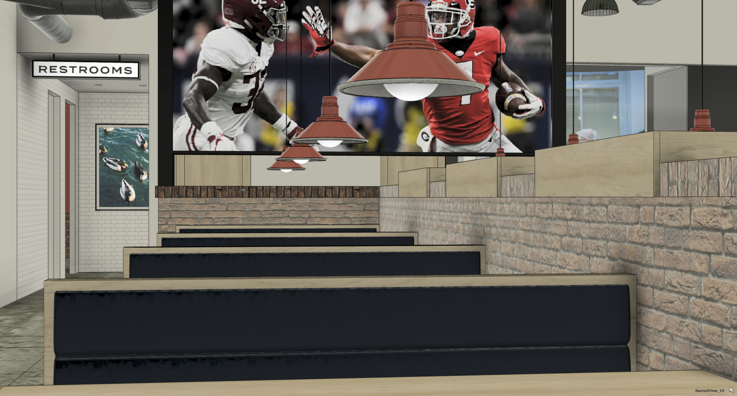
In a radical move that allowed for a significant reduction of clutter by the removal of individual TV monitors we upgraded the customer experience to something more akin to being in an actual living room or even on the bleachers during an actual game. This allows for a clearer distinction between the respective designated zones within the total footprint of the restaurant which enhances the quality of the dining experience for many without removing the ability of others to enjoy a broadcast or a split-screen view of many matches or channels of entertainment in more concentrated fashion.
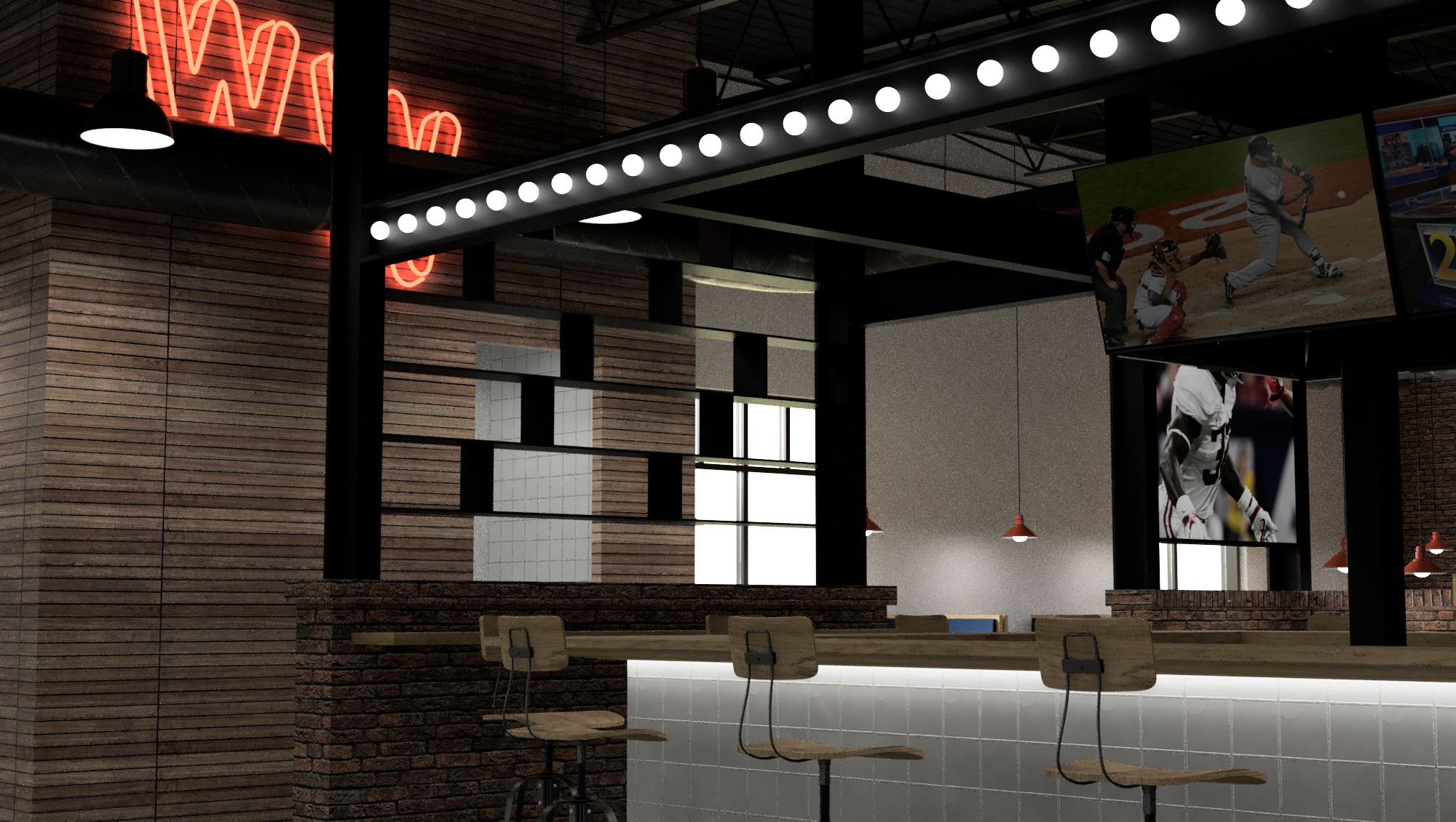

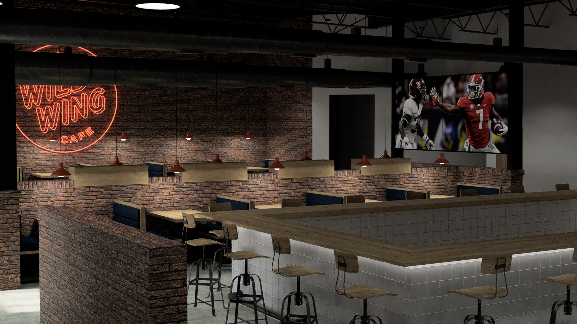
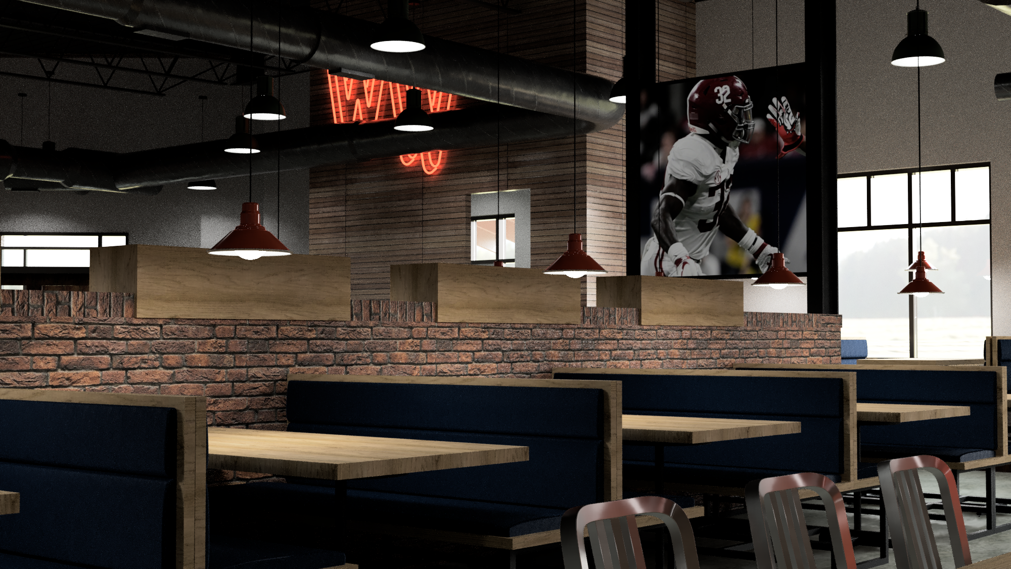
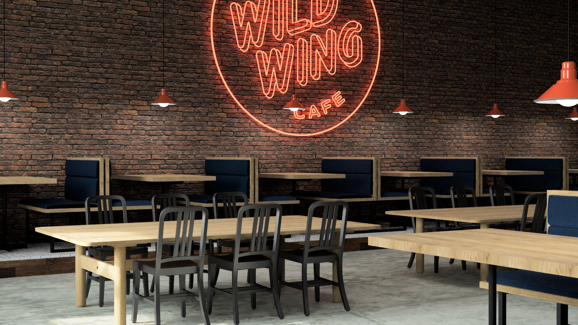

Mixed height furniture and a variety of pendants make for a space that retains depth but also contains interest by enforcing intentional zones within itself.


The new web presence is crisp and to the point and scales well for mobile devices.

A fun, wildly colorful system of adhesive labels for marking the sauce used on wings to go.

The order integrity seal also functions as a way to personalize each item which keeps things organized and friendly at the same time.


The new party box is much, much wilder than ever without losing its sustainable essence or function.

We developed this inexpensive, sustainably and locally made wooden table-top LTO holder system as a way to reduce clutter and bring simple and honest materials back into the every day casual dining experience.

The updated menu system is modular and inexpensive and easy to maintain over long term.


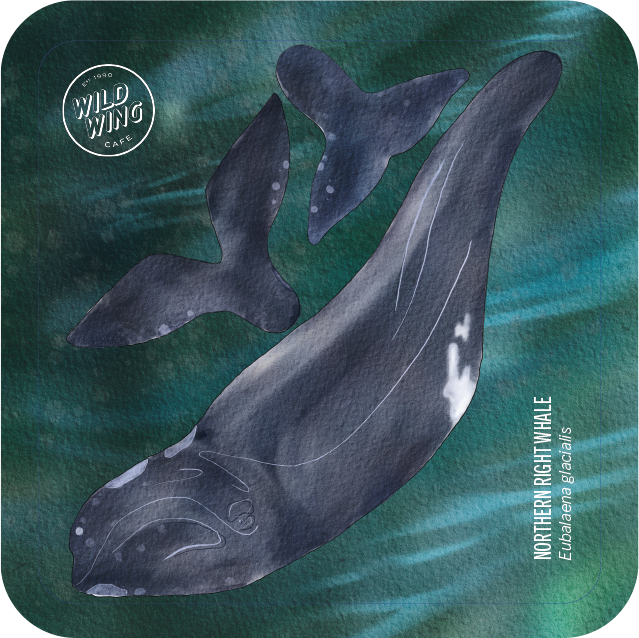
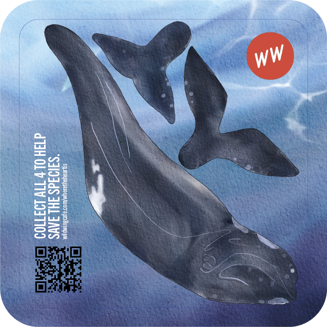
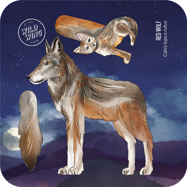
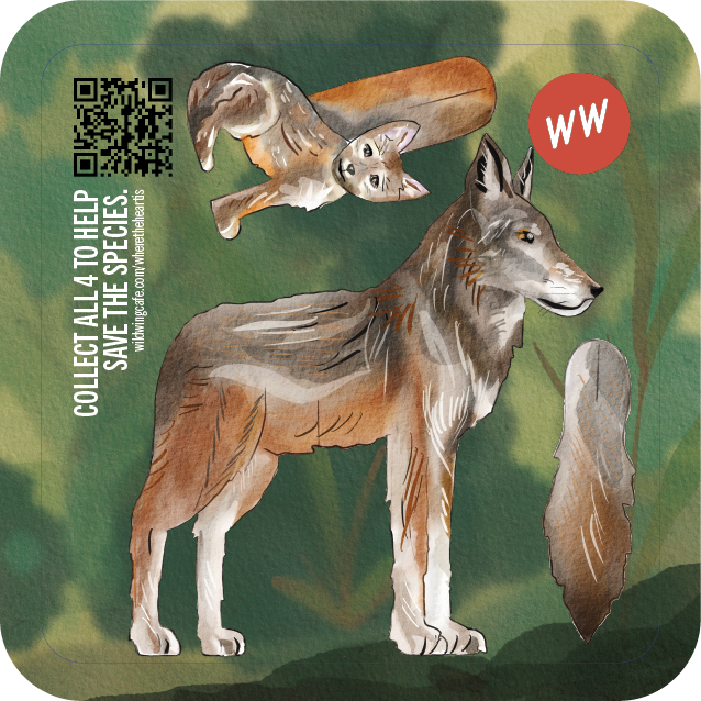
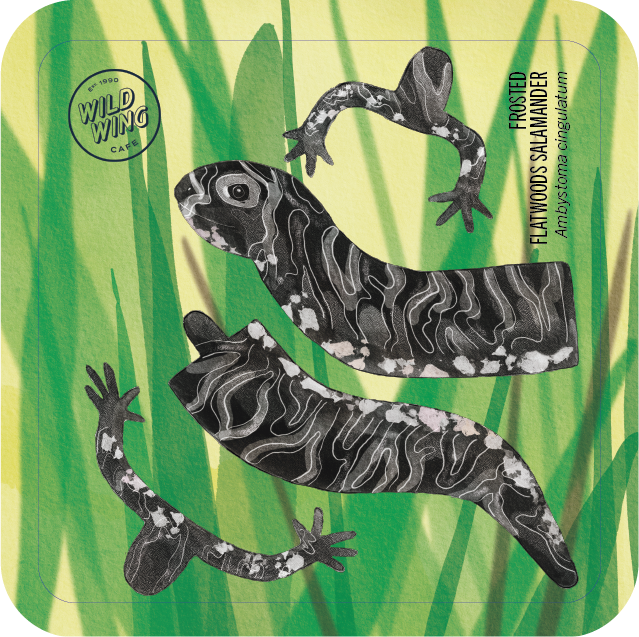
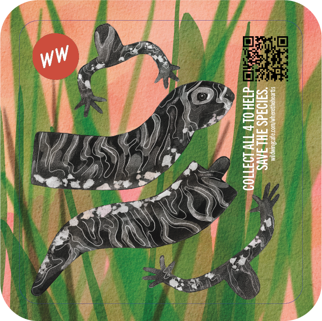
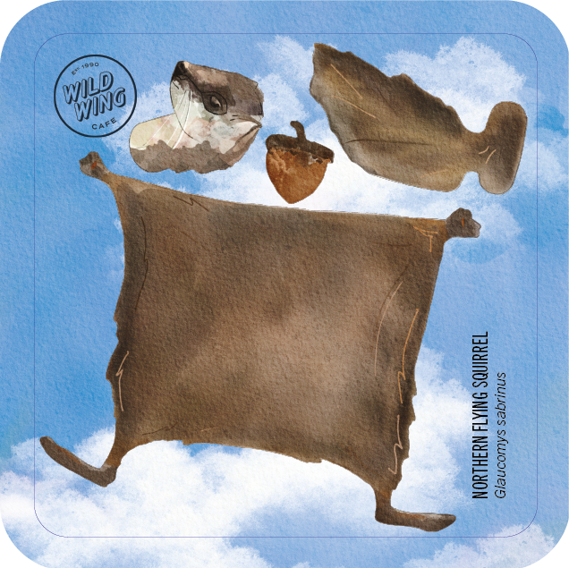
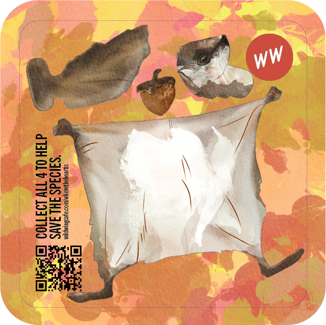
Although rolled out as part of the redesigned children’s Wild Child menu, this is a multi-functional and multiple-audience-oriented beverage coaster that raises awareness about endangered species from the native habitats that coincide with the 43 locations of the WWC. The coasters are 100% compostable and assemble into 3-dimensional sculptures of the respective animal they depict. The embedded QR-code allows for a donation towards the conservation efforts and is connected to the WWC loyalty program.
An excerpt from the brand book.


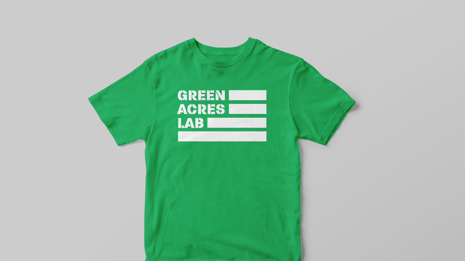
Green Acres
The place to be if you reside in DC and are interested in keeping Cannabis-generated money in your community. Addressing a combination of social and economic justice issues via a unique and accounting-compliant marketplace that brings together local cultivators, consumers, and the greater community.
Alphaforms helped Green Acres Lab articulate their unique digital platform through the development of the visual brand identity along with original storytelling and customer experience design.
Inspired equally by farming and patriotic themes the logo for Green Acres Lab is as robust to reproduce as it is memorable.


Qixo
Branding, UX, and UI prototyping for frictionless fantasy gameplay. Inspired by the love of the game, designed with global user base in mind.
The monogram puts everything into context.

Simplified, horizontal form of the brand mark.

Differentiation by color.

Brand elements used in a social media campaign context.


Logged in user.

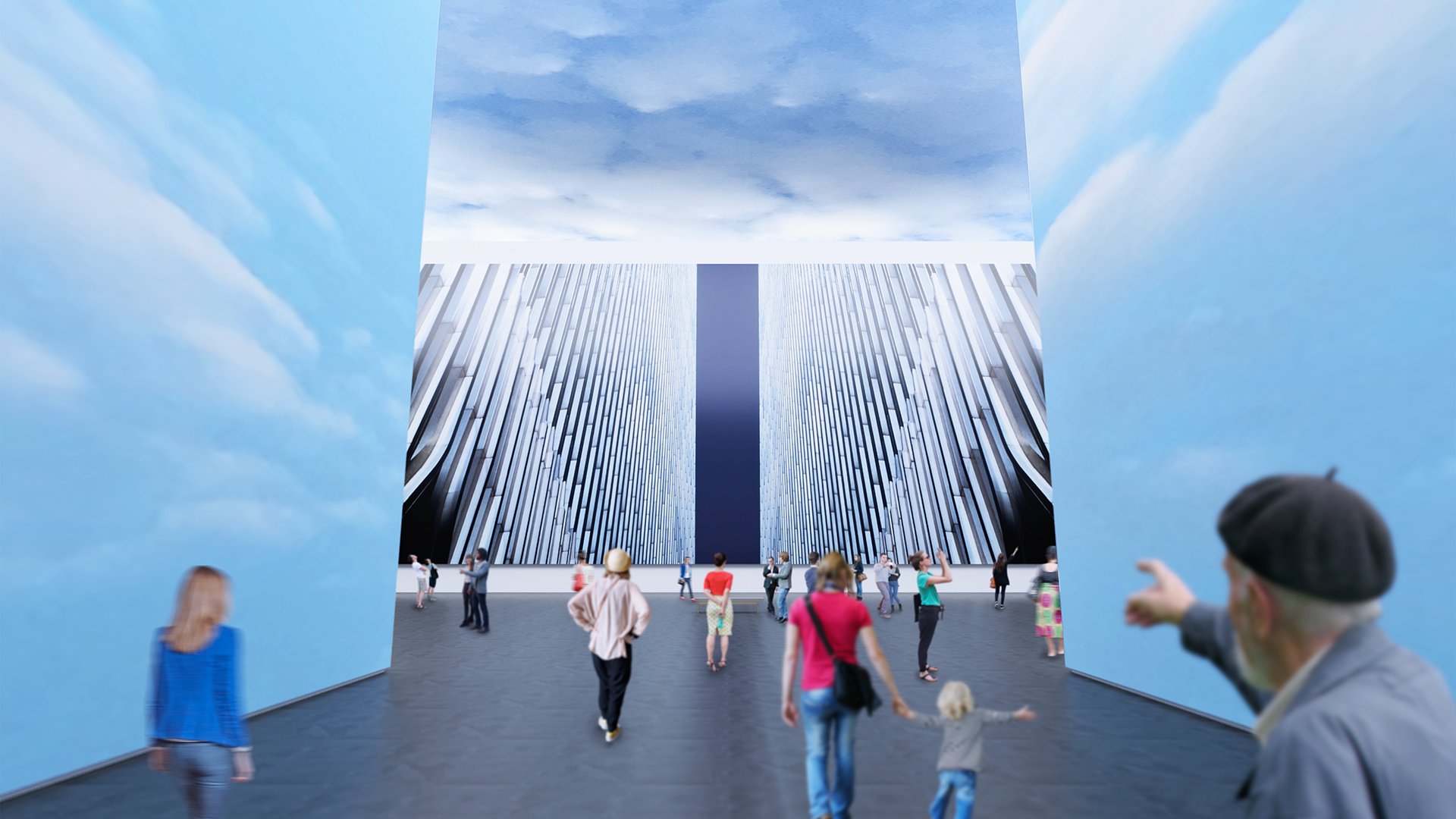
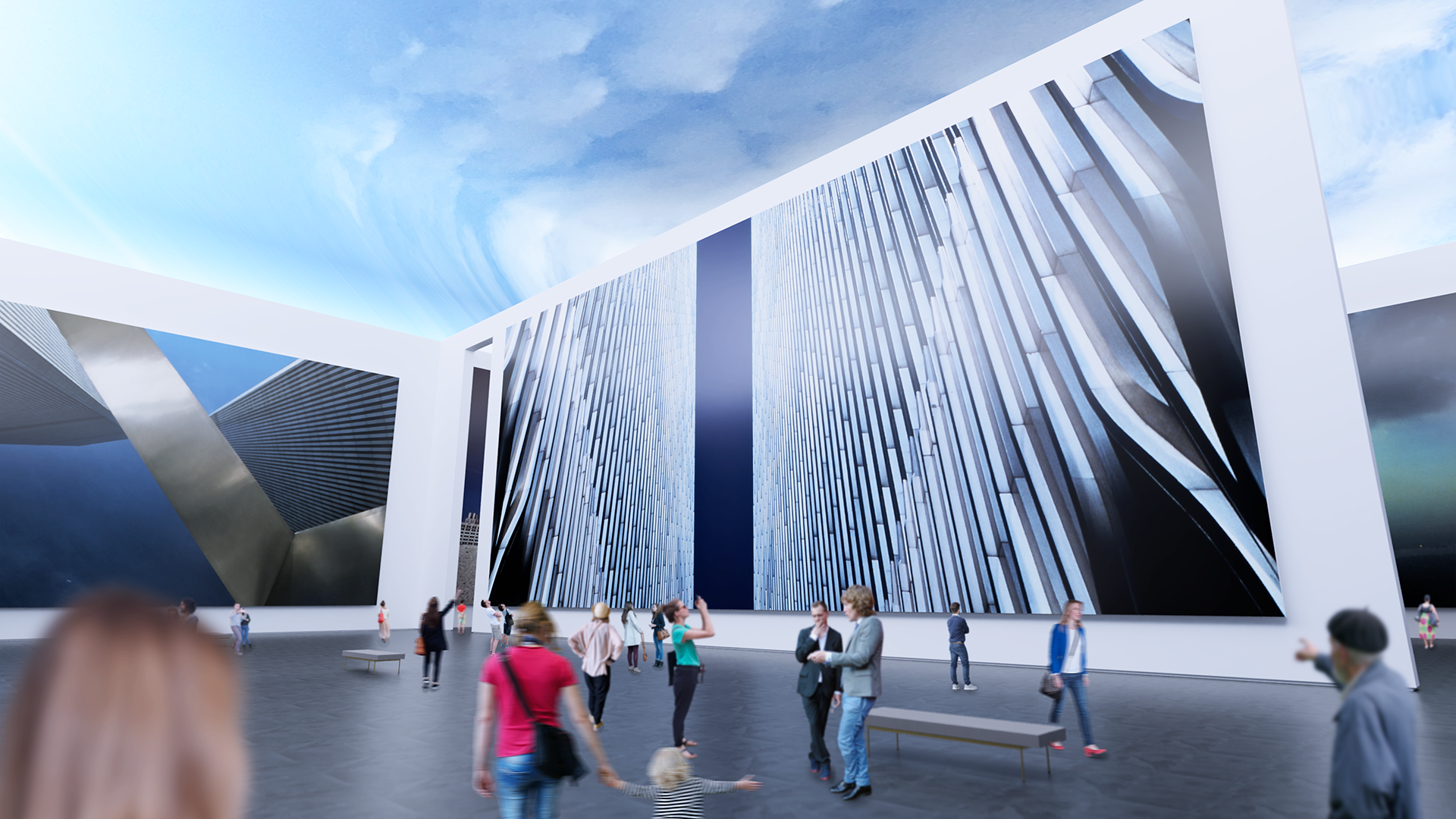
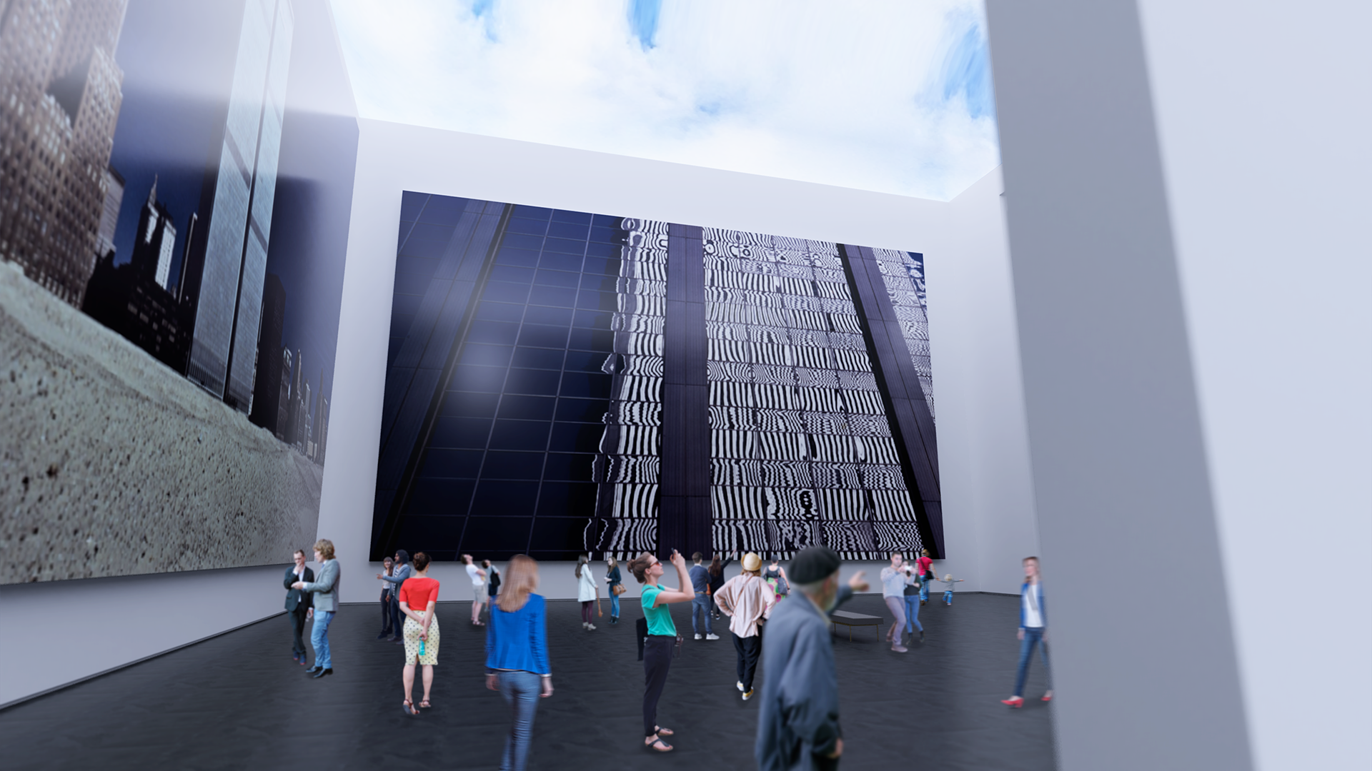
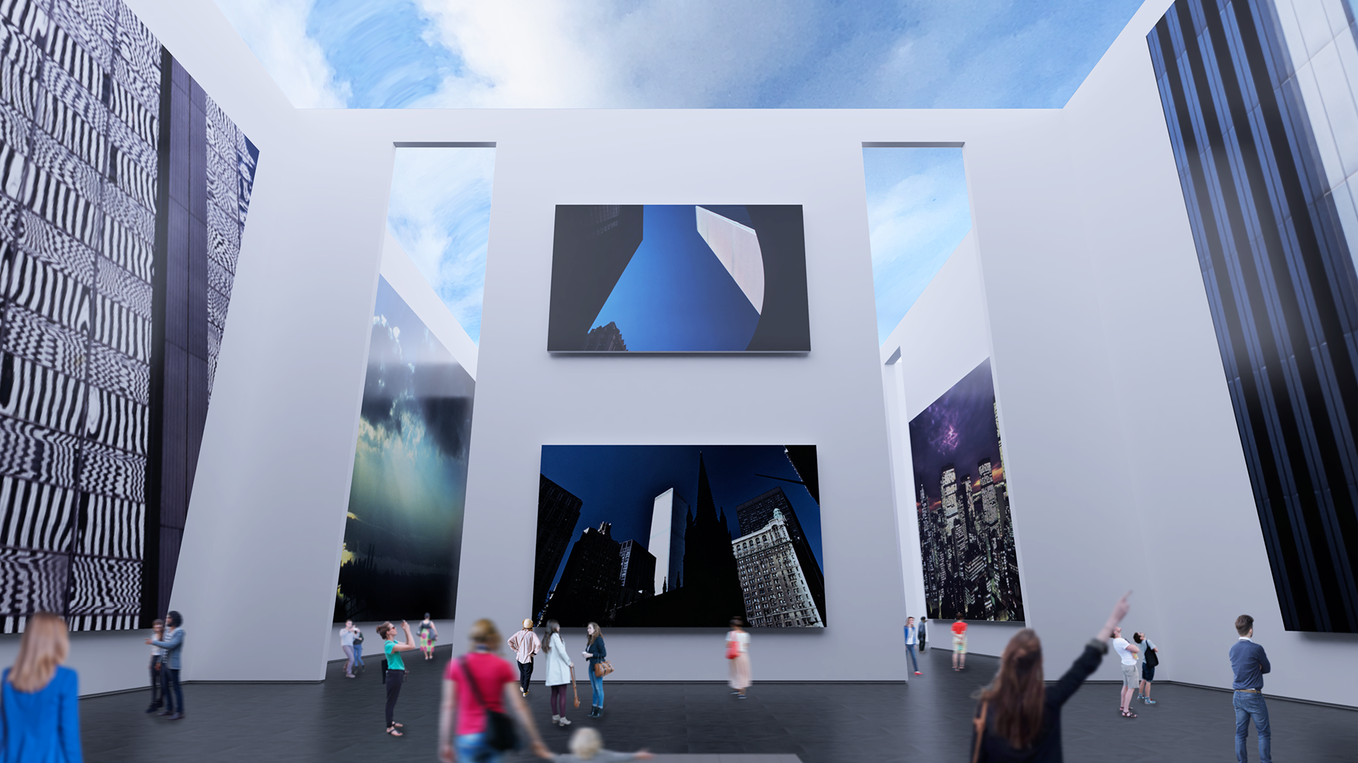
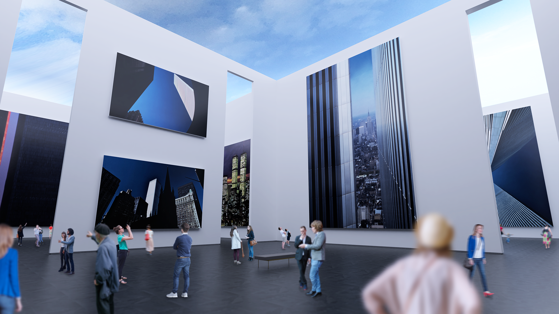
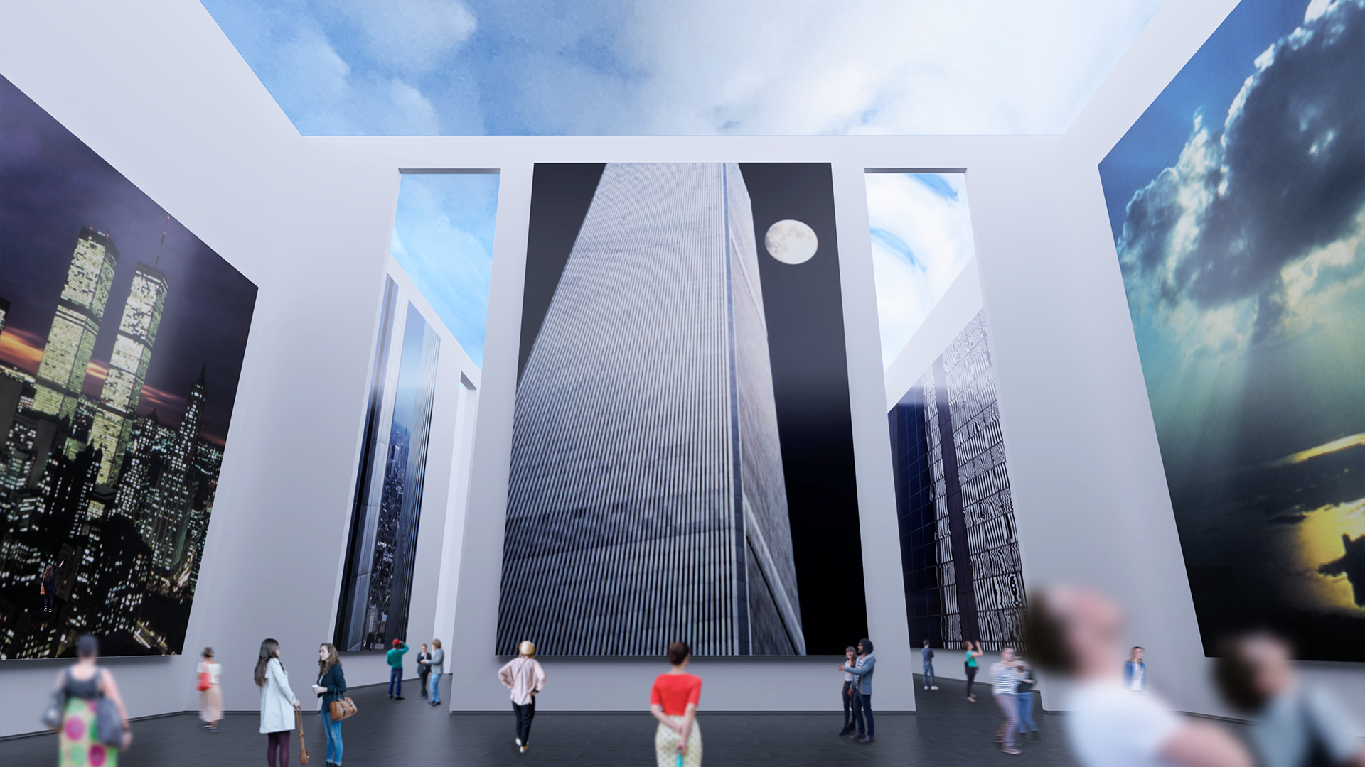
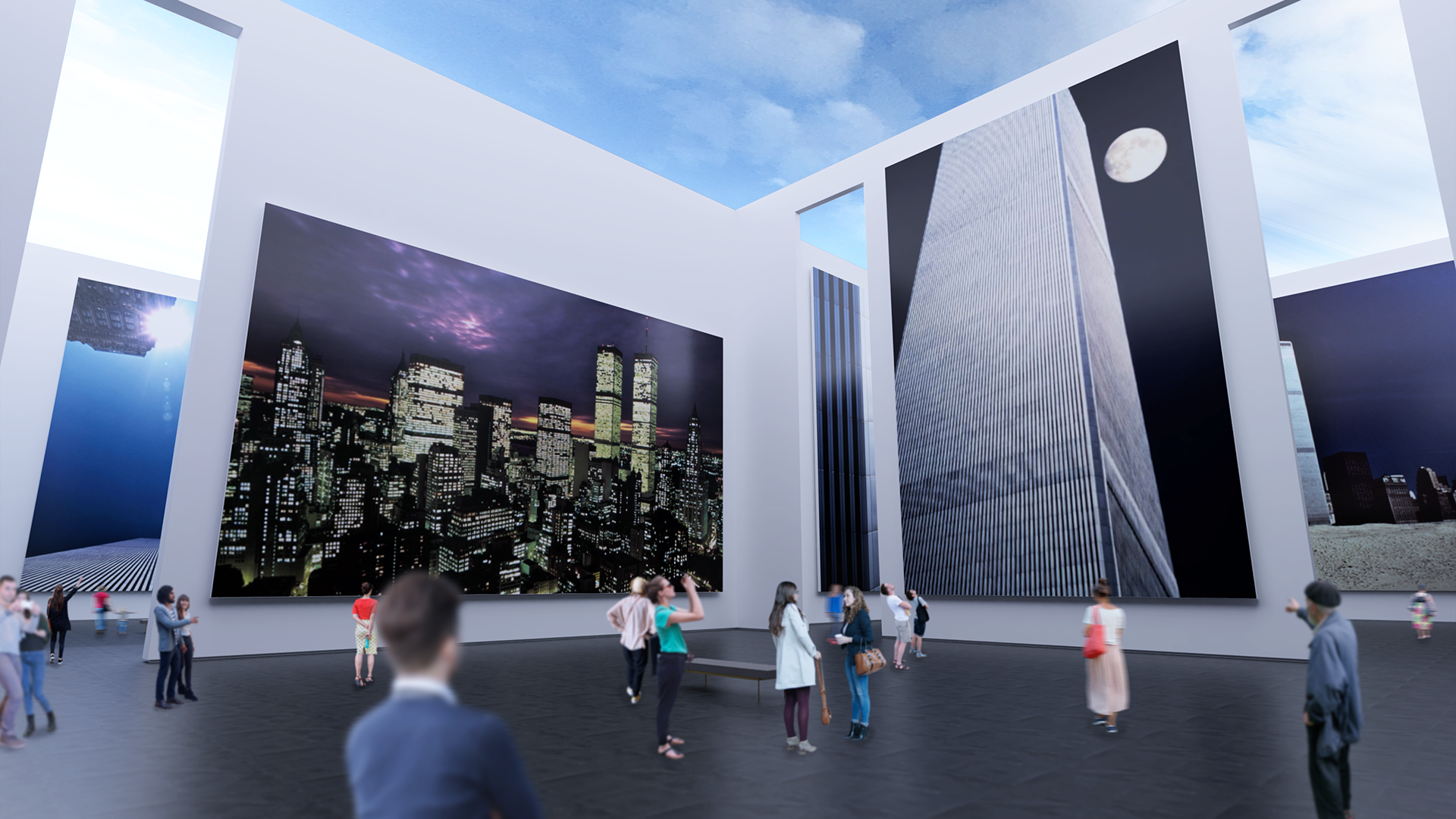
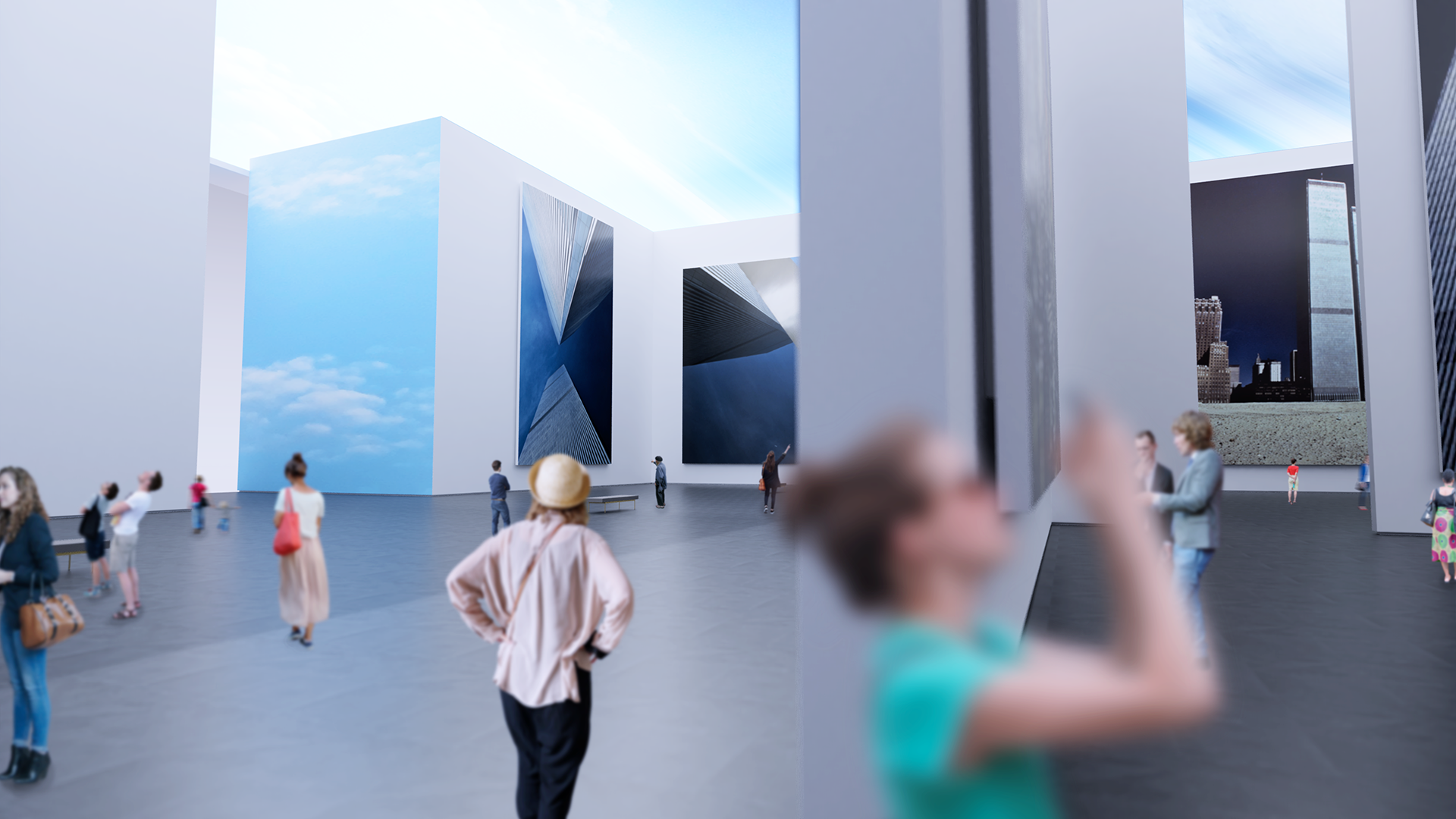
Genius Loci
Branding a memorial to something that did not just come to an end in a violent event, but to one that may well have been the definitive starting point of the current historical era, was to time travel and re-discover the hope and aspiration the World Trade Center development represented to anyone that remembers the time before tragedy.
Inspired by the photography of a long-time Manhattan resident, designer, and photographer Charles H. Moretz, Jr., the Genius Loci visual identity is first and foremost guided by the literal and philosophical pillars of light the twin structure embodied, but also borrows from the optimism and vibrancy represented by the cool blue sky that it so memorably pierced during its reign as a signature element of the New York City skyline for decades of growth and prosperity.
Brand Identity


Icon for social media and other shorthand uses.

Print Collateral

The vertical orientation of the stationery was chosen to purposely echo the skyward silhouette of the towers.
Experience Design

Book Design

“The Spirit of the Place” - a book published by ORO Editions of the photographs featured in the planned memorial.


Storytelling


The website serves as the primary point of presence and contact with an integrated fundraising module.

Maison Te Mata
A complete, unisex clean beauty line from LA. For modern nomads. Stay tuned for launch in 2020!