From physical and digital products, services, and experiences to storytelling, we design unique and effective solutions for brands, people, and the planet.
We devise systems.

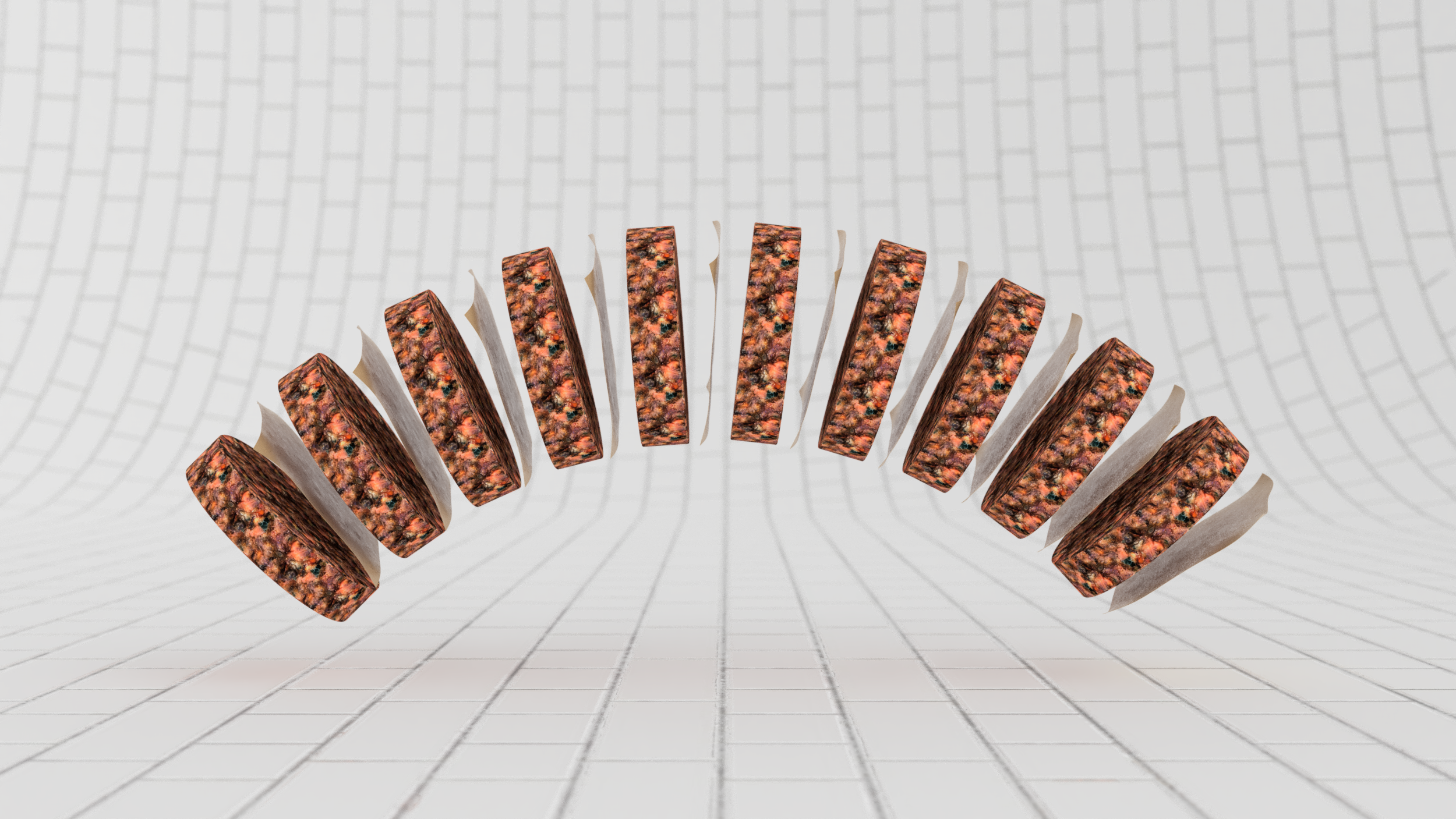
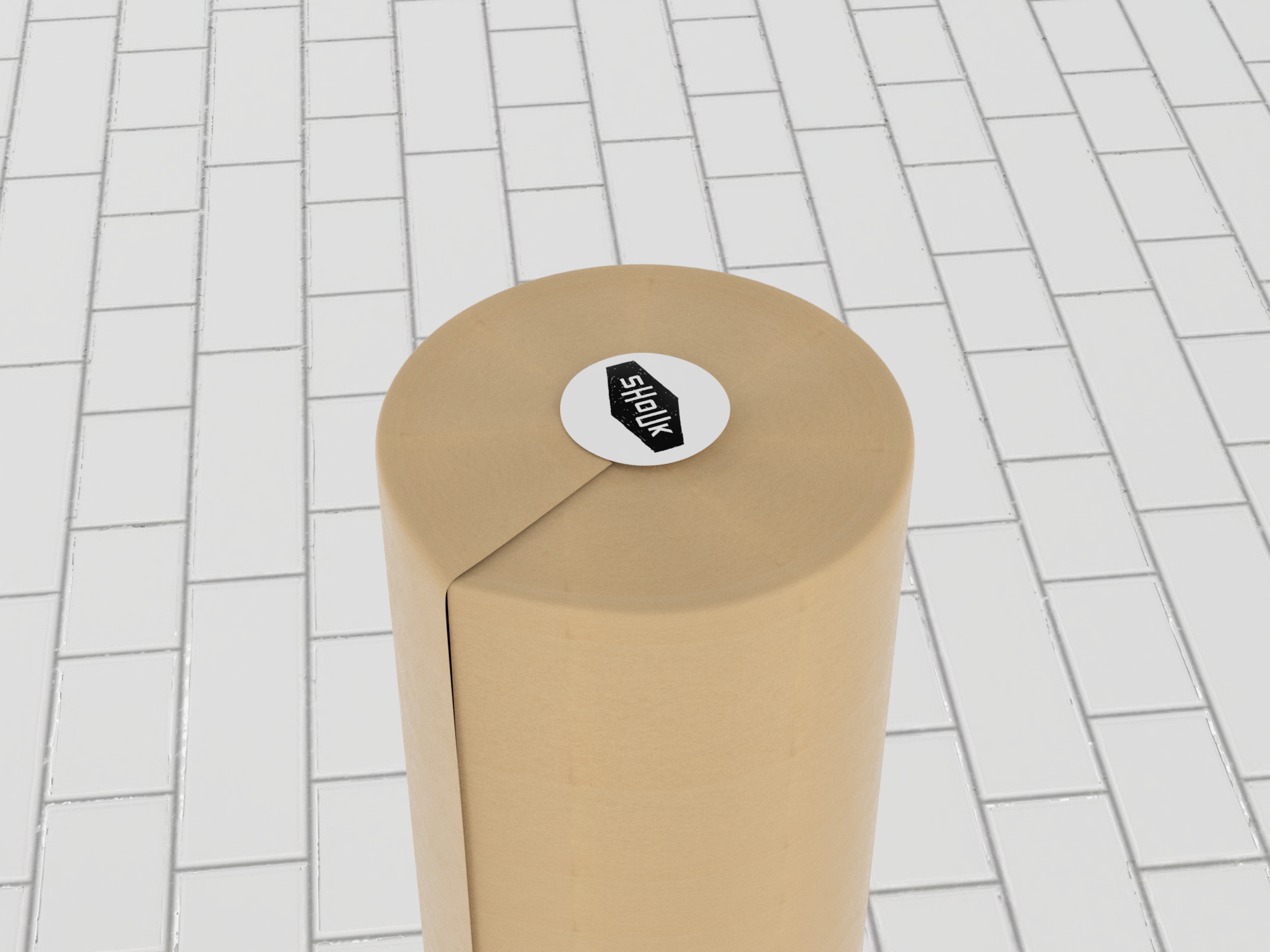
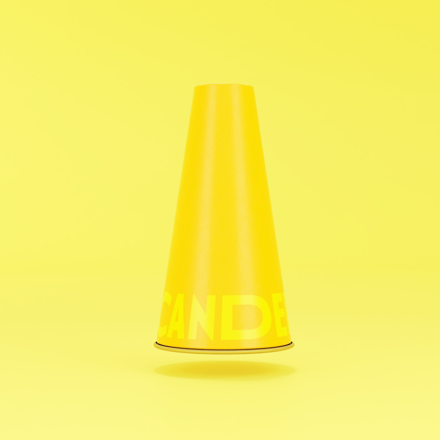
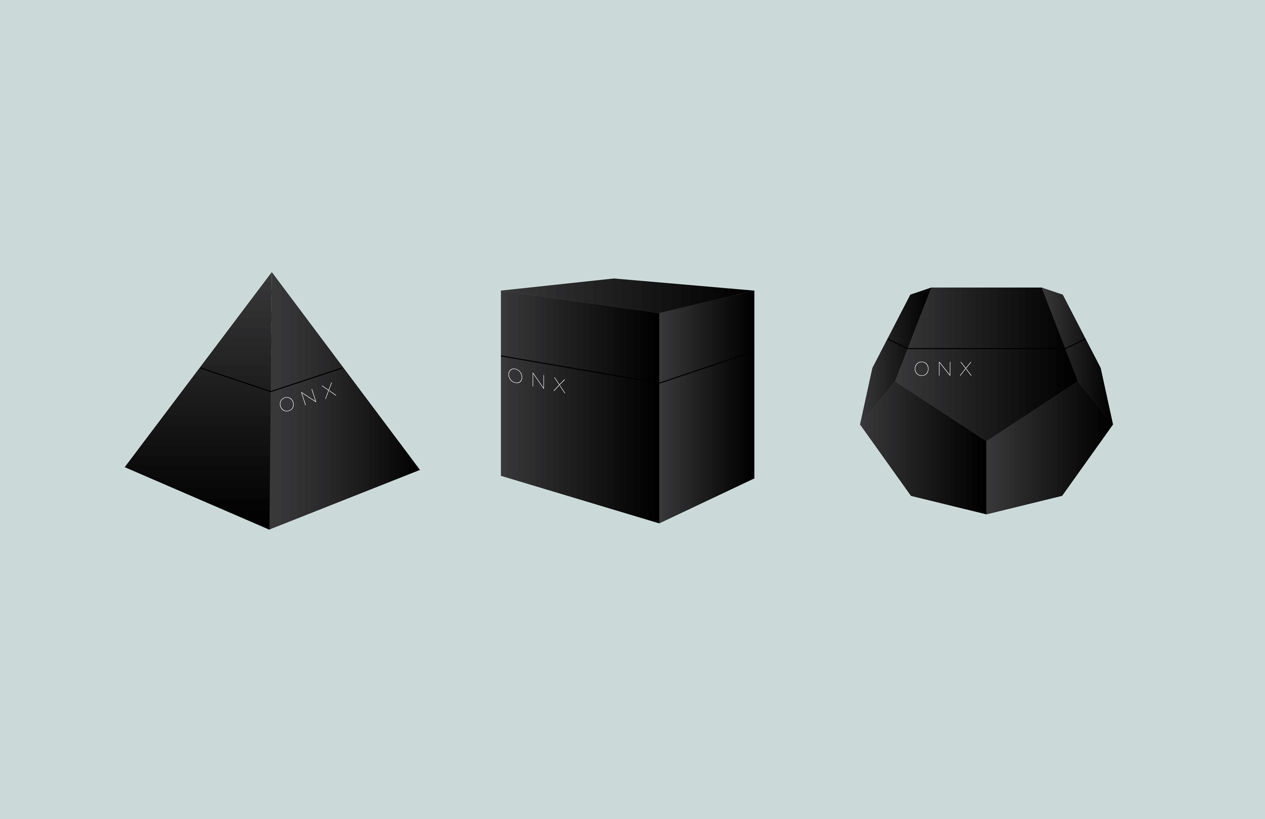
Shoukburger
We collaborated with our old friends at Shouk to come up with branding and a 100% compostable multi-functional packaging system for the now legendary pre-cooked frozen vegetable patties they refer to as Shoukburgers. Just in time for the meatless burger wars. Then again, we’re convinced that once you taste them there will be peace at last. Unlike meat-substitute or conventional veggie burgers, a Shoukburger is moist and beefy while made 100% from minimally processed vegetables, mushrooms, and other things you can pronounce, and with a satisfying flavor profile that is true to its Israeli street food roots.
The inspiration board.
The logo is derived from the Shouk logo but with a clear goal of communicating the nature and physical volume of the product. The idea of stackability is built into the visual language as much as into the form and function of the packaging system.

An actual Shoukburger. Yep!

Rather than wrapping each patty individually in an attempt to prevent the onset of freezer burn, we arrived at a delightfully simple solution inspired by frozen beef hamburgers.
Introducing a single membrane vis a vis a breathable paper wrapper allowed us to arrive at a solution that is elegant, on-brand, fast and inexpensive to implement at scale or in a more limited capacity.


The pulp cylinder system is durable enough to withstand direct to consumer shipping and stands out exceptionally in the retail display.

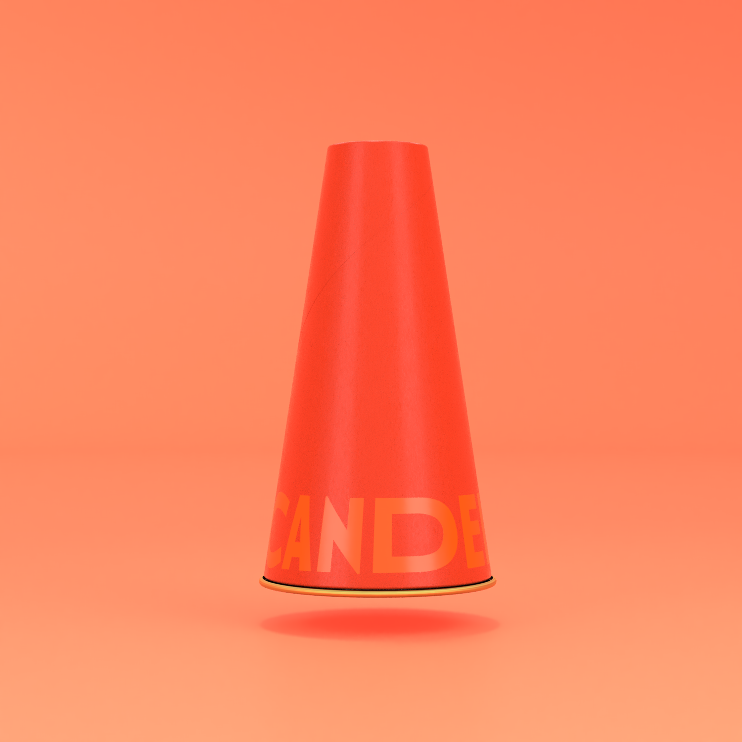


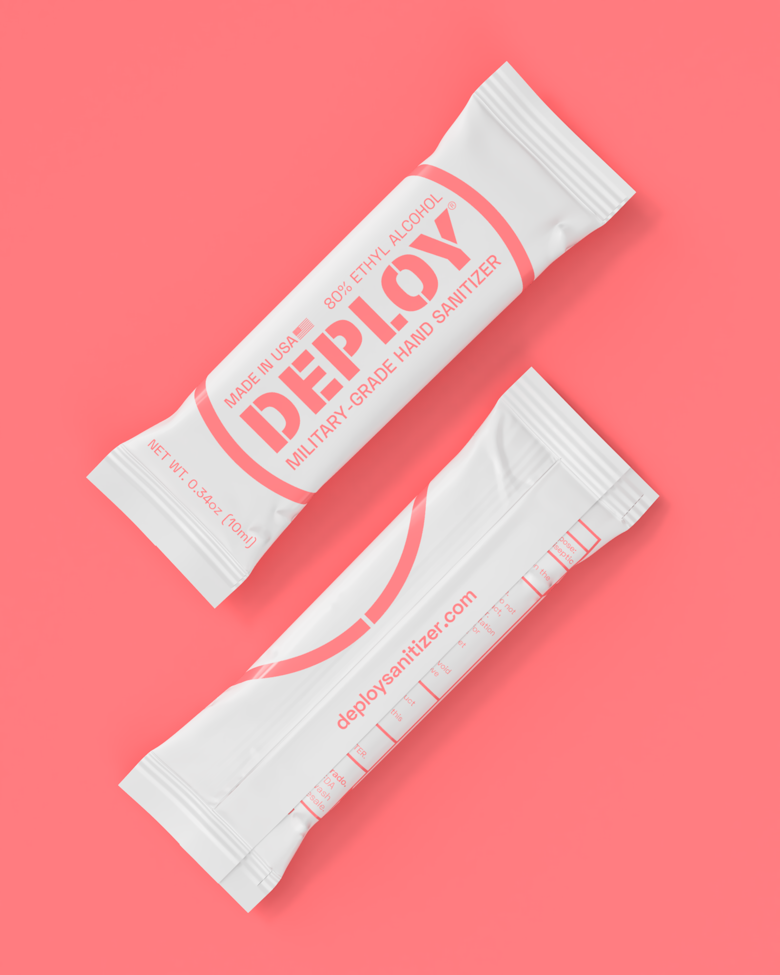
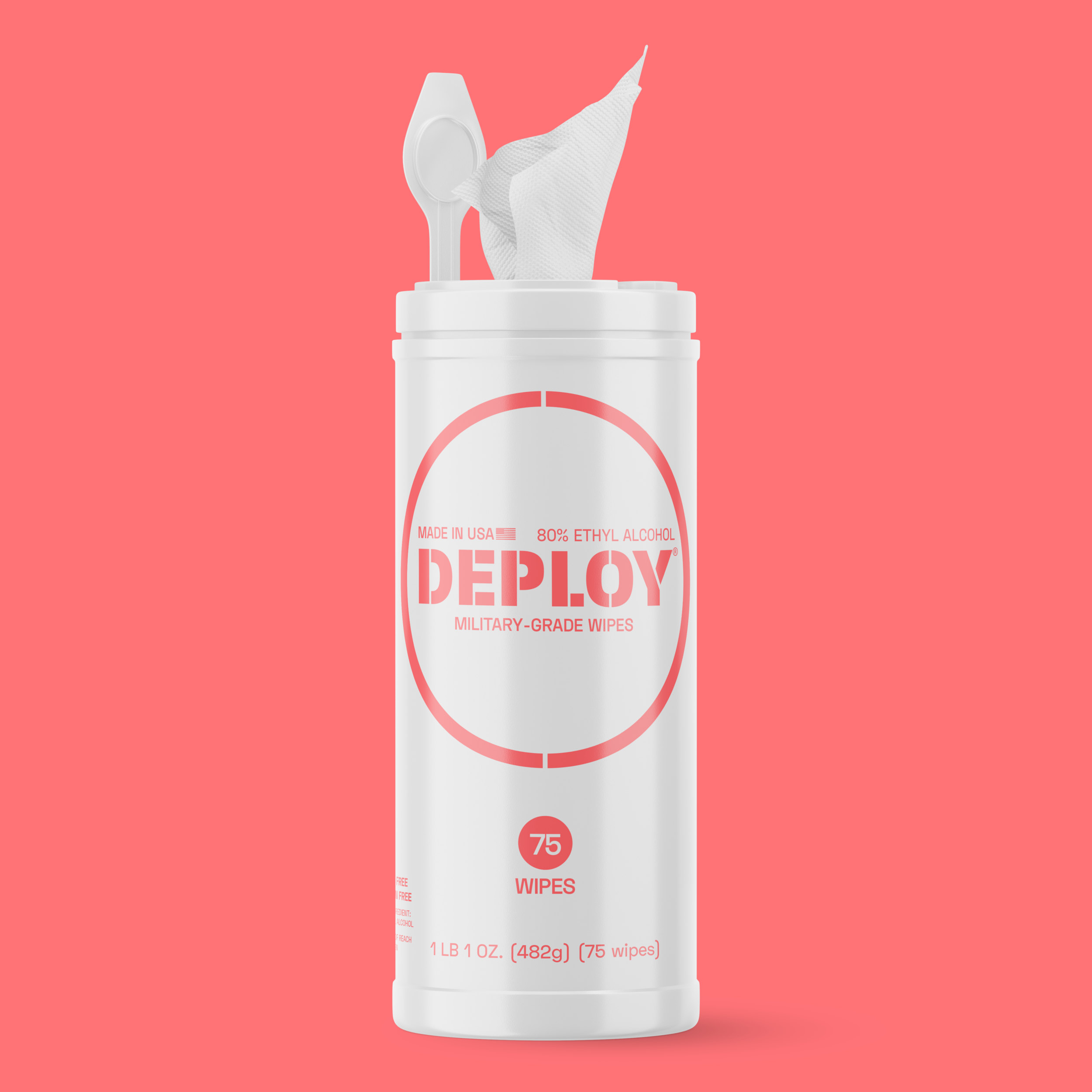
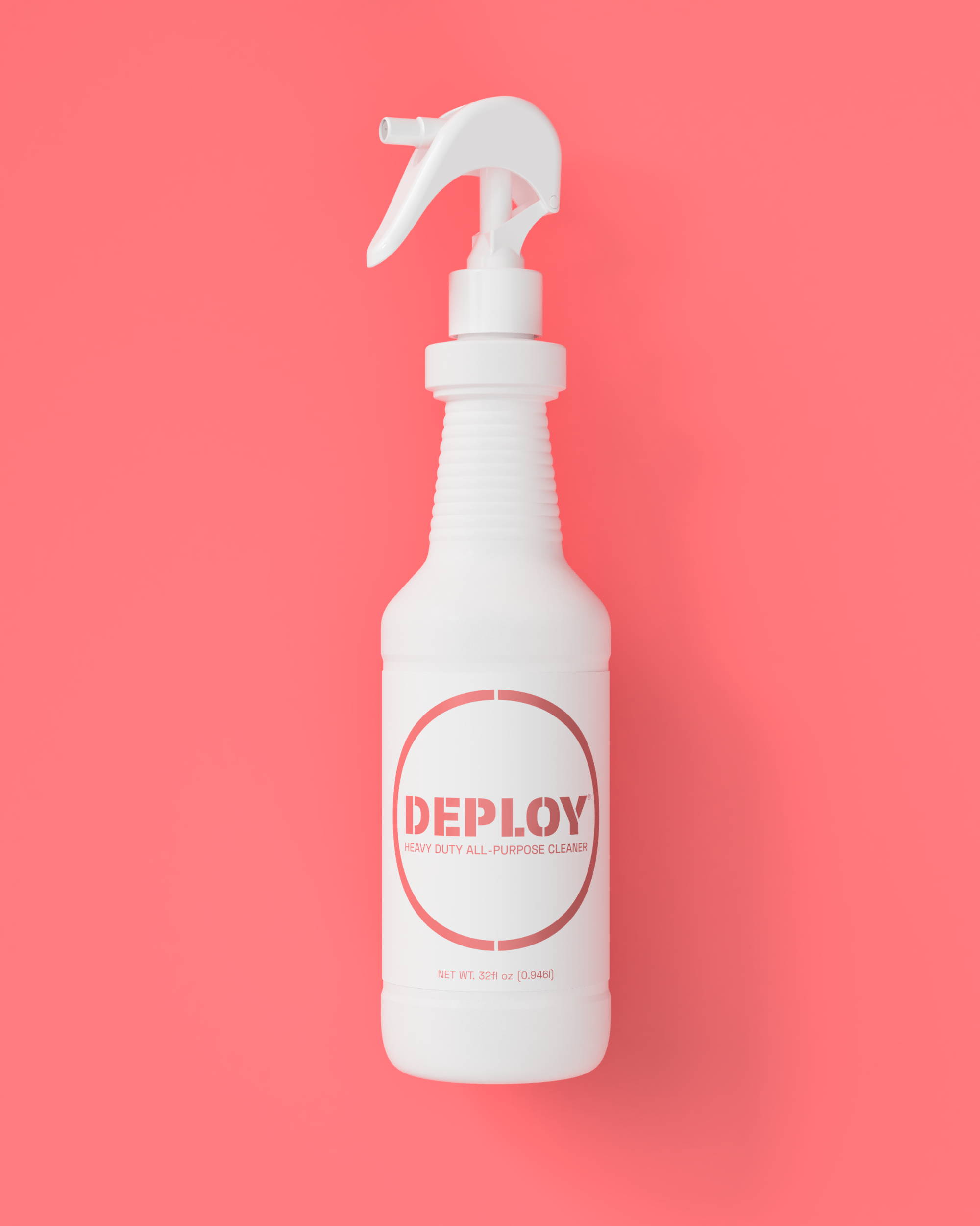
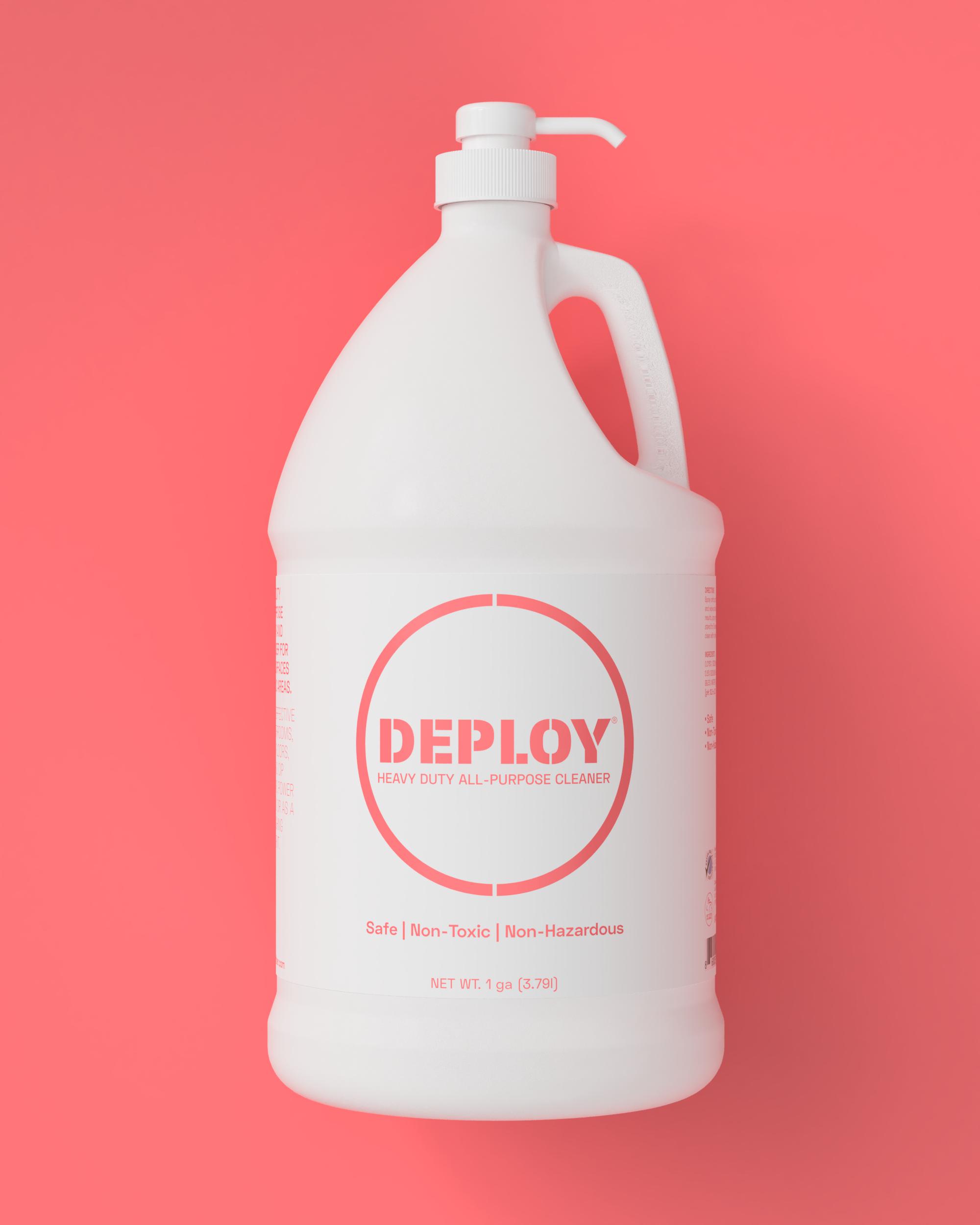
Deploy
Inspired by effectiveness - a trait they credit their hero General Patton with, Deploy was born as a best-of-class product in any category. American-owned and made, it is meant to be bold and stand tall and represent a military-grade germ defense perimeter - like an invisible but very real force field of sorts. The idea of urgency combined with the notions of efficacy and blunt force power added to the very real need to differentiate in the retail isle necessitated the eventual choice for the coral neon as the vibrating and singular signature brand color.


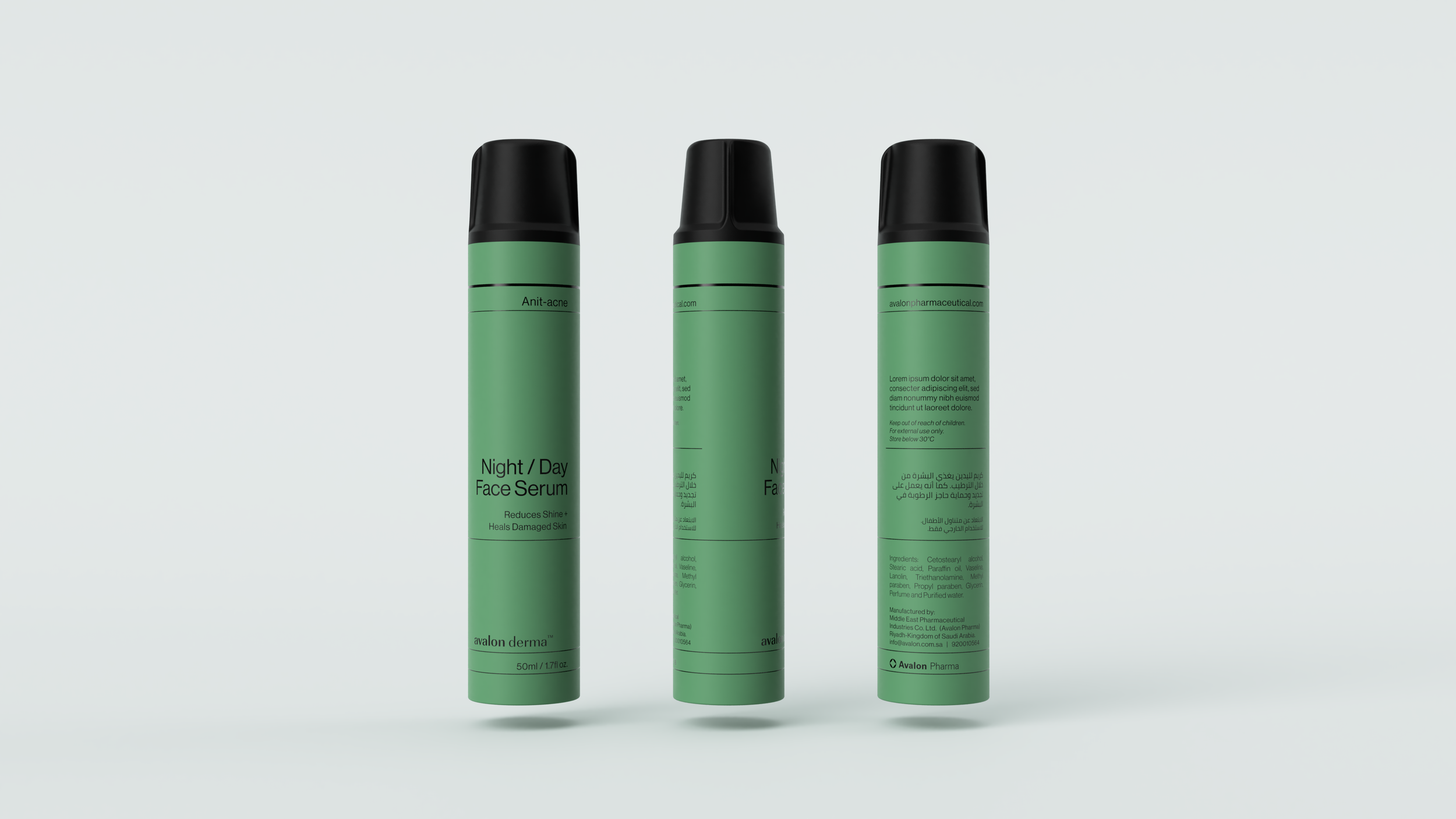
Avalon Derma
A new skincare line for Riyadh’s fastest-growing beauty and personal care manufacturer Avalon injects vibrancy into an otherwise harsh, muted and often chromatically-challenged ambiance of the desert, serving as a respite from the everyday. It is at once utilitarian and minimalist while conveying cosmopolitan modernist confidence rarely seen in the native Saudi brandscape.


Hooked on Play
Some of the most important and fundamental principles of effective design are derived from observation of the world in constant motion around us since our earliest memories begin. It is for that reason that the notion that “everyone is a designer” exists, albeit as a kind of a half-truth. Most humans are endowed with creativity from birth but it tends to get conditioned out of us during childhood as a result of society’s purposeful intent to produce conformity and predictability (blame the Freemasons if you’d like). It is largely a holdover of that type of thinking that results in a resolute line between work and play - an attitude that would seem to belong with the baby boomers and demonstrates a lack of understanding how much work has changed since the dot-com 90s. Those of us that manage to retain these untainted and primal instincts, and good designers as a norm, can and should necessarily intuit and imagine a solution to most user interface problems. Yet, ultimately the best result is yielded by a purposeful and trained use of a combination of a tuned aesthetic sense and the application of trial and error. In short, a successful design is a result of intentional incremental failures that could also be rightfully described as “play”. It should thus come as no surprise that play is at the center of most successful learning and development strategies. Play doesn’t just encourage and titillate but more importantly failure in the context of a game is tolerated. This is true because the perceived stakes in most games (Russian Roulette being a notable exception!) are low but also because there is a chance to “win”.
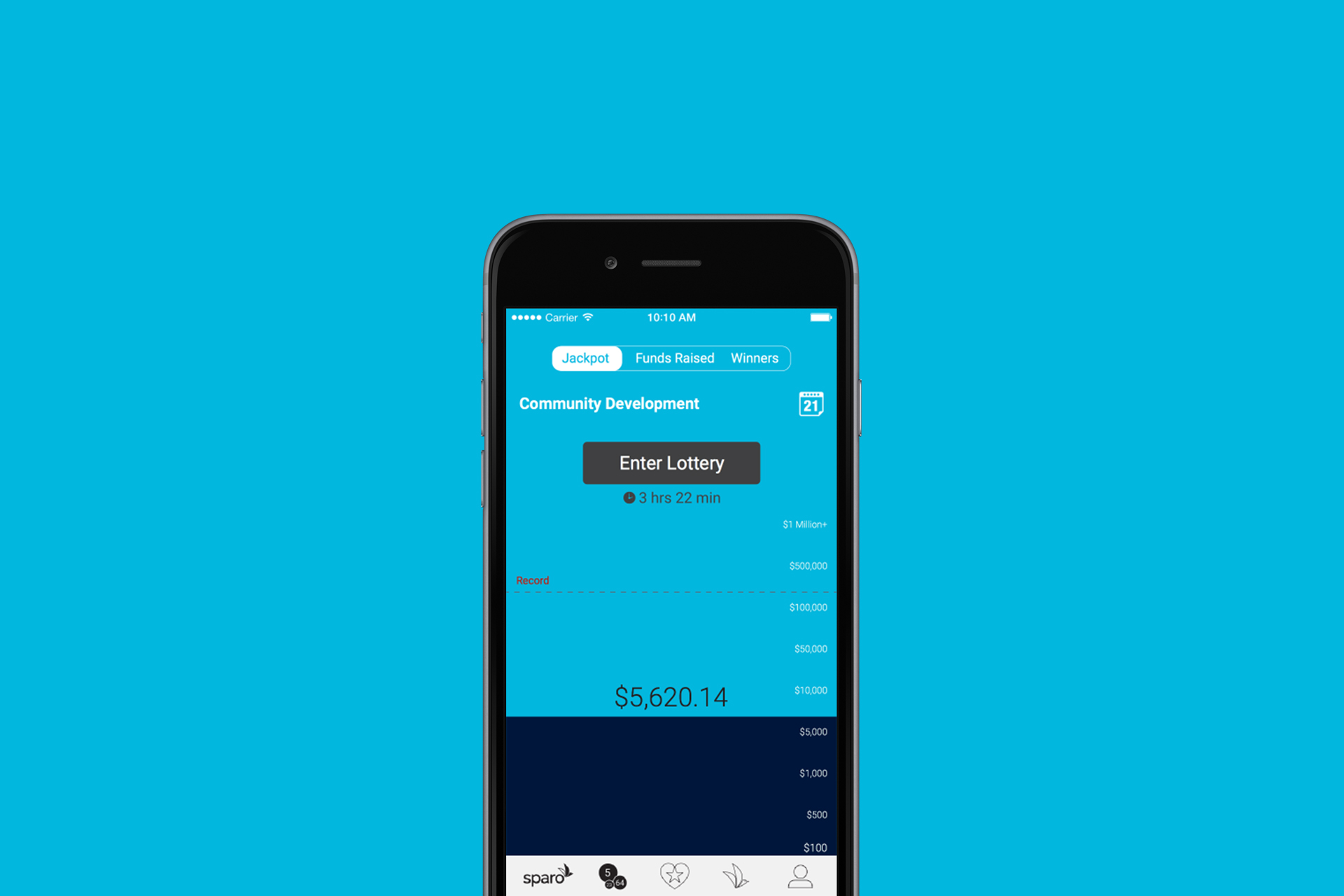
Making the fundraising goal central to the content of the screen ensures continued awareness by the players of the current jackpot vis a vis the fundraising goal and their own donation.
For all its obviousness play is still the lowest hanging fruit in the proverbial tool-chest of experience and interface designers (and the entrepreneurs behind them) that is far too often missed. The stigma surround play as a “waste of time” is usually to blame. Understanding why play matters and how to purposely harness its value for any app project is essential for devising delightful, unique and successful user experiences. Here are some of the basics for any brand’s app or other UI design checklist:
Surprise & Delight
Winning speaks to the reward center of the brain. A chance to win something even as basic as a superficial title (think the mayorships of 4Square from years back) and to project the resulting improvement in the perception of (social) status go an unsurprisingly long way. Creating rewards doesn’t necessarily have to translate into giving something away for free. This is all about creating a successful perception after all. Even something as mundane as remembering a username from the previous visit or using other means to intuit or predict the mental model of the user in a very specific micro-moment can and will have direct bearing on the bottom line of your business. The devil is in the details after all. Design thinking teaches us that a meaningful application of surprise and delight can result in bonding with the brand and the community it inhabits. The real question is how will you keep doing this sustainably? Do you have a plan? Is delight “designed in”?
Motion creates emotion
When building interfaces especially for prolonged and/or repeat uses it is important to remember that even the simplest tasks can and do quickly become chores. These “chores” are the proverbial stumbling blocks when aiming to provide the most frictionless transaction possible. One of the basic ways to counter the mundane is by incorporating some “carrots” along with the “sticks” which can be delivered in the form of movement or animation in a way that responds to the user’s input, whether desired or undesired, and thereby successfully guide the transaction in question to a completion. Because movement represents an intimate connection to our basic survival and thus to our primordial past it makes the emotions being generated in the process so powerful. But beware that movement is something that can be a source of delight as well as of over-saturation and noise! Because movement is tightly connected to the “fight or flight” reflexes of the ancient reptilian brain and basically acts as an extreme stimulant. When practicing good design it is essential to temper one’s enthusiasm for embellishment which should be rightfully dismissed as a cardinally opposite goal.

The ticking clock is a classic interface device for helping to introduce urgency for the user to complete a particular task.
A Picture is worth 1000 words (A VIDEO EVEN MORE)
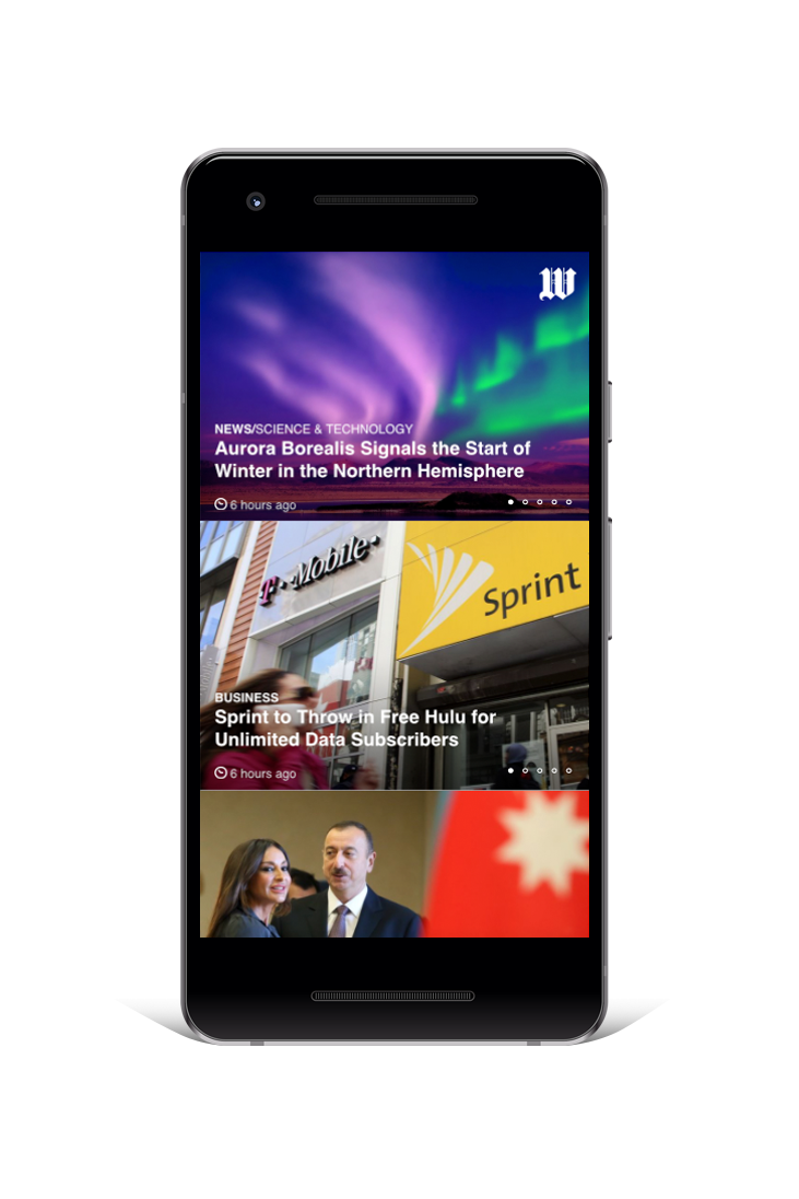
Placing a heavy emphasis on visuals over text or even removing text entirely can have a naturally liberating and disarming effect while also improving focus because the brain generally finds that type of content more interesting and pleasurable. When relying exclusively on imagery or mostly imagery there is little in the way of additional editorial steering or other boundaries imposed in the form of text so the intended message theoretically has a better way of succeeding unimpeded. This technique has been historically used in book publishing going back a few centuries and traces to the beginning of paperbacks and to magazines as periodical content delivery formats. It is also apparent in news publication (UI) design evolution at large with the explicit goal of widening reach (and appeal) among, illiterate, less literate or otherwise broader audiences from outside a particular demographic niche. You don’t have to go further than the successive UI iterations over the past 3 decades of Time and Newsweek, USA Today, and NYT layout systems - all of which have been tailored and re-tailored to capture as many eyeballs as possible. It is no big surprise that the same is likewise true for cable and streaming giants like HBO, Showtime, and Netflix or anyone seeking to deliver news, messaging or entertainment via content or to offer transactional functionality.
Allowing the user to effortlessly toggle between currencies’ performance over time, and to quickly adjust an investment strategy make for a powerful yet simple dashboard for a crypto-currency investor.
Less is More
As is true with any overindulgence in successful interface design less is definitely more. And we’re not talking about minimalism as an explicit or abstract goal here but rather about purposely having empathy towards your users and understanding the human threshold for incoming information - especially if it contains instructions - and their ability to respond to it without or with the least amount of errors. Noise is bad. Given to how badly recent studies have discredited our ability to multi-task (there basically is no such thing, apparently) it should be no great leap to conclude that successful interfaces should help guide users through the necessary tasks while improving their focus on the task. Movement can be an effective way to make up for having less redundancy in terms of navigation elements or other tasks especially if they are to be repeated in the course of recurring visits/uses. Control and customization are other great ways to balance whatever may be perceived as lost to the simplification of an interface.
We are tactile
When it comes to making sense of the reality we inhibit our embedded, innate input sensors abound but touch is by far one of the most powerful of all the senses. More people like hugging than not and those that don’t are likely victims of cultural conditioning. Touch is natural and rewarding. Ultimately, it represents our mothers and more specifically the time spent in the womb (see physical bonding for newborns). Do you love touching your phone or fiddling with another IoT gadget? How many times a day do you try to resist the temptation to be rewarded by that action? It is for this reason that the early attempts at voice interface leave a lot to be desired from a stimulation point of view, and why the maker movement as a backlash against consumption-only model of society is so telling. Tinkering on your home improvement project, mowing the lawn, etc. can help anyone unlock a very personal understanding of why touch is so innately powerful and why it factors so prominently in experience design. Tactility is a key to understanding our desire to control our environment and our innate need to be rewarded and should be at the center of designing any physical touchpoints, let alone UX/UI/UE for your brand, products and tools.
Allowing the user to do their own editorial curation creates an opportunity to bond with a particular user archetype in a meaningful way.
Play TO WIN
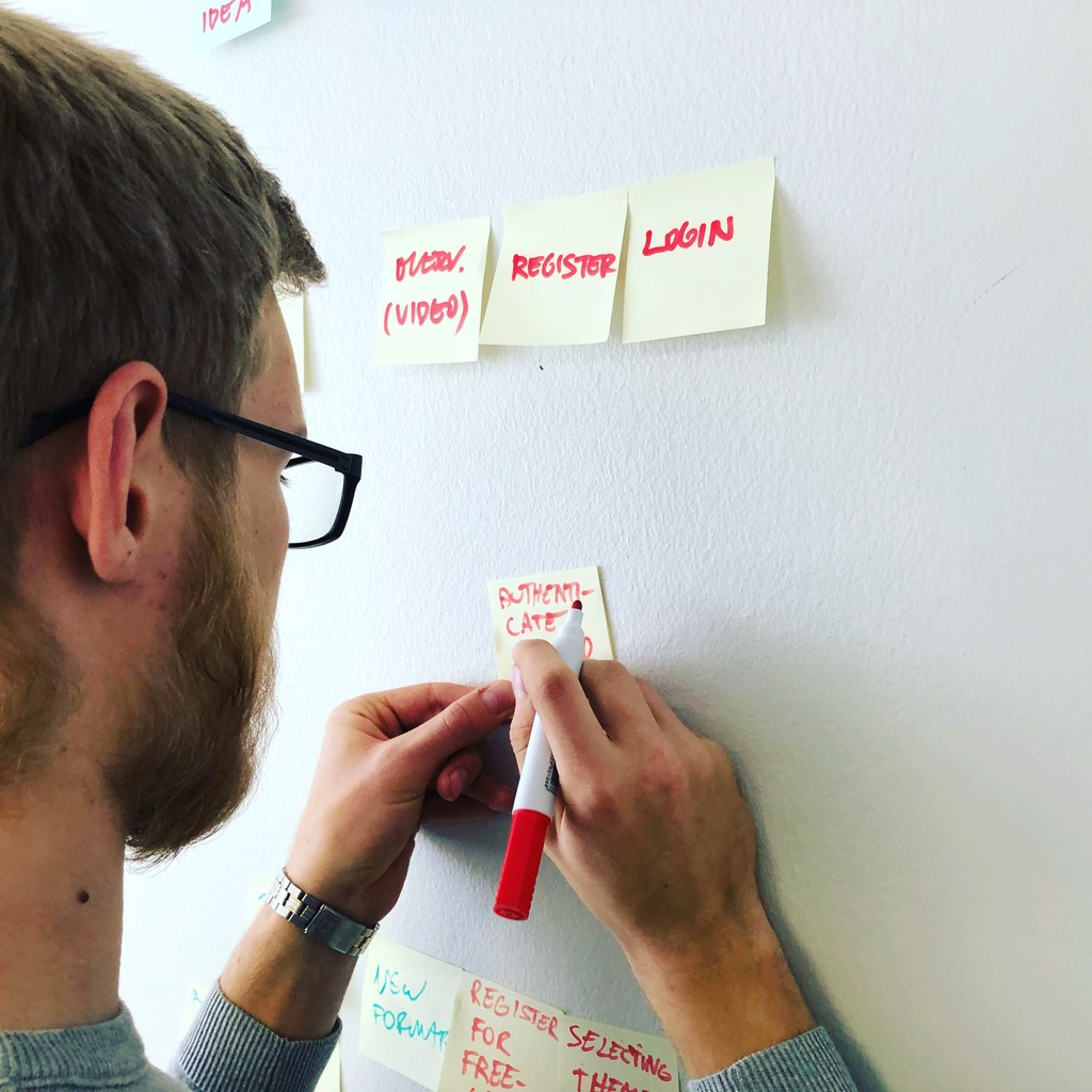
Co-creation and ideation with actual representatives of user archetypes is essential to avoiding the myopia that occasionally plagues even the most talented and experienced design practitioners. Prototyping and user testing as integral parts of the creative process are important and don’t have to be particularly elaborate or costly in order to yield meaningful insight to anyone seeking to build an effective and rewarding user interface. Building unintentional dead ends or adding undesirable or unnecessary functionality along with clumsy navigation are among the many reasons the so-called app economy is as competitive as anything as it is virtually impenetrable (there are now literally a million apps for “that”, most of which will never make it except perhaps as loss leaders) unless a brand really has something unique to offer. Every brand knows by now that not everyone will need an app in order to succeed or that having one is no guarantee of love or traction. But it is all too tempting to assume that just because something seems simple or straightforward from the point of view of a sales script or steps in a retail process (“you just put a thing in a cart, choose quantity, add payment information, get an up-sell recommendation or a coupon and check out!”), your sales, or subscription funnels, it is something that anyone could devise. Unless you’re methodical or pay an expert to design your digital interface there are no guarantees of success. While coding/programming/development is more or less a commodity in today’s market, in branding like in user interface design you get what you pay for.

A moderated user testing session in progress.
If you have an interface design project coming up or one that could use a fresh pair of eyes do not hesitate to get in touch so you can benefit from our deep experience in facilitating the design process through to a successful alpha build. Most importantly, keep an open mind and have fun!

Infiniti

Celebrated chef and personality, Chef Roblé Ali, invites us into his process when navigating the preparation and execution of a specialized meal. By utilizing both his expertise and a powerful resource, the Infiniti QX50, he is able to achieve the ultimate experience in taste and presentation.
This multiple agency collaboration for Infiniti and UrbanDaddy was directed, edited, and produced by our own Ryan Smith.

Green is the New Black
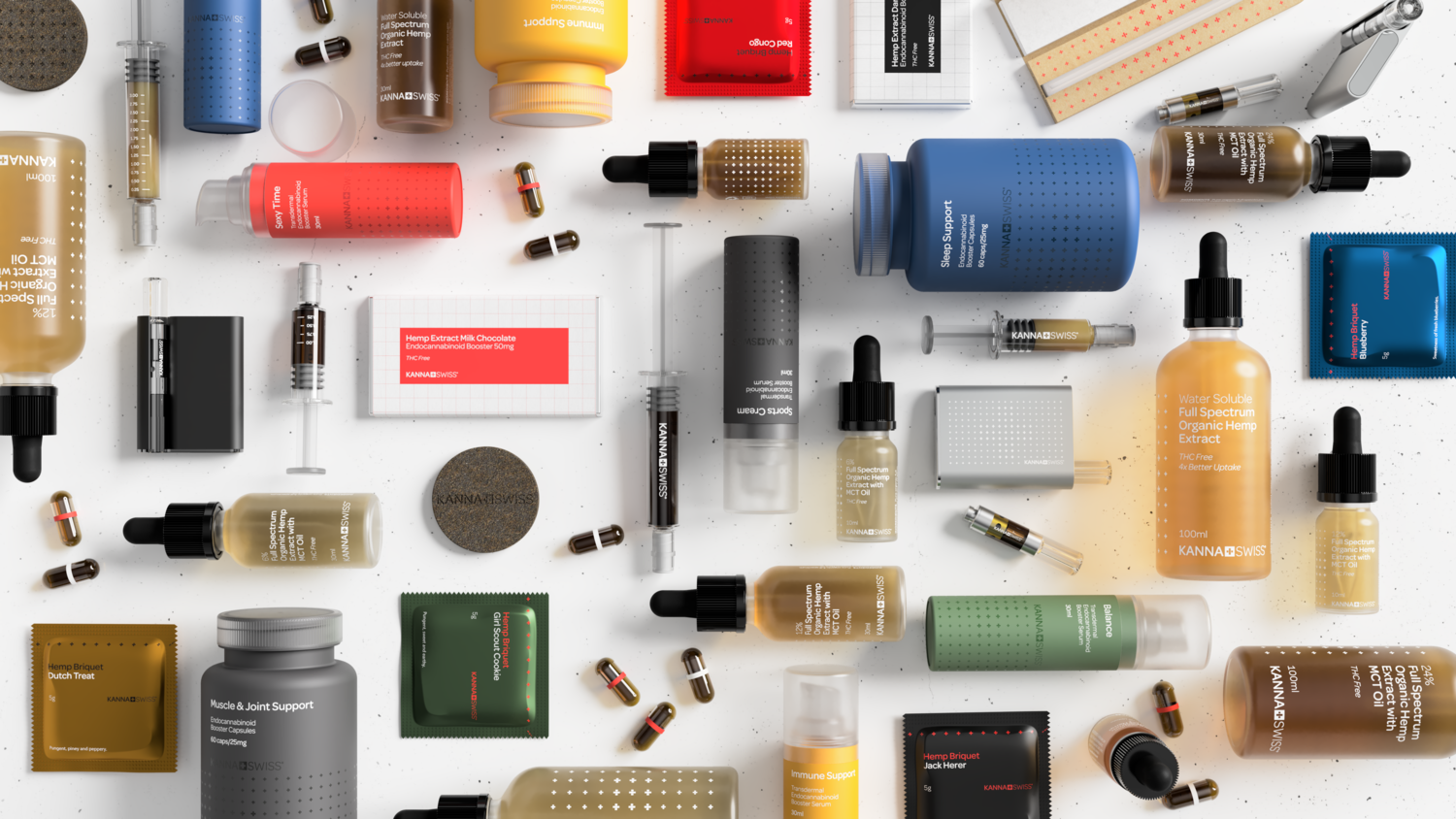
And by green we are speaking about a flower called Cannabis sativa. And then there is the green of cash. So this is just as much about methodically unlocking tremendous near-term future growth opportunities for innovative entrepreneurs and investors alike. The following Black Friday offering of thanks is to our past, present and future clients and is compiled as a basic conversation structure about early mistakes to avoid and successes to be had when developing your own cannabis offering. They are based on our learnings from the trenches while working on a growing range of cannabis brands in ever diverse industry and product categories as well as seasoned by several decades of experience as branders and designers at large.

The Stigma
Despite the virtually certain eventual complete legalization of cannabis in major world markets for a broad range of consumer applications the stigma of “criminality” and the negative associations formed in the collective memory over many generations by government propaganda need to be effectively addressed. Fortunately, this can be achieved rather methodically over time by a combination of clear and succinct messaging delivered through relevant and high resolution content, espousing operational transparency and accountability, enforcing the strictest safety and quality controls to ensure consistency, and investing in the best design money can buy across your brand’s touchpoints from identity through to product or service, visuals, content, packaging, merchandise, environmental, digital, as applicable.
The Soul
Most of the typical barriers for new brands entering a market are essentially functional not emotive. But it would be a mistake to not consider this to be the most fundamental consideration of all. It is as vitally important for a Cannabis product or service to effectively differentiate themselves as it is for any other highly competitive consumer product or service. In fact, almost definitely more so due to some of the unique challenges already mentioned above. Every successful brand inhabits a community much like a movement or a belief. It has a discernible voice and an identity as expressed in a coordinated, curated and uniform fashion across its ecosystem of touchpoints. It is embedded in the aesthetics but also in the operational practices and internal culture as much as in the outbound storytelling and customer relationship management. Who’s your target audience and what is your unique value proposition for them? A great place to start seeking what you sound and look and feel like, i.e., how your audiences experience you is after successfully defining your reason to exist.

Switzerland provides a convenient haloing opportunity when dealing with a controversial topic like cannabis while speaking to pharmaceutical integrity, precision and safety, ethical practices, and natural purity of the base ingredient as expressed through the fairy tale-like scenery.

A sure sign of relief. Enhanced in Switzerland.

Relief and relaxation along with sustainability goals embedded into a small batch organic cotton loungewear collection.
The Science
As much of the controversy around the topic of cannabis has to do with the popular misunderstanding of the chemistry, therein lies a clear opportunity to demonstrate leadership on behalf of your brand. The story of the various cannabinoids and their related effects may well need to remain in any cannabis brand’s mandatory communications arsenal for some time as an obvious and necessary way to inform the broadest audiences so they are able to make intelligent and confident choices safely. This matters to the consumer when it comes to choosing your brand over the competition but more fundamentally orienting themselves among the various delivery mechanisms, formats and compounds. Terminology matters crucially which is why the use of the word marijuana or any other colloquial references should likely be avoided in favor of the traditional Latin form. Hemp has been historically used as a more broadly acceptable term even if it is somewhat awkward due to its agricultural origins. The confusion over the science combined with ineffective messaging means that there is a pervasive lack of knowledge on behalf of the consumers on the broad range of applications of cannabis chemistry from recreational to pharmaceutical to personal care and cosmetics to food. This represents a huge missed opportunity for growth regardless of which category your cannabis brand belongs to.

Purity and transparency along with safety and reliability as expressed in packaging form for a pharmaceutical delivery method.


Explaining a 24-hour time-released CBD-empowered beauty routine through packaging graphics.
The Safety
When it comes to any consumer product or service but especially pharmaceutical, beauty and personal care, or food item safety is a vital baseline requirement. Closely related to the stigma and the science challenges, safety along with efficacy as measures of quality (or purity) has obvious implications on packaging design and delivery methods. But no less than on the supply chain and operations including internal culture, etc. In case of food products that contain psychoactive cannabinoids and are intended for recreational adult consumption even the flavoring becomes a central aspect of responsible product design and should be carefully considered in order to reduce the appeal to undesirable audiences and to further discourage accidental exposure while maximizing appeal and affording ease of use to the target groups.

ISO-certified production process and highest purity ingredients encapsulated.
The Selling
The last of the common issues to be addressed for most cannabis entrepreneurs but clearly not the least is transactional whether we are speaking of online or brick and mortar stores. Despite considerable advances in quickly and inexpensively establishing an online presence with e-commerce for just about any other consumer product by any number of popular hosted template platforms like Squarespace of Shopify, selling cannabis products remains as one of the key chokeholds along with banking, shipping and customs, and law enforcement. Due to restrictions by major payment processors that integrate with these platforms by default, and by outdated government regulations concerning interstate and international commerce. While there isn’t yet a patented cure for all of these ails there are dedicated payment processors ranging in reliability for cannabis transactions and a few different and creative ways to get your non-THC online store up and running with a little bit of expert coding help.
With regard to the physical store experiences it is equally important to understand the general learnings from decades of effective retail and merchandising design in terms of product placement, queuing, activities, and checkout as it is to have a nuanced understanding of the constantly changing consumer expectations with regard to what constitutes a delightful and meaningful high street shopping experience. The place must obviously stay true to the brand while still remaining flexible and scalable in terms of the underlying prototype kit of parts and to the geography and streetscape that it inhabits. And it should probably not look like a pharmacy or a dispensary unless that is exactly what it is intended to be.
A glimpse at an evolving non-psychoactive cannabis offering.
As holdovers from the pre-decriminalization era of cannabis, of outdated science and government regulation and propaganda and the related confusion of the cash crop for recreational consumption and cannabinoids as natural, non-toxic, non-psychoactive ingredients in pharmaceuticals, food, nutritional supplements, and beauty products, effectively addressing these core aspects will give your brand a fighting chance in the onslaught that is sure to continue to unravel exponentially in the coming months as more brands enter the cannabis space until mainstream brands acquire and aim to crush as much of the perceived competition as possible. We’d love to be a part of the conversation of making your brand succeed before the bubble bursts!

OX
Nanoxidil-powered hair styling and scalp care kit for men. Virility, vitality, volume. Stylish, professional grade tools for everyman’s bathroom. Not your dad’s hair club.

Excerpts from the design brief.


A name and identity system that speaks volume, speed, and professional power.

Bold, not bald.

Complete care kit.


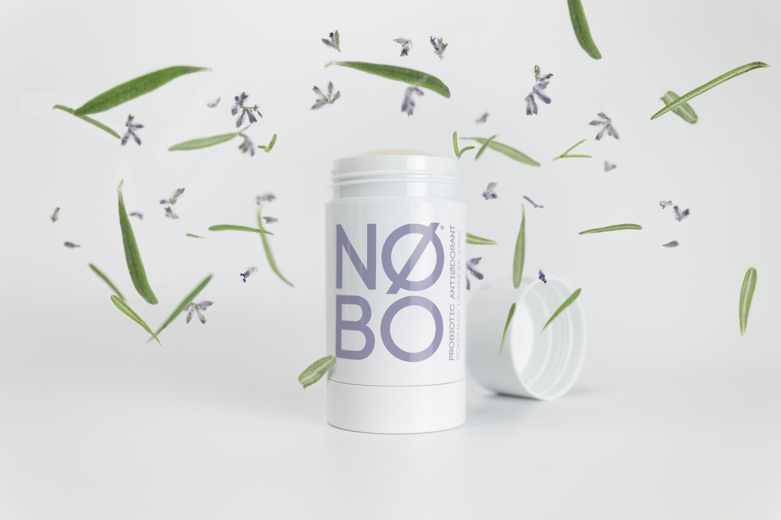
NØBO
Fight odor causing bacteria with the help of your microbiome. No more B.O. Even less B.S.! All natural probiotic deodorant for all. The brief was about as minimalist as a designer could hope for in both its limitations and its possibilities in terms of being able to strip things down to the basics - an inspiration for the brand and the product from the formulation of all natural essential oils and ingredients with probiotics to how it will help expand the possibilities of probiotics as a platform for continued development for other personal hygiene and beauty products.
Secondary logo style for digital use.

Zero odor emission promise is embedded.


Honest Tea

Honest Team launched The Great Recycle in New York’s Times Square with the goal of helping to boost national recycling rates. The experiential tour has since visited 20 states and recycled more than 540,000 beverage containers. Ryan Smith directed and produced a series of videos for the event, including the brand storytelling through a stop-animation journey of a bottle through its recycling lifecycle and coverage of the event itself.

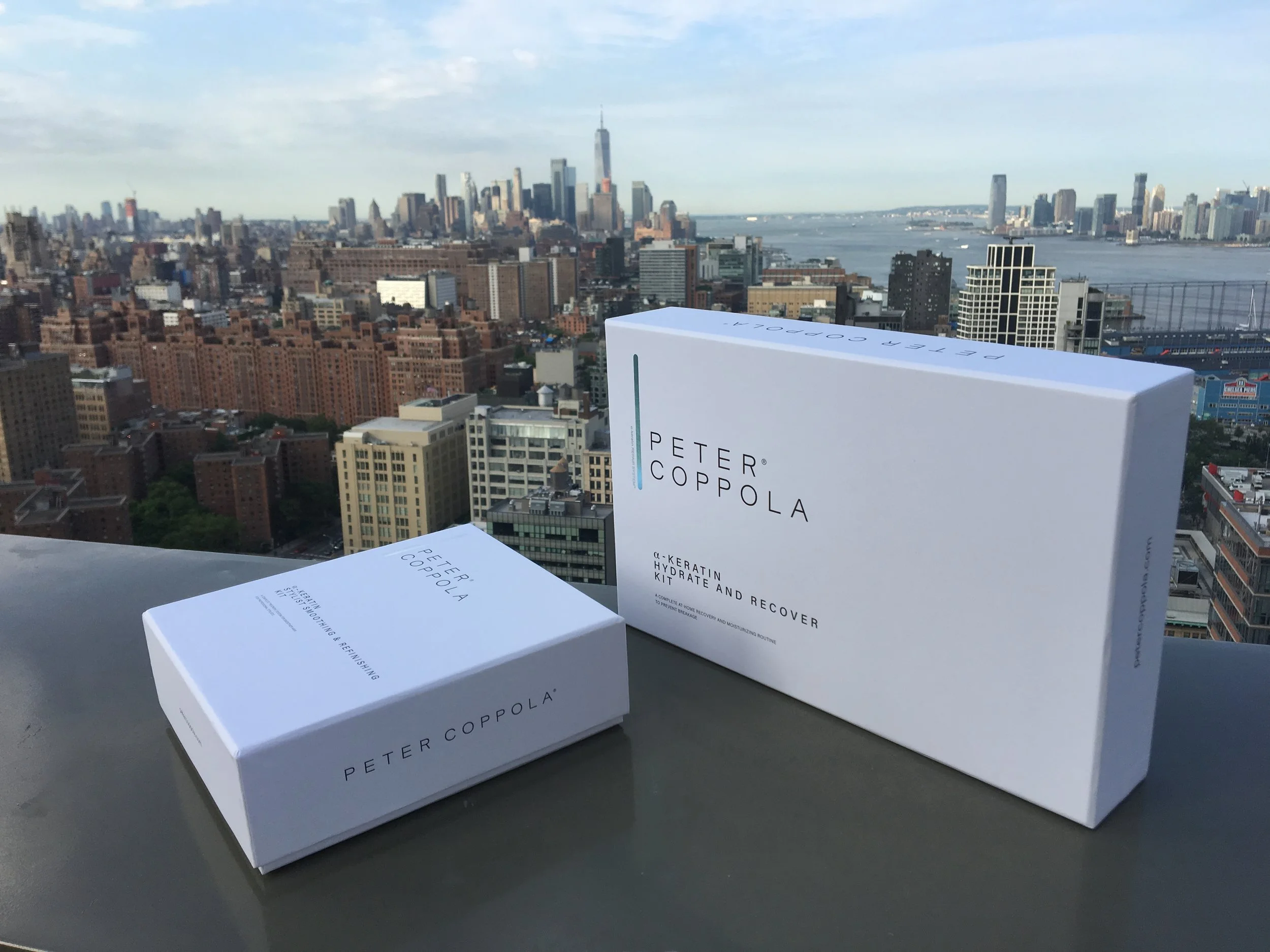
Peter Coppola
Let's iron things out wit this new straightening iron from Peter Coppola - a Personal Brands brand.

And redesign of the entire line followed.


Kicksback
When Nike Innovation's Nexus project approached Alphaforms about creating a life-like, high-resolution e-commerce application in order to test a business plan. We worked as a subset of the Peer Insight team in order to create the solution which succeeded in several key performance categories including qualifying for continued funding by the internal VC board. The end product of that collaboration is now known as the Nike Adventure Club. You know, for kids.

Shoelace-inspired identity.

Working with Peer Insight we co-created and collaborated with Nike in order to validate the use cases and build a beautiful alpha experience, end to end.

