From physical and digital products, services, and experiences to storytelling, we design unique and effective solutions for brands, people, and the planet.
We devise systems.

Wild Wing Cafe
New everything. Rebranded, redesigned, rethought, and a return to course for a NC-headquartered Southern casual bar & restaurant franchise built around freshly baked chicken wings and local live entertainment. We started with devising an updated brand strategy which includes redefined values and brand positioning tagline, as well as, a restated mission and vision statements. Then followed by an aesthetic recalibration and re-imagination of the visual expression from logo to color scheme, the re-establishment of the brand’s purposeful and coordinated voice and tone. ultimately finishing with the environmental store prototype redesign.

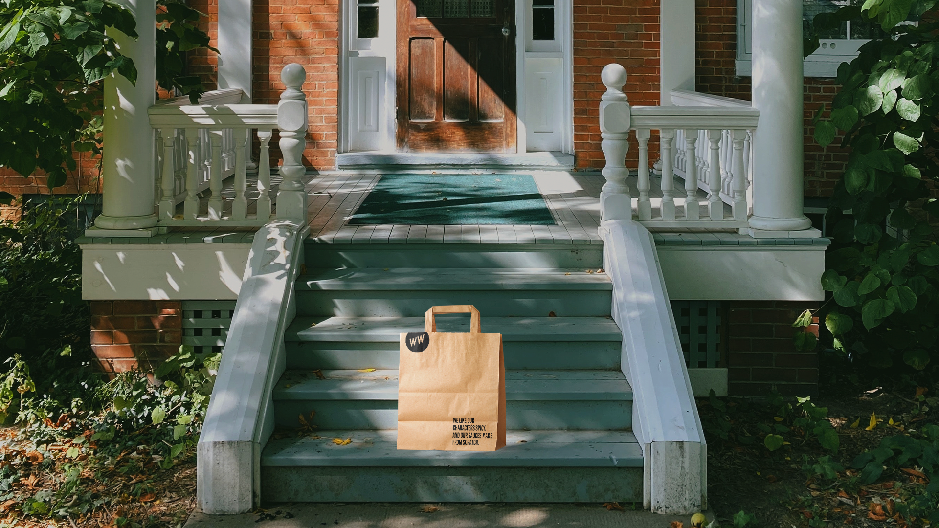
As part of activating the new brand strategy, WWC has begun a wholesale conversion to mostly compostable or highly recyclable single-use packaging system.

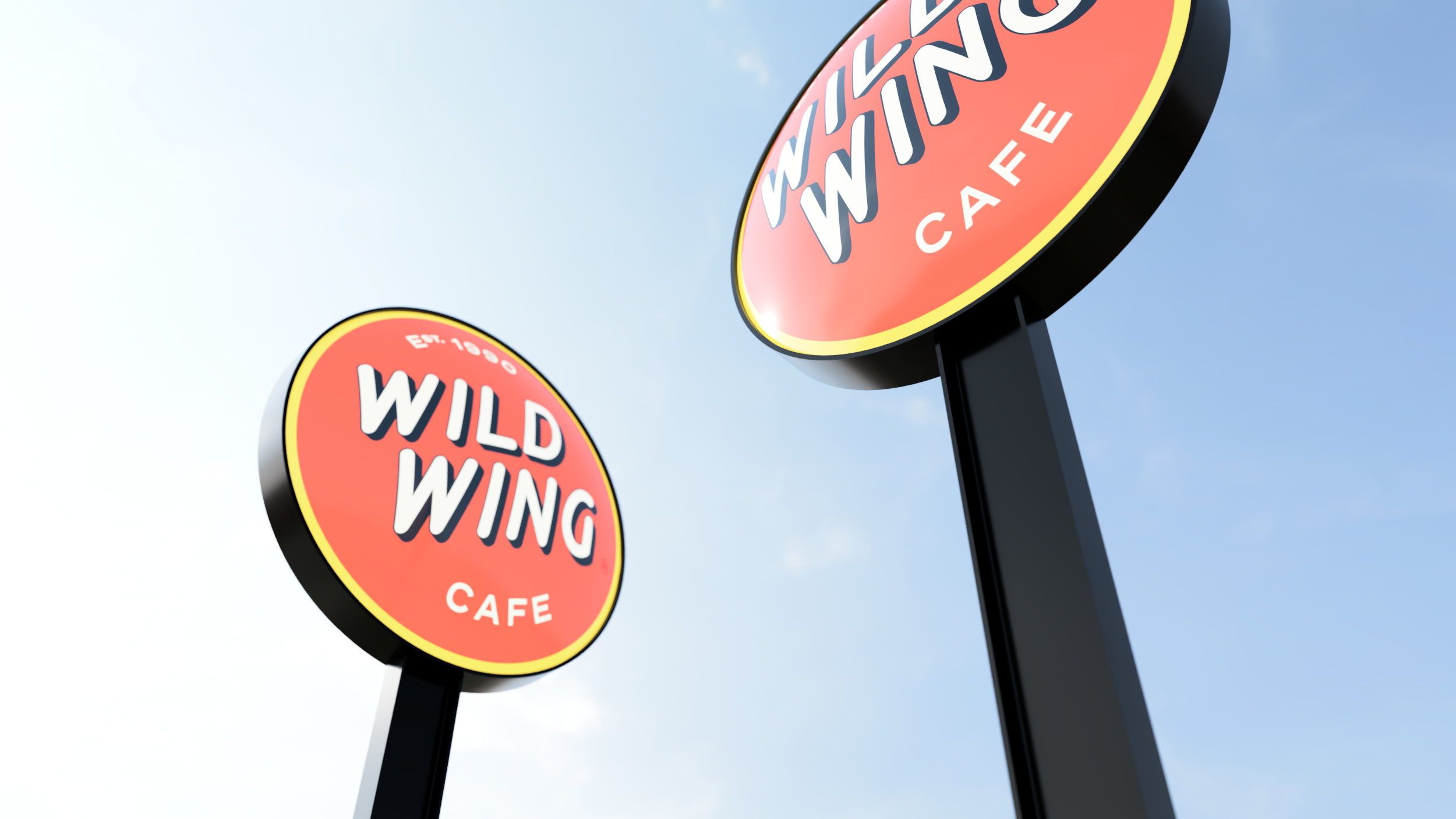
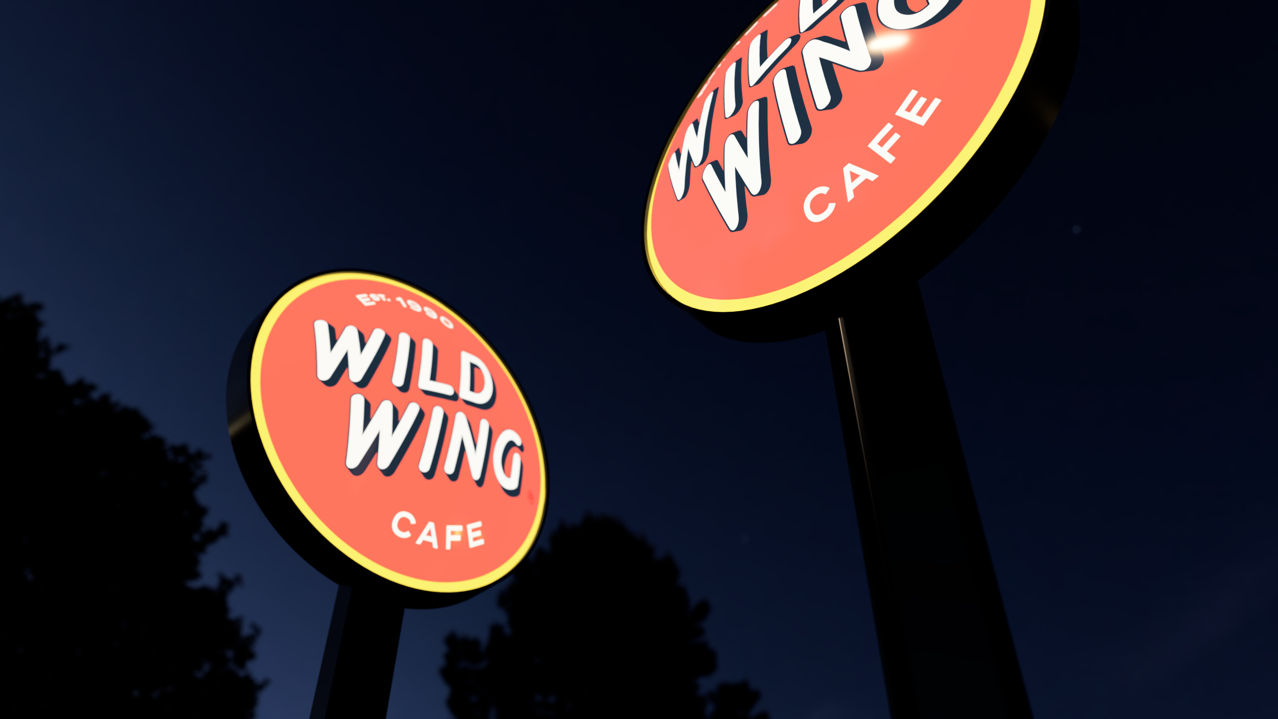

The reimagined retail exterior prototype includes signature elements such as covered porches and generous outdoor areas as additional subtle expressions of the endemic Southern hospitality.
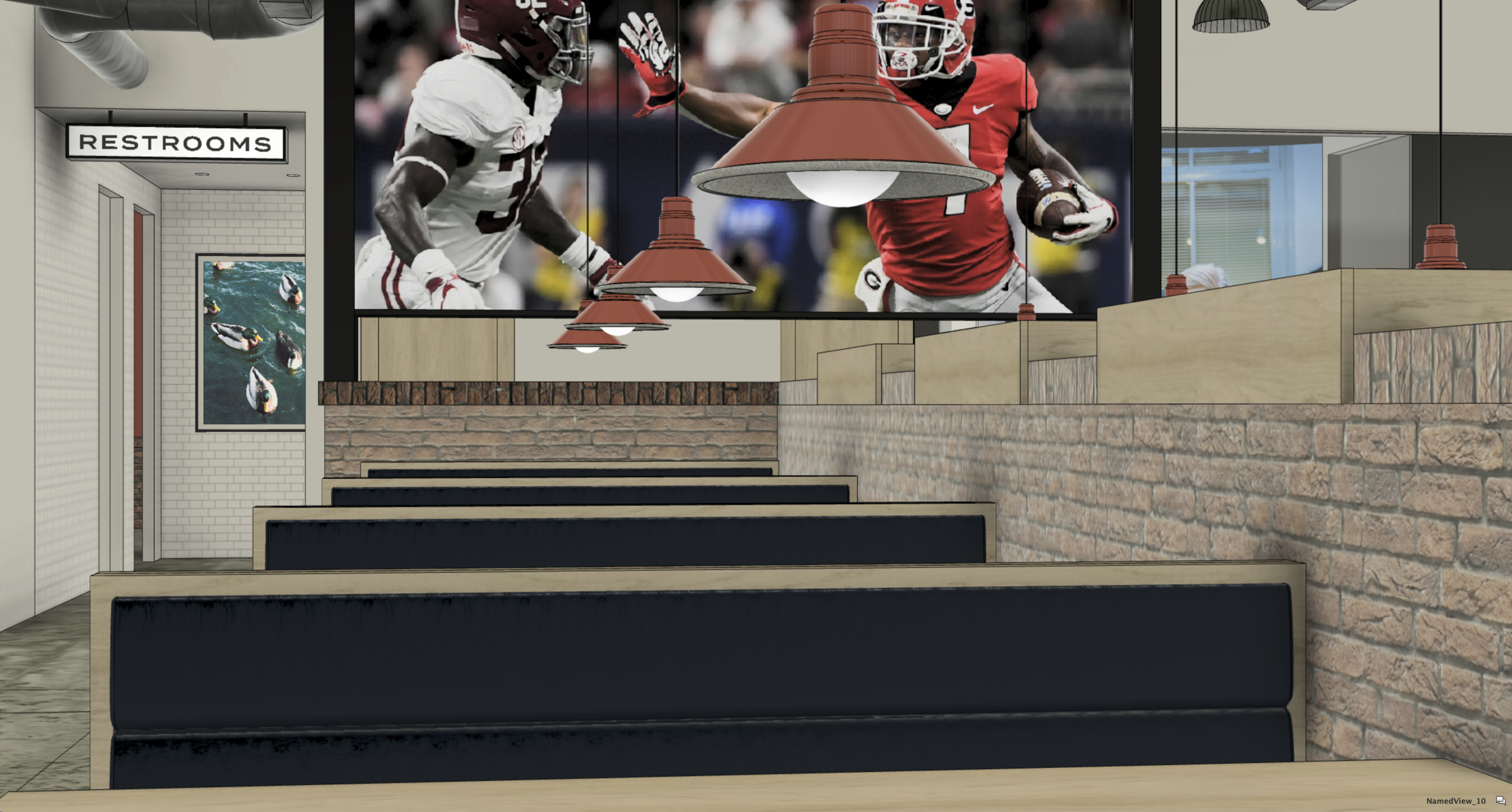
In a radical move that allowed for a significant reduction of clutter by the removal of individual TV monitors we upgraded the customer experience to something more akin to being in an actual living room or even on the bleachers during an actual game. This allows for a clearer distinction between the respective designated zones within the total footprint of the restaurant which enhances the quality of the dining experience for many without removing the ability of others to enjoy a broadcast or a split-screen view of many matches or channels of entertainment in more concentrated fashion.
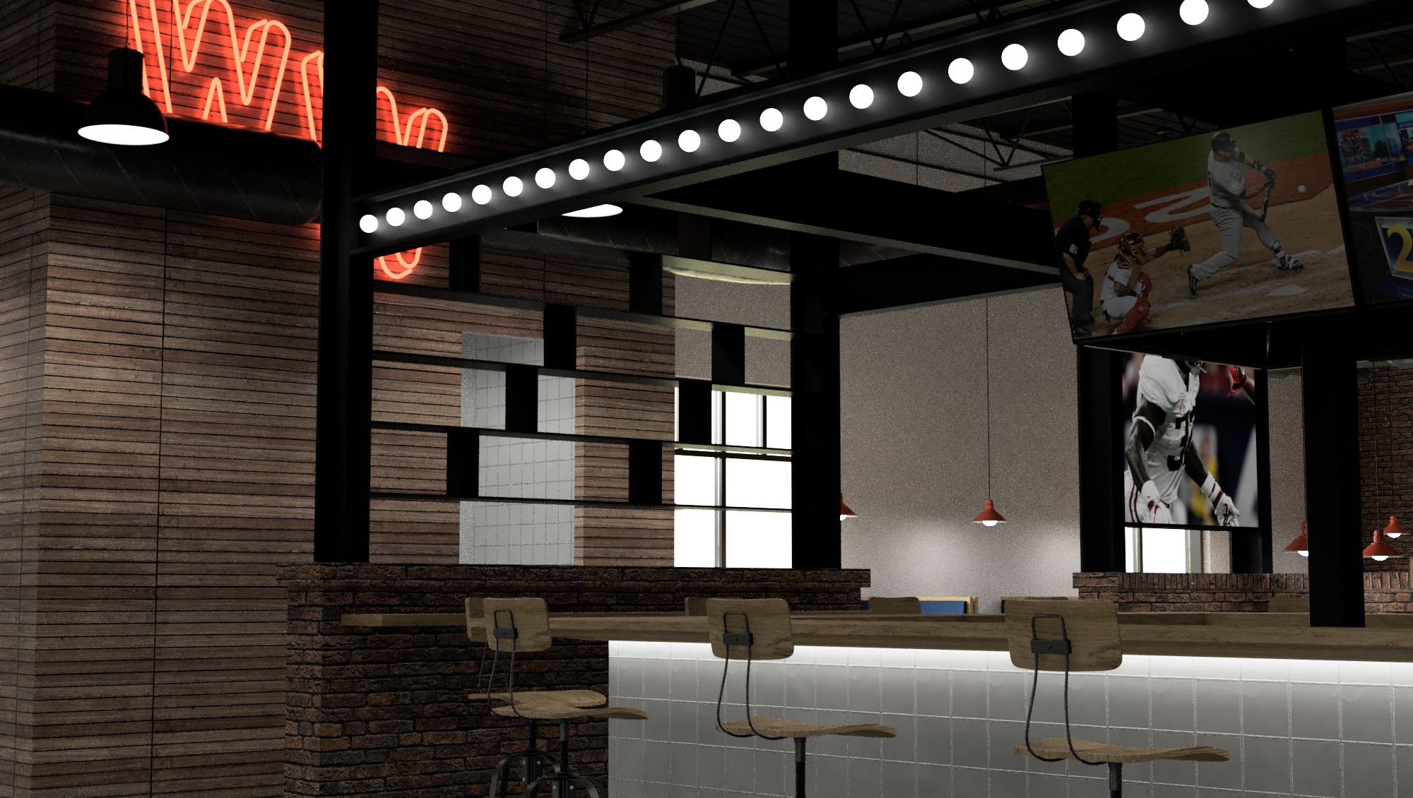

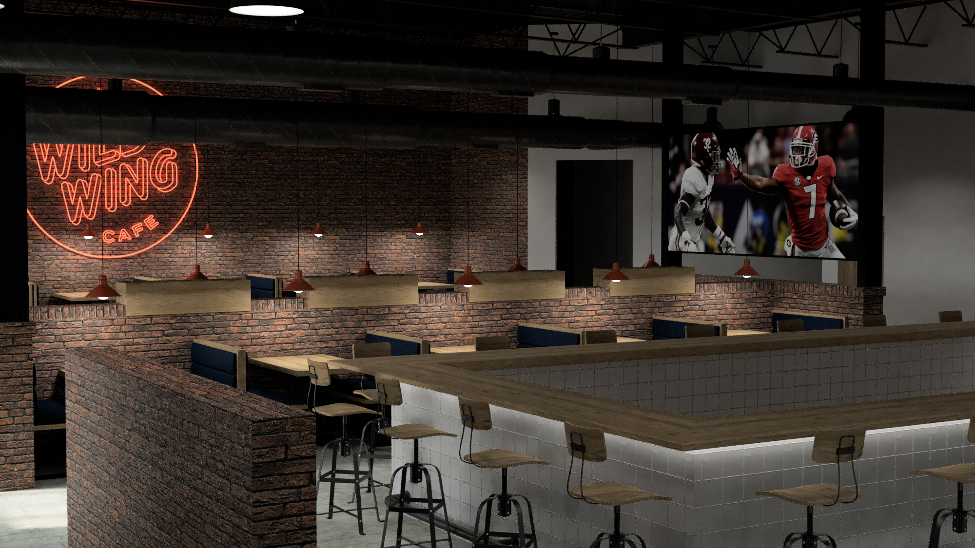
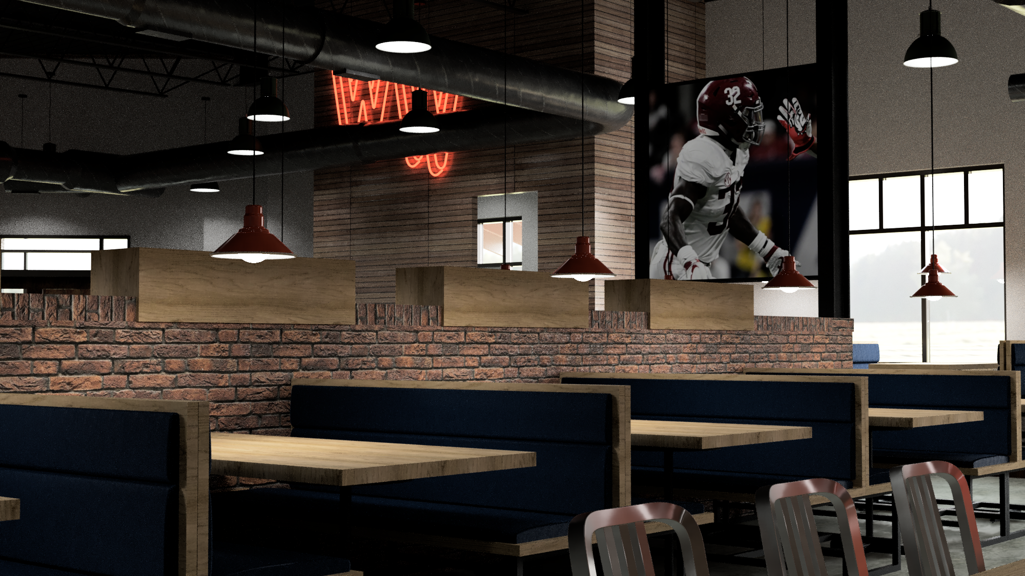
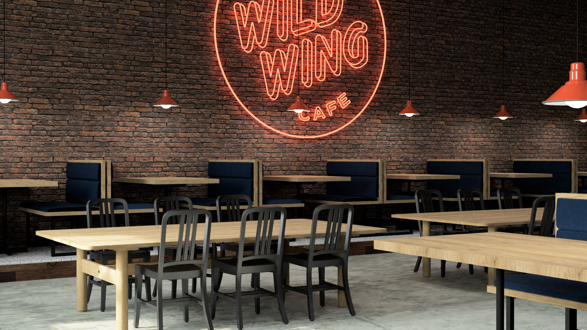

Mixed height furniture and a variety of pendants make for a space that retains depth but also contains interest by enforcing intentional zones within itself.


The new web presence is crisp and to the point and scales well for mobile devices.

A fun, wildly colorful system of adhesive labels for marking the sauce used on wings to go.

The order integrity seal also functions as a way to personalize each item which keeps things organized and friendly at the same time.


The new party box is much, much wilder than ever without losing its sustainable essence or function.

We developed this inexpensive, sustainably and locally made wooden table-top LTO holder system as a way to reduce clutter and bring simple and honest materials back into the every day casual dining experience.

The updated menu system is modular and inexpensive and easy to maintain over long term.


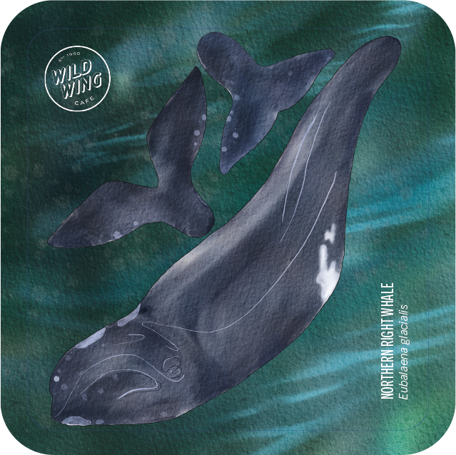
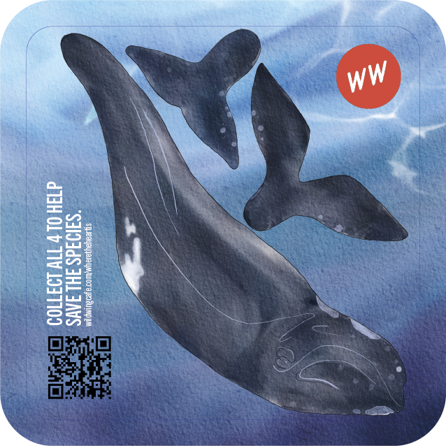
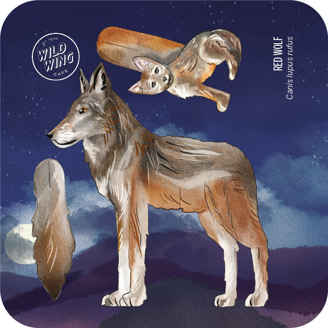
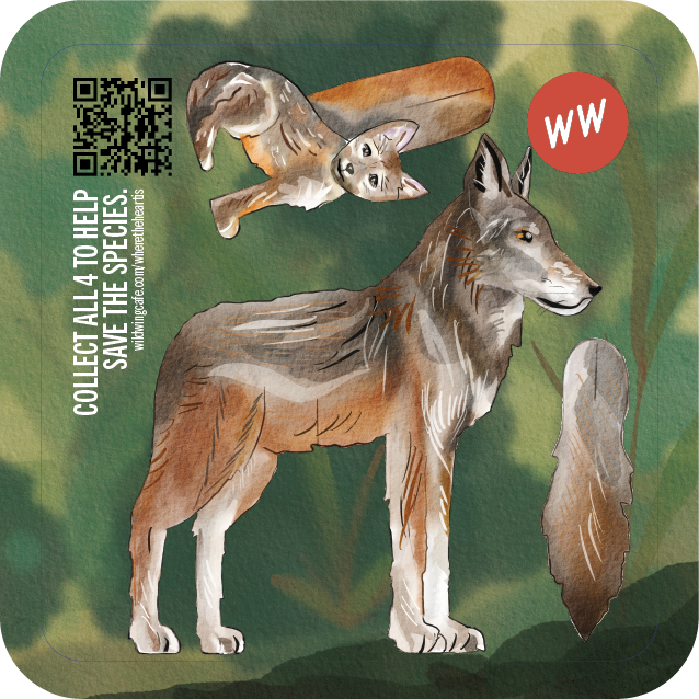
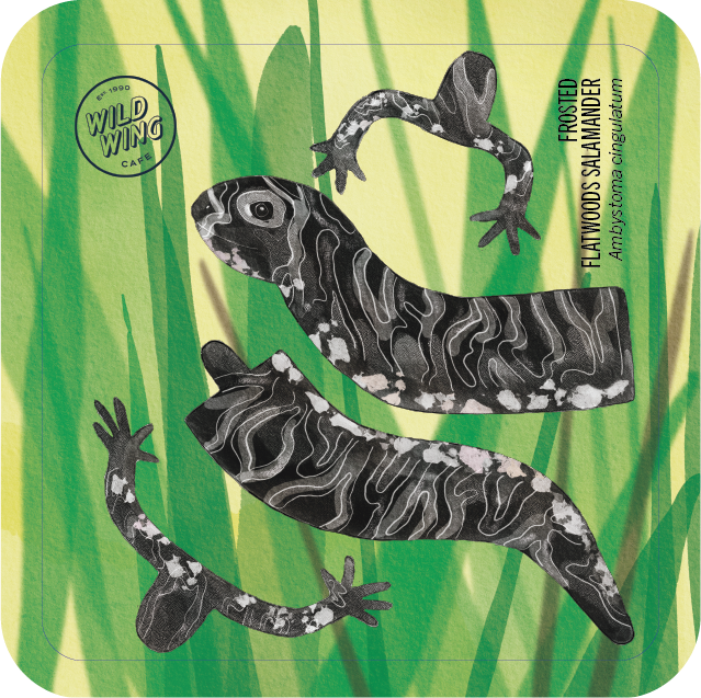
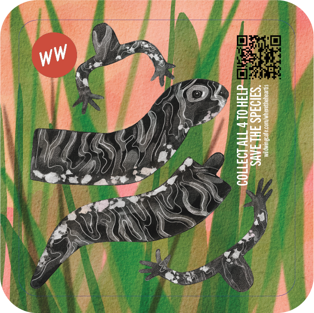
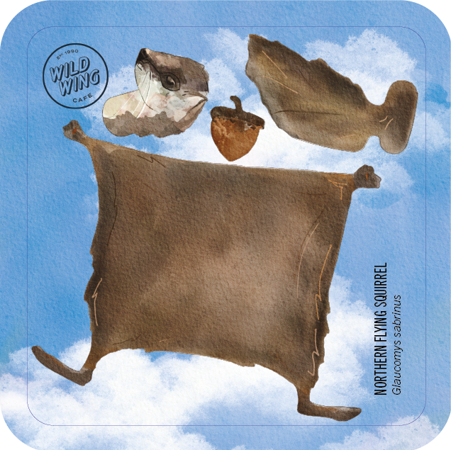
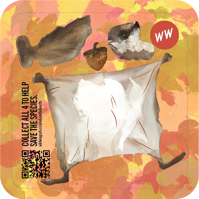
Although rolled out as part of the redesigned children’s Wild Child menu, this is a multi-functional and multiple-audience-oriented beverage coaster that raises awareness about endangered species from the native habitats that coincide with the 43 locations of the WWC. The coasters are 100% compostable and assemble into 3-dimensional sculptures of the respective animal they depict. The embedded QR-code allows for a donation towards the conservation efforts and is connected to the WWC loyalty program.
An excerpt from the brand book.

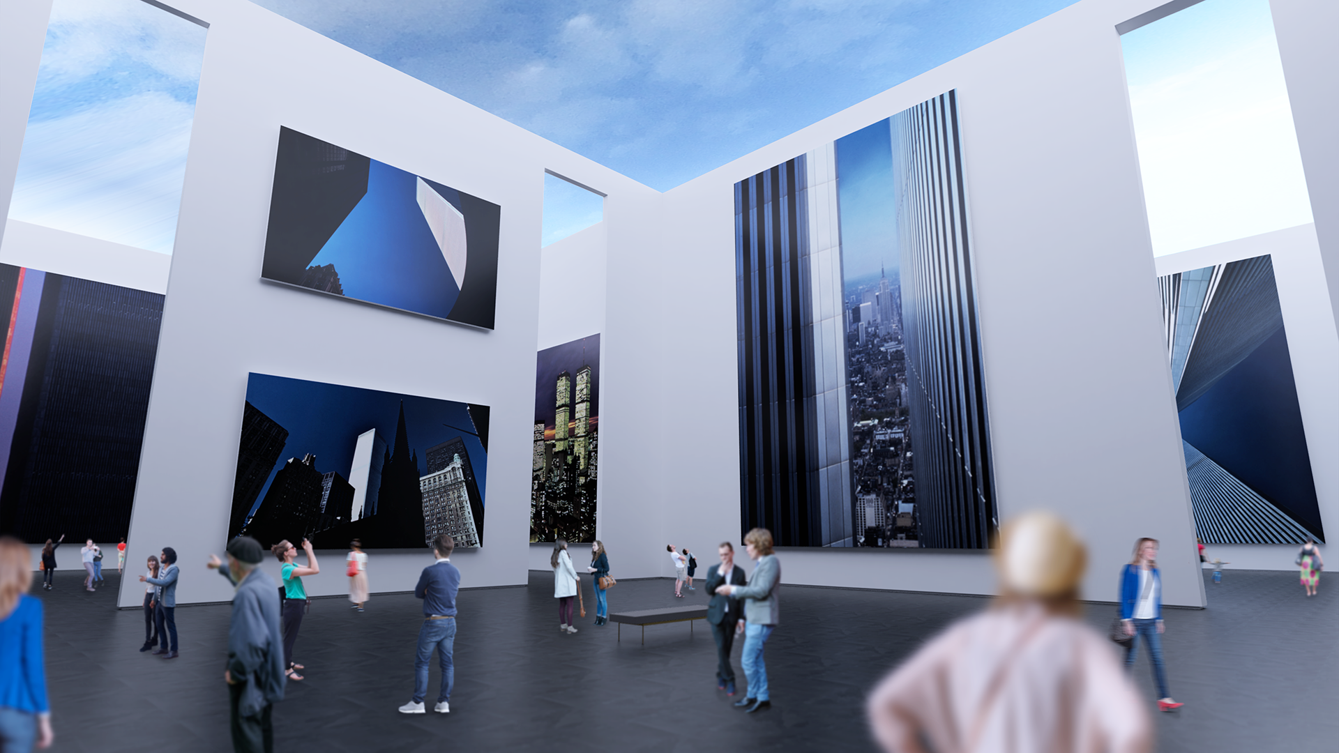
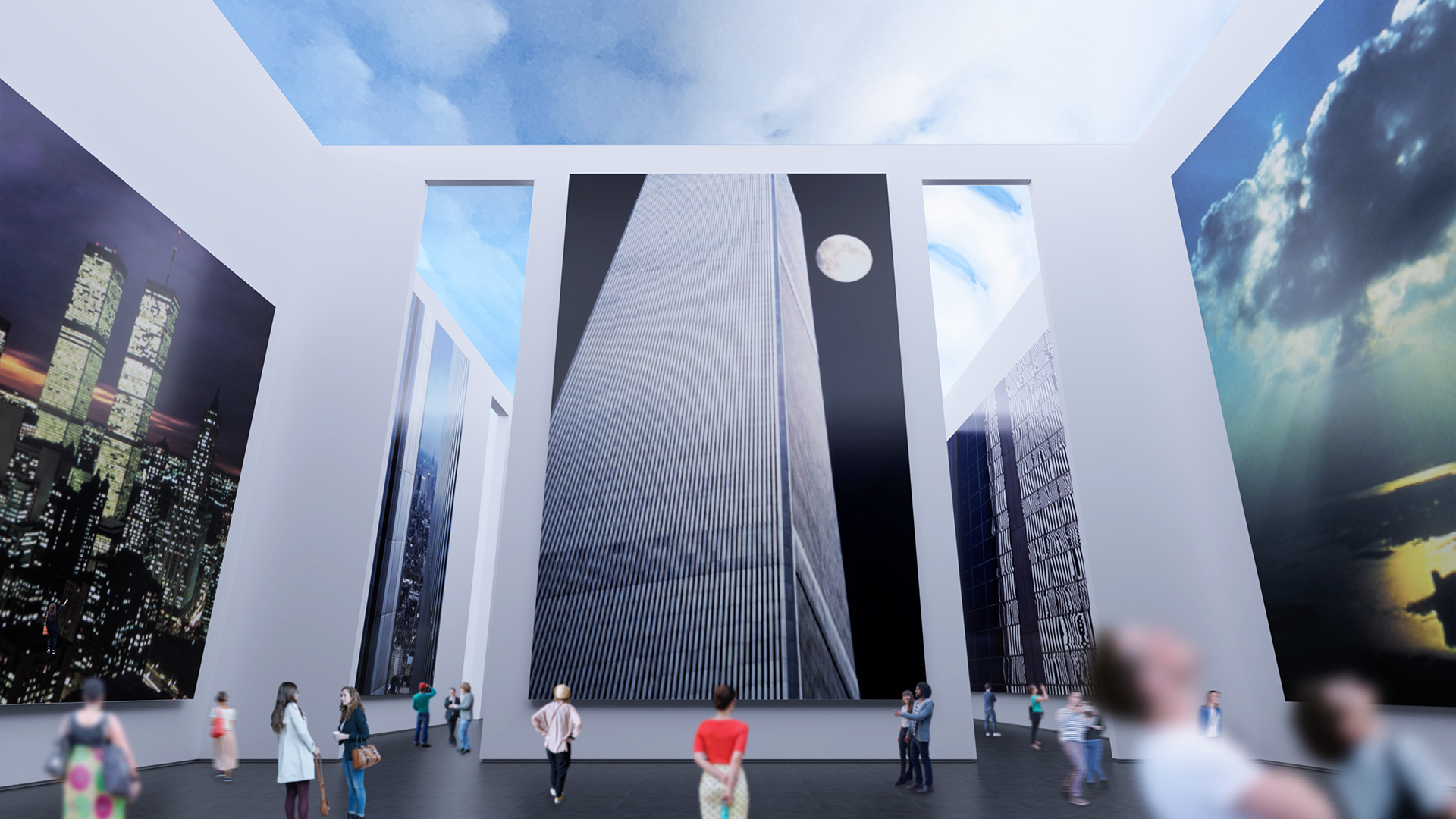
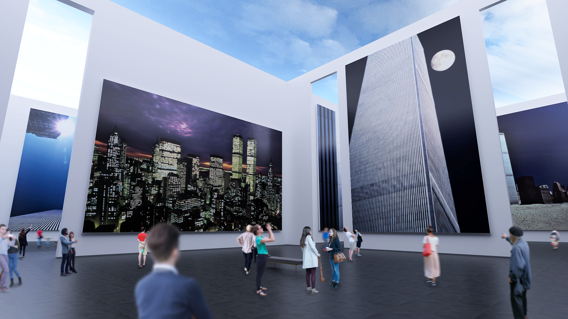
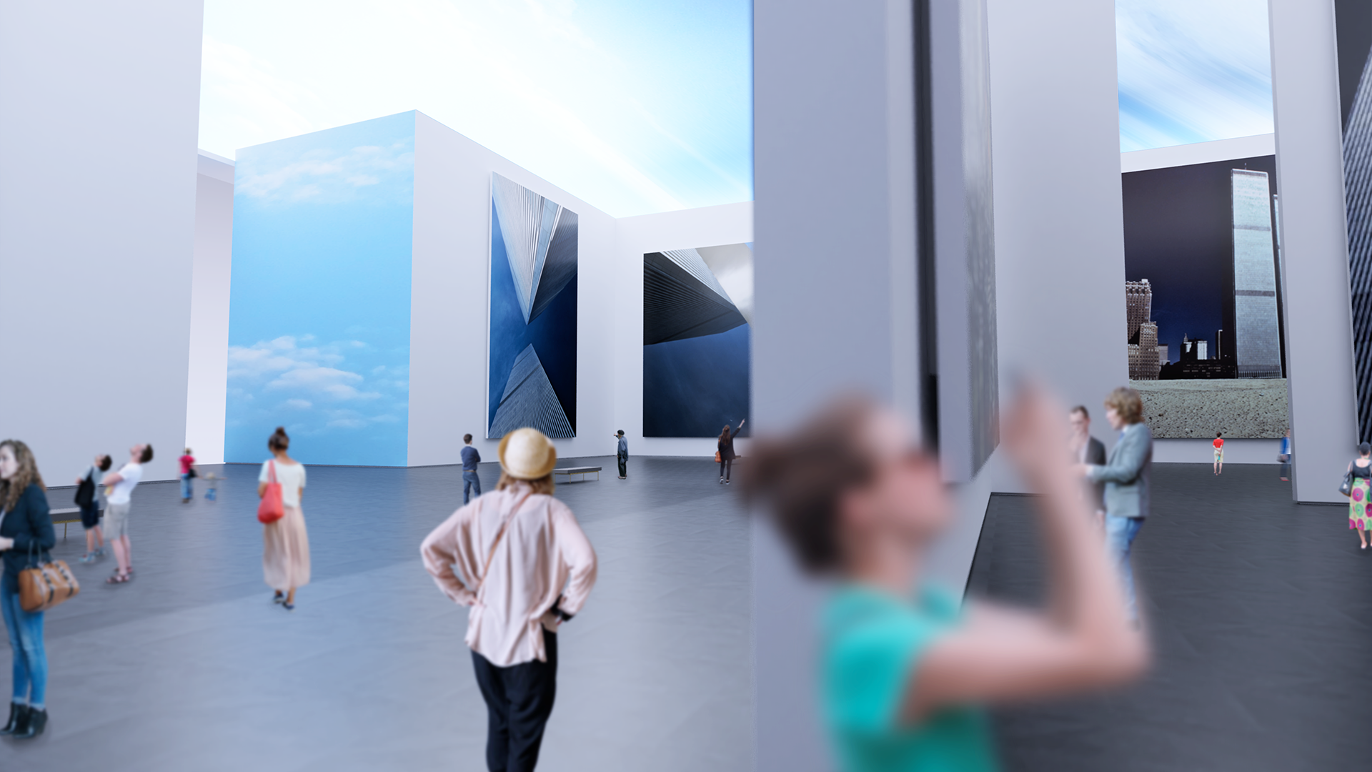
Genius Loci
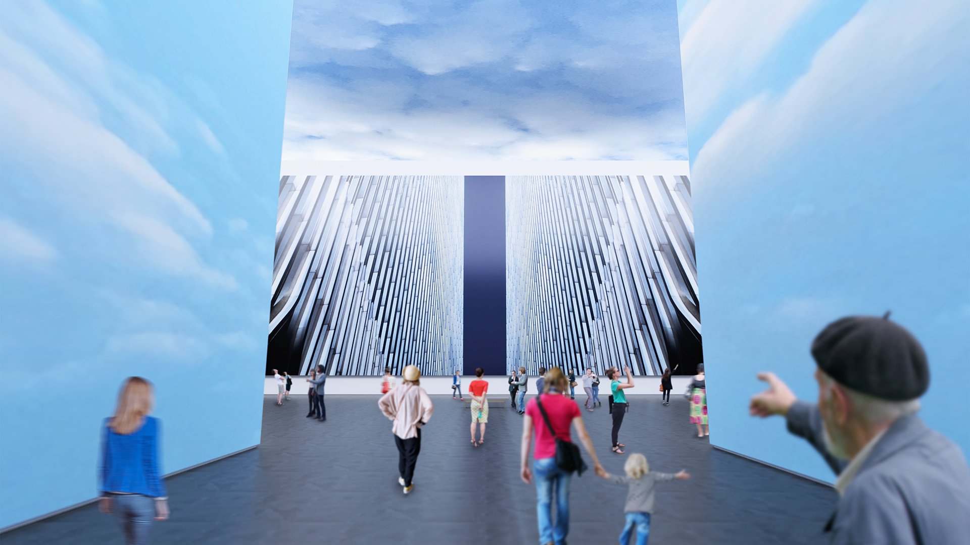
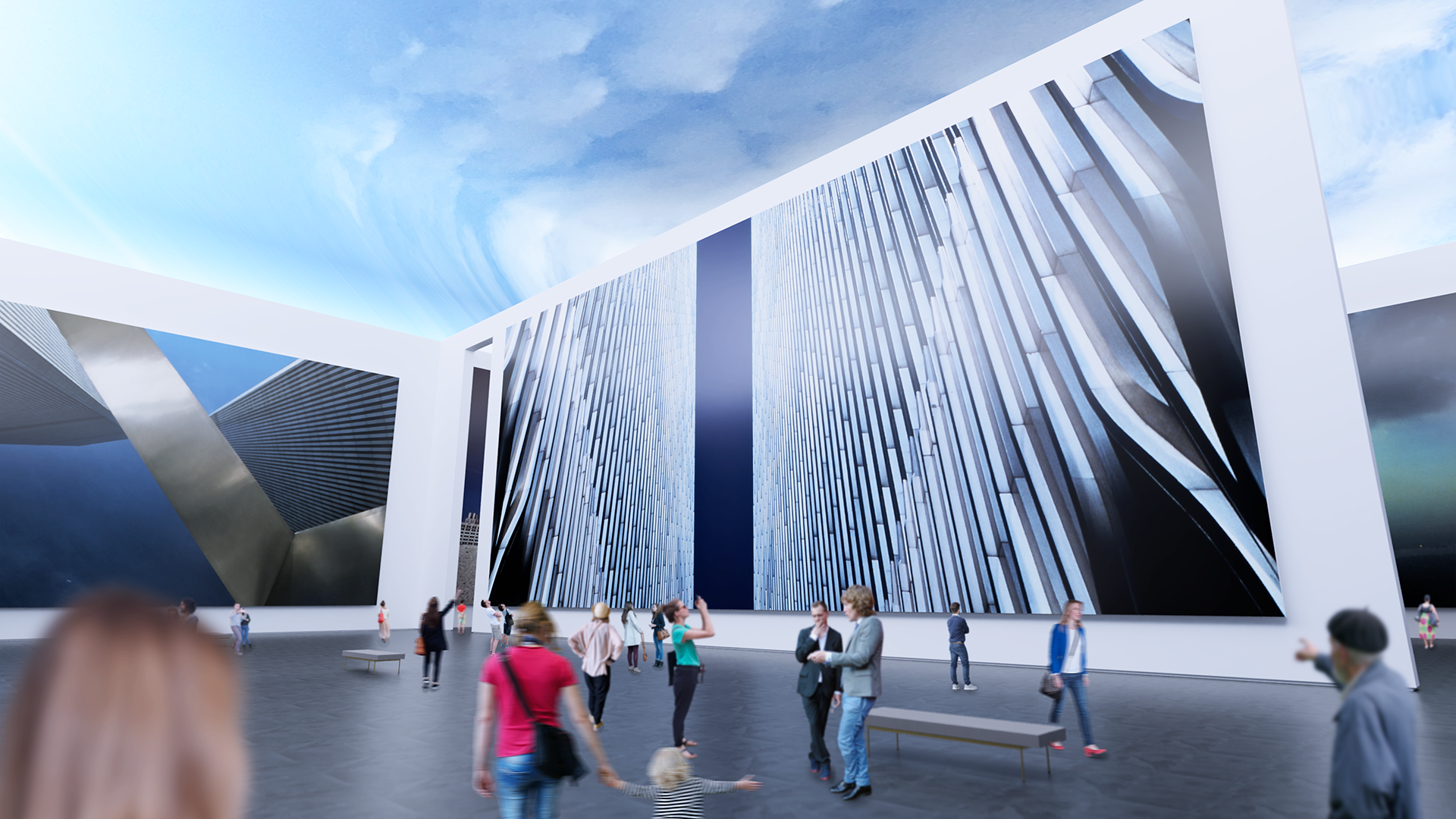
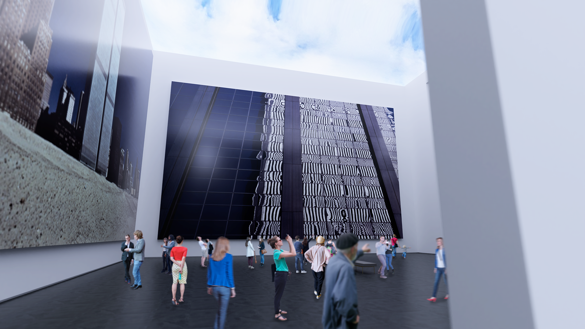
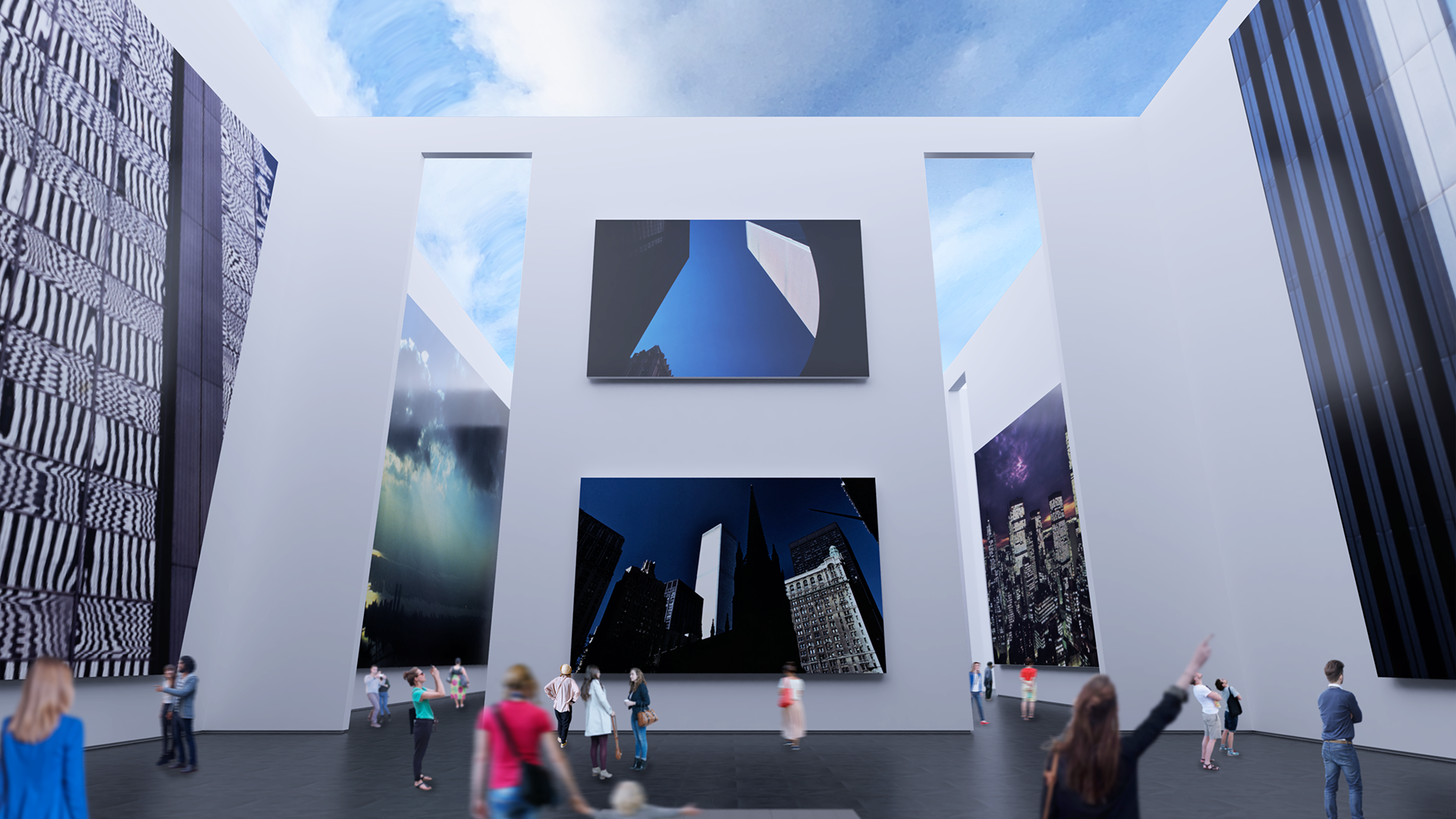
The principal challenge of branding a memorial to something that did not just come to a violent end but to one that may well have been the definitive starting point of the current historical era, was to time travel and re-discover the hope and aspiration the World Trade Center development represented to anyone that remembers the time before tragedy.
Inspired by the photography of a long-time Manhattan resident, designer and photographer Charles H. Moretz, Jr., the Genius Loci visual identity is first and foremost guided by the literal and philosophical pillars of light the twin structure embodied, but also borrows from the optimism and vibrancy represented by the cool blue sky that it so memorably pierced during its reign as a signature element of the New York City skyline for decades of growth and prosperity.


Icon for social media and other shorthand uses.


The vertical orientation of the stationery was chosen to purposely echo the skyward silhouette of the towers.


The website serves as the primary point of presence and contact with an integrated fundraising module.


“The Spirit of the Place” - a book published by ORO Editions of the photographs featured in the planned memorial.


Hooked on Play
Some of the most important and fundamental principles of effective design are derived from observation of the world in constant motion around us since our earliest memories begin. It is for that reason that the notion that “everyone is a designer” exists, albeit as a kind of a half-truth. Most humans are endowed with creativity from birth but it tends to get conditioned out of us during childhood as a result of society’s purposeful intent to produce conformity and predictability (blame the Freemasons if you’d like). It is largely a holdover of that type of thinking that results in a resolute line between work and play - an attitude that would seem to belong with the baby boomers and demonstrates a lack of understanding how much work has changed since the dot-com 90s. Those of us that manage to retain these untainted and primal instincts, and good designers as a norm, can and should necessarily intuit and imagine a solution to most user interface problems. Yet, ultimately the best result is yielded by a purposeful and trained use of a combination of a tuned aesthetic sense and the application of trial and error. In short, a successful design is a result of intentional incremental failures that could also be rightfully described as “play”. It should thus come as no surprise that play is at the center of most successful learning and development strategies. Play doesn’t just encourage and titillate but more importantly failure in the context of a game is tolerated. This is true because the perceived stakes in most games (Russian Roulette being a notable exception!) are low but also because there is a chance to “win”.
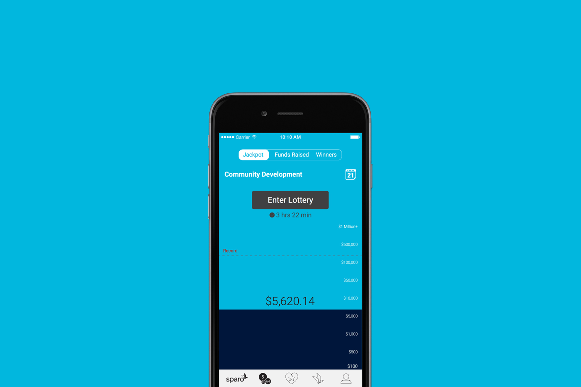
Making the fundraising goal central to the content of the screen ensures continued awareness by the players of the current jackpot vis a vis the fundraising goal and their own donation.
For all its obviousness play is still the lowest hanging fruit in the proverbial tool-chest of experience and interface designers (and the entrepreneurs behind them) that is far too often missed. The stigma surround play as a “waste of time” is usually to blame. Understanding why play matters and how to purposely harness its value for any app project is essential for devising delightful, unique and successful user experiences. Here are some of the basics for any brand’s app or other UI design checklist:
Surprise & Delight
Winning speaks to the reward center of the brain. A chance to win something even as basic as a superficial title (think the mayorships of 4Square from years back) and to project the resulting improvement in the perception of (social) status go an unsurprisingly long way. Creating rewards doesn’t necessarily have to translate into giving something away for free. This is all about creating a successful perception after all. Even something as mundane as remembering a username from the previous visit or using other means to intuit or predict the mental model of the user in a very specific micro-moment can and will have direct bearing on the bottom line of your business. The devil is in the details after all. Design thinking teaches us that a meaningful application of surprise and delight can result in bonding with the brand and the community it inhabits. The real question is how will you keep doing this sustainably? Do you have a plan? Is delight “designed in”?
Motion creates emotion
When building interfaces especially for prolonged and/or repeat uses it is important to remember that even the simplest tasks can and do quickly become chores. These “chores” are the proverbial stumbling blocks when aiming to provide the most frictionless transaction possible. One of the basic ways to counter the mundane is by incorporating some “carrots” along with the “sticks” which can be delivered in the form of movement or animation in a way that responds to the user’s input, whether desired or undesired, and thereby successfully guide the transaction in question to a completion. Because movement represents an intimate connection to our basic survival and thus to our primordial past it makes the emotions being generated in the process so powerful. But beware that movement is something that can be a source of delight as well as of over-saturation and noise! Because movement is tightly connected to the “fight or flight” reflexes of the ancient reptilian brain and basically acts as an extreme stimulant. When practicing good design it is essential to temper one’s enthusiasm for embellishment which should be rightfully dismissed as a cardinally opposite goal.

The ticking clock is a classic interface device for helping to introduce urgency for the user to complete a particular task.
A Picture is worth 1000 words (A VIDEO EVEN MORE)
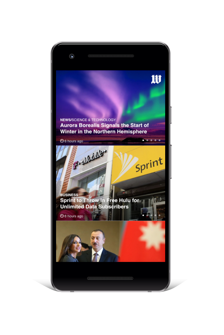
Placing a heavy emphasis on visuals over text or even removing text entirely can have a naturally liberating and disarming effect while also improving focus because the brain generally finds that type of content more interesting and pleasurable. When relying exclusively on imagery or mostly imagery there is little in the way of additional editorial steering or other boundaries imposed in the form of text so the intended message theoretically has a better way of succeeding unimpeded. This technique has been historically used in book publishing going back a few centuries and traces to the beginning of paperbacks and to magazines as periodical content delivery formats. It is also apparent in news publication (UI) design evolution at large with the explicit goal of widening reach (and appeal) among, illiterate, less literate or otherwise broader audiences from outside a particular demographic niche. You don’t have to go further than the successive UI iterations over the past 3 decades of Time and Newsweek, USA Today, and NYT layout systems - all of which have been tailored and re-tailored to capture as many eyeballs as possible. It is no big surprise that the same is likewise true for cable and streaming giants like HBO, Showtime, and Netflix or anyone seeking to deliver news, messaging or entertainment via content or to offer transactional functionality.
Allowing the user to effortlessly toggle between currencies’ performance over time, and to quickly adjust an investment strategy make for a powerful yet simple dashboard for a crypto-currency investor.
Less is More
As is true with any overindulgence in successful interface design less is definitely more. And we’re not talking about minimalism as an explicit or abstract goal here but rather about purposely having empathy towards your users and understanding the human threshold for incoming information - especially if it contains instructions - and their ability to respond to it without or with the least amount of errors. Noise is bad. Given to how badly recent studies have discredited our ability to multi-task (there basically is no such thing, apparently) it should be no great leap to conclude that successful interfaces should help guide users through the necessary tasks while improving their focus on the task. Movement can be an effective way to make up for having less redundancy in terms of navigation elements or other tasks especially if they are to be repeated in the course of recurring visits/uses. Control and customization are other great ways to balance whatever may be perceived as lost to the simplification of an interface.
We are tactile
When it comes to making sense of the reality we inhibit our embedded, innate input sensors abound but touch is by far one of the most powerful of all the senses. More people like hugging than not and those that don’t are likely victims of cultural conditioning. Touch is natural and rewarding. Ultimately, it represents our mothers and more specifically the time spent in the womb (see physical bonding for newborns). Do you love touching your phone or fiddling with another IoT gadget? How many times a day do you try to resist the temptation to be rewarded by that action? It is for this reason that the early attempts at voice interface leave a lot to be desired from a stimulation point of view, and why the maker movement as a backlash against consumption-only model of society is so telling. Tinkering on your home improvement project, mowing the lawn, etc. can help anyone unlock a very personal understanding of why touch is so innately powerful and why it factors so prominently in experience design. Tactility is a key to understanding our desire to control our environment and our innate need to be rewarded and should be at the center of designing any physical touchpoints, let alone UX/UI/UE for your brand, products and tools.
Allowing the user to do their own editorial curation creates an opportunity to bond with a particular user archetype in a meaningful way.
Play TO WIN
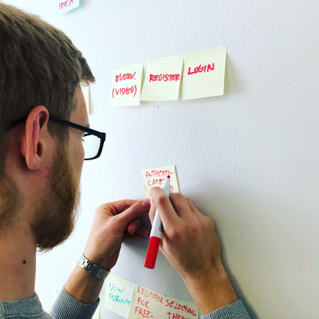
Co-creation and ideation with actual representatives of user archetypes is essential to avoiding the myopia that occasionally plagues even the most talented and experienced design practitioners. Prototyping and user testing as integral parts of the creative process are important and don’t have to be particularly elaborate or costly in order to yield meaningful insight to anyone seeking to build an effective and rewarding user interface. Building unintentional dead ends or adding undesirable or unnecessary functionality along with clumsy navigation are among the many reasons the so-called app economy is as competitive as anything as it is virtually impenetrable (there are now literally a million apps for “that”, most of which will never make it except perhaps as loss leaders) unless a brand really has something unique to offer. Every brand knows by now that not everyone will need an app in order to succeed or that having one is no guarantee of love or traction. But it is all too tempting to assume that just because something seems simple or straightforward from the point of view of a sales script or steps in a retail process (“you just put a thing in a cart, choose quantity, add payment information, get an up-sell recommendation or a coupon and check out!”), your sales, or subscription funnels, it is something that anyone could devise. Unless you’re methodical or pay an expert to design your digital interface there are no guarantees of success. While coding/programming/development is more or less a commodity in today’s market, in branding like in user interface design you get what you pay for.

A moderated user testing session in progress.
If you have an interface design project coming up or one that could use a fresh pair of eyes do not hesitate to get in touch so you can benefit from our deep experience in facilitating the design process through to a successful alpha build. Most importantly, keep an open mind and have fun!


